I’ve lived in Chester for 7 years but realised recently I have scarcely any photos of the city, so a few weeks ago I went off on a morning of indiscriminate photography using a Canon EF-S 10-22mm f3.5-4.5 on my Canon 400D. You can see the results of my labours on this and an earlier trip here.
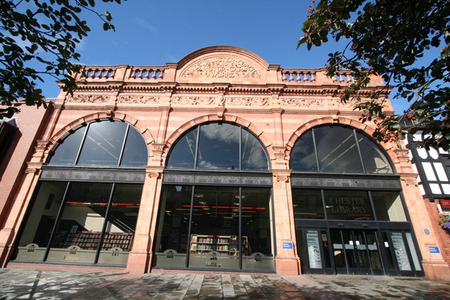
The 10-22mm lens is a nice, very wide-angle lens but as you can see below it can produce some odd effects when used close-up to take picture of buildings. This can be seen in the picture of Chester Library shown below:
The library is housed in the old Westminster Coach and Motor Car Works, built around 1913-14 with a rather nice brick and terracotta front (see history here).
Aside from my usual problem of apparently having one leg shorter than the other, the verticals in the building converge. The “short-leg” problem can be fixed using Picasa, the aesthetic problem of converging verticals needs a different approach.
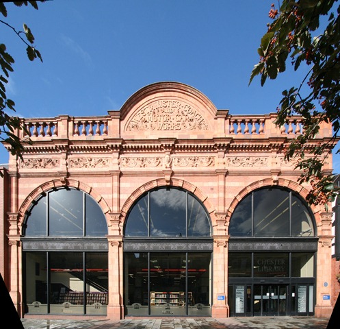
It’s worth pointing out that the image shown above is “correct” in the sense that the vertical lines of the building should converge because the top of the building is further away from the photographer than the bottom of the building. This problem is more severe when using a wide-angle lens. I want something that looks like the image below; what’s sometimes known as an “architectural projection”.
In the old days an architectural projection could be achieved using tilt-shift lenses or rather odd darkroom techniques. By the way, Cambridge in Colour, linked to for tilt-shift above is my first port of call for the mechanics of all manner of photographic things.
These days perspective corrections of this sort can be achieved using software, such as Hugin. Hugin is designed as a photostitching software but as a side-effect of this it needs to have all manner “projective geometry” knowledge. Projective geometry relates the real, 3D world to what will appear in a camera (a 2D projection of that world); it’s important in machine vision applications, computer graphics and in this sort of image processing.
The process of “correcting” converging verticals is described in a very good tutorial on the Hugin website. There is also a related perspective correction tutorial, this stops both horizontal and vertical lines from converging, this can have the effect of shifting you from an oblique view to a square on view (sort of). Applying this to my original image of the library we get this:
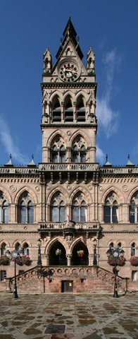
Which I find rather pleasing. This is Chester Town Hall, built in 1869, similarly treated:
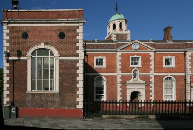
Finally, the Blue Coat “Hospital” which was never a hospital but actually a school, it’s also a demonstration of the perspective correction pushed a little too far, something odd is going on with the dome tower. This is because the things I am applying a warp to are not all in the same plane.
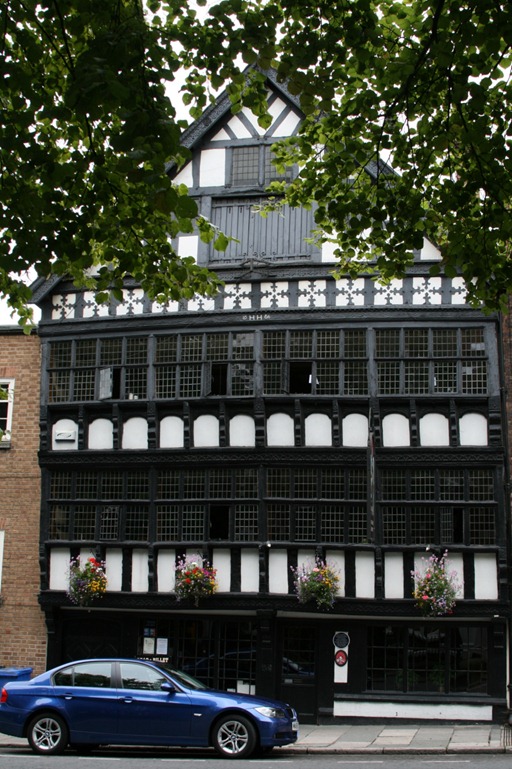
It’s easy to grow familiar with a place, not realising it is a little bit special. Chester really is architecturally special although it’s at times like this I wish there was a filter for modern signage and vehicles. There are a number of black and white “timber framed” buildings, often these are “mock” dating back to the late 19th century:
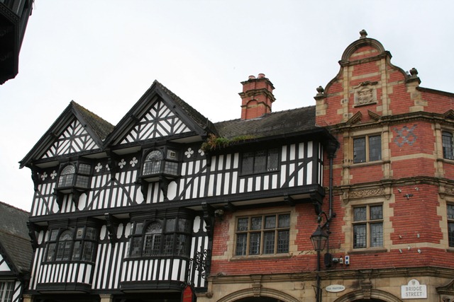 Whilst others are genuinely old, such as the Bear and Billet Inn built in 1664:
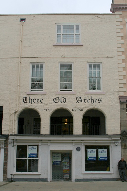
The Three Old Arches is reputedly the oldest shop front in England:
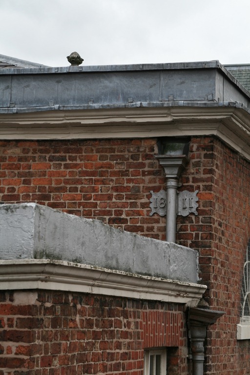
And there are all manner of interesting little twiddly bits, I keep spotting more of these each time I visit now:
A load more of my photos of Chester here.
 |
| Chester |

