Tag: graphs

Revisions to UK GDP data

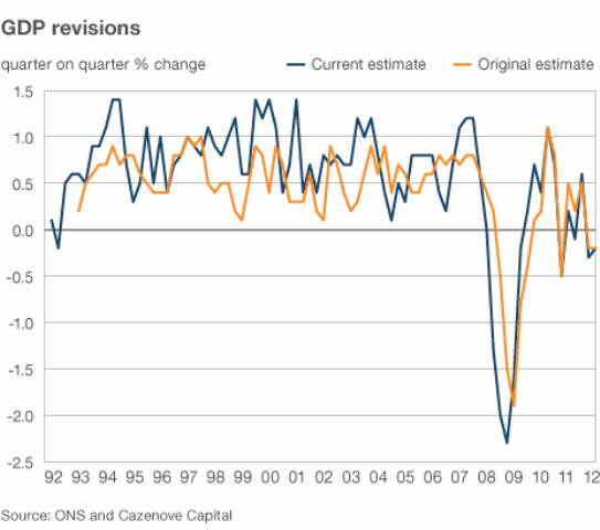
The BBC published an article entitled “Viewpoint: Is UK GDP data fit for purpose?” which featured a graph showing the original estimates for quarterly UK GDP growth and current estimates for those same figures. The point being that the original figures are subject to revision which can change figures quite significantly, for example currently we are technically in recession with a GDP growth figure for Q1 2012 of –0.2% (source). But how does this compare with the size of the revisions made to the data?

Here is the graph from the original article:

464

This is quite nice but there are other ways to display this data, which unfortunately isn’t linked directly to the graph. However, this should not stop an enterprising number-cruncher, there exists software which will allow you to extract the numbers from graphs! I used Engauge Digitizer, which worked fine for me – I had the data I wanted 20 minutes or so after I’d downloaded the software. It does some semi-automatic extraction which makes separating the two different sets of data in the graph on the basis of the colour of the lines quite easy.

This type of approach is not ideal, the sampling interval for the extracted data is not uniform, and not the same for the two datasets, furthermore the labelling of the x-axis is unclear so it’s difficult to tell exactly which quarter is referred to.

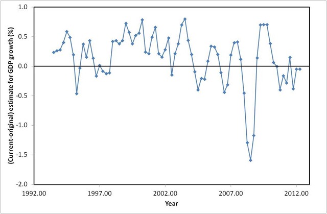
I next loaded up the data into Excel for a bit of quick and easy plotting. To address the sampling problem I used the vlookup function to give me data for each series on a quarterly basis. I can then plot interesting things like the difference between the current and original estimates for each quarter, as shown below:

DifferenceGraph

A few spot checks referring back to the original chart can convince us that we have scraped the original data moderately well. The data also fit with the ONS comment on the article:

…looking back over the last 20 quarters, between the first and most recent estimates, the absolute revision (that is, ignoring the +/- sign) is still only 0.4 percentage points.

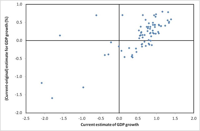
I calculated this revision average and got roughly the same result.We can also plot the size of revisions made as a function of the current estimate of the GDP growth figure:

DifferenceGraph2

This suggests that as the current estimate of growth goes up so does the size of the revision: rises are under-estimated, falls in growth are under-estimated in the first instance although this is not a statistically strong relationship. These quarterly figures on GDP growth seem awfully noisy, which perhaps explains some of the wacky explanations for them (snow, weddings, hot weather etc etc) – they’re wild stabs at trying to explain dodgy data which doesn’t actually have an explanation.

The thing is that the “only 0.4 percentage points” that the ONS cites makes all the difference between being in recession and not being in recession!

Footnotes

I uploaded my spreadsheet here, the figures did not import well.

Board of Longitude

It’s been a while since I did a data driven blog post, so here I am with one on the “Board of Longitude”. The board was established by act of parliament in 1714 with a headline prize of £20,000 to anyone who discovered a method to determine the longitude at sea to within 30 nautical miles. The members of the Board also had discretion to make smaller awards of up to £2,000 in support of proposals which they thought had merit. The Board was finally wound up in 1828, 114 years after its formation.

The latitude is your location in the North-South direction between the equator and either of the earth’s poles, it is easily determined by the position of the sun or stars above the horizon, and we shall speak no more of it here.

The longitude is the second piece of information required to specify ones position on the surface of the earth and is a measure your location East-West relative to the Greenwich meridian. The earth turns at a fixed rate and as it does the sun appears to move through the sky. You can use this behaviour to fix a local noon time: the time at which the sun reaches the highest point in the sky. If, when you measure your local noon, you can also determine what time it is at some reference point Greenwich, for example, then you can find your longitude from the difference between the two times.

The threshold for the highest Longitude award amounts to knowing the time at Greenwich to within 2 minutes, wherever you are in the world, and however you got there. This was a serious restriction at the time, because a journey to anywhere in the world could have taken months of voyaging at sea with its concomitant vibrations and extremes of temperature, pressure and humidity all of which have serious implications for precision timekeeping devices.

The Board of Longitude intertwines with various of the people whose biographies I’ve read, and surveying efforts taking place during the 18th and 19th centuries. It made a walk on appearance in Tim Harford’s Adapt, which I’ve just read, as an early example of prizes being offered to solve scientific problems.

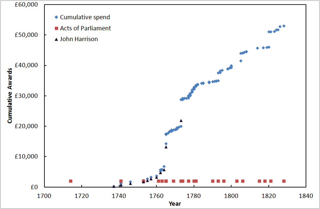
Below I present data on the awards made by the Board during its existence from 1714 to 1828. The data I have used is from “Britain’s Board of Longitude: The Finances, 1714-1828” By Derek Howse1 which I reached via The Board of Longitude Project based at the Royal Museums at Greenwich. The chart below shows the cumulative total of the awards made by the Board (blue diamonds), awards made to John Harrison who won the central prize of the original Board (black triangles) and the dates of Acts of Parliament relating to the Board (red squares). Values are presented as at the time they were awarded, the modern equivalent values are debatable but the original £20,000 award is said to have been worth between £1million and £3.5million in modern terms, so a rule of thumb would be to multiple by 100 to get approximate modern values.

image

Although established in 1714, the Board made no reward until 1737 and until 1765 made the great majority of awards to John Harrison for his work on clocks; clockmakers Thomas Earnshaw (1800, 1805), Thomas Mudge (1777,1793) and John Arnold (father and son 1771-1805) also received significant sums from the Board.

A second area of awards was in the “lunar” method of determining the longitude which uses the positions of stars relative to the moon to determine time and hence longitude. The widow of Tobias Mayer received the largest award, £3,000, for work in this area. The list of awardees contains a number of famous European mathematicians including Leonhard Euler, Friedrich Bessel, and Johann Bernoulli.

After 1763 the Board started to branch out, having been mandated by parliament to prepare and print almanacs containing astronomical information. In the twilight of its years the Board gained responsibility for awards relating to the discovery of the North-West passage (a sea route from the Atlantic to the Pacific via the north of Canada), the second largest recipient of awards for the whole period were the crews of the Hecla and Griper of £5000 in 1820 for reaching 110oW within the Arctic Circle, pursuing this goal.

The story of the Board of Longitude is often presented as a battle between the Board and John Harrison for the “big prize” but these data highlight a longer and more subtle existence with Harrison receiving support over an extended period and the Board going on to undertake a range of other activities.

References

1. “Britain’s Board of Longitude: The Finances, 1714-1828” By Derek Howse, The Mariner’s Mirror, Vol. 84(4), November 1998, 400-417. (pdf) Sadly the article notes that Derek Howse died after the preparation of this article.

2. Data from (1) can be found in this Google Docs spreadsheet

Book Review: The Visual Display of Quantitative Information by Edward R. Tufte


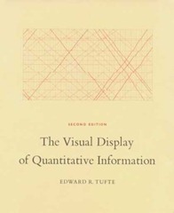
tufteThe Visual Display of Quantitative Information” by Edward R. Tufte is a classic in the field of data graphics which I’ve been meaning to read for a while, largely because the useful presentation of data in graphic form is a core requirement for a scientist who works with experimental data. This is both for ones own edification, helping to explore data, and also to communicate with an audience.

There’s been something of a resurgence in quantitative data graphics recently with the Gapminder project led by Hans Gosling, and the work of David McCandless and Nathan Yau at FlowingData.


The book itself is quite short but beautifully produced. It starts with a little history on the “data graphic”, by “data graphic” Tufte specifically means a drawing that is intended to transmit data about quantitative information in contrast to a diagram which might be used to illustrate a method or facilitate a calculation. On this definition data graphics developed surprisingly late, during the 18th century. Tufte cites in particular work by William Playfair, who was an engineer and political economist who is credited with the invention of line chart, bar chart and pie chart which he used to illustrate economic data. There appears to have been a fitful appearance of what might have been a data graphic in the 10th century but to be honest it more has the air of a schematic diagram.

Also referenced are the data maps of Charles Joseph Minard, the example below shows the losses suffered by Napoleon’s army in it’s 1812 Russian campaign. The tan line shows the army’s advance on Moscow, it’s width proportional to the number of men remaining. The black line shows their retreat from Moscow. Along the bottom is a graph showing the temperature of the cold Russian winter at dates along their return.

800px-MinardInterestingly adding data to maps happened before the advent of the more conventional x-y plot, for example in Edmund Halley’s map of 1686 showing trade winds and monsoons.

Next up is “graphic integrity”: how graphics can be deceptive, this effect is measured using a Lie Factor: the size of the effect shown in graphic divided by the size of the effect in data. Particularly heroic diagrams achieve Lie Factors as large as 59.4. Tufte attributes much of this not to malice but to the division of labour in a news office where graphic designers rather than the owners and explainers of the data are responsible for the design of graphics and tend to go for the aesthetically pleasing designs rather than quantitatively accurate design.


Tufte then introduces his core rules, based around the idea of data-ink – that proportion of the ink on a page which is concerned directly with showing quantitative data:

  • Above all else show the data
  • Maximize the data-ink ratio
  • Erase non-data-ink
  • Erase redundant date-ink
  • Revise and edit.

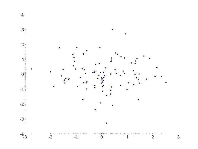
A result of this is that some of the elements of graph which you might consider essential, such as the plot axes, are cast aside and replaced by alternatives. For example the dash-dot plot where instead of solid axes dashes are used which show a 1-D projection of the data:

ddp

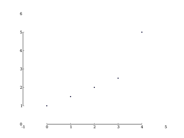
Or the range-frame plot where the axes are truncated at the limits of the data, actually to be fully Tufte the axes labels would be made at the ends of the data range, not to some rounded figure:

range

Both of these are examples are from Adam Hupp’s etframe library for Python. Another route to making Tufte-approved data graphics is by using the Protovis library which was designed very specifically with Tufte’s ideas in mind.

Tufte describes non-data-ink as “chartjunk”, several things attract his ire – in particular the moiré effect achieved by patterns of closely spaced lines used for filling areas, neither is he fond of gridlines except of the lightest sort. He doesn’t hold with colour or patterning in graphics, preferring shades of grey throughout. His argument against colour is that there is no “natural” sequence of colours which link to quantitative values.

What’s striking is that the styles recommended by Tufte are difficult to achieve with standard Office software, and even for the more advanced graphing software I use the results he seeks are not the out-of-the-box defaults and take a fair bit of arcane fiddling to reach.  Not only this, some of his advice contradicts the instructions of learned journals on the production of graphics.

Two further introductions I liked were Chernoff faces which use the human ability to discriminate faces to load a graph with meaning, and sparklines – tiny inline graphics showing how a variable varies in time without any of the usual graphing accoutrements: – in this case one I borrowed from Joe Gregorio’s BitWorking.

In the end Tufte has given me some interesting ideas on how to present data, in practice I fear his style is a little too austere for my taste.There’s a quote attributed to Blaise Pascal:

I would have written a shorter letter, but I did not have the time.

I suspect the same is true of data graphics.

Footnote

Mrs SomeBeans has been referring to Tufte as Tufty, who UK readers of a certain age will remember well.

The House of Lords by numbers

Reform is in the air for the House of Lords, to be fair reform has been in the air for large parts of the last hundred years. Currently reform comes in the form of a proposal put forward by Nick Clegg and backed by David Cameron – you can see the details here. It comes in the context of all three main Westminster parties supporting a largely elected House of Lords in their 2010 General Election manifestos.

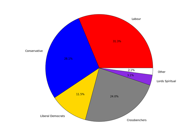
The purpose of this post is not to go through the proposals in detail but simply to provide some charts on appointments to the House of Lords over the years. The current composition of the House is shown in the pie-chart below:

CurrentComposition

The membership of the House of Lords currently numbers 789, I have excluded the handful of members from UKIP, DUP, UUP, the Greens and Plaid Cymru since they are too few to show up in such a chart.

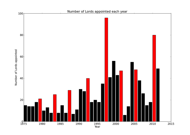
The website www.theyworkforyou.com provides a handy list of peers in an easily readable format, this list includes data such as when they were appointed, what party they belong to, what name they have chosen and when they left and whether they used to be an MP. We can plot the number of appointments each year:HoLTotalByYear

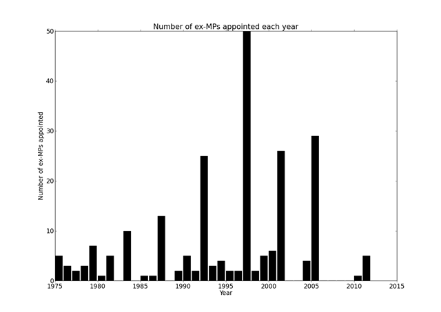
I’ve highlighted election years in red, as you can see election years are popular for the appointment of new members, and it would seem many of those appointed in such years are former MPs, as shown in the graph below:

HoLexMPs

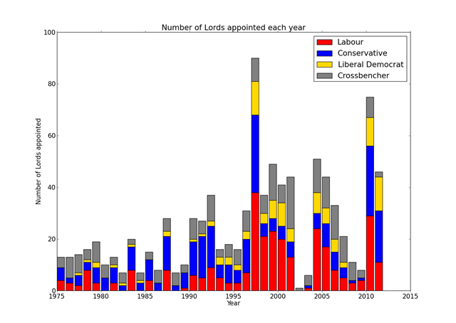
But to which parties do these appointees belong? This question is answered below:

HoLTotalByYearAndParty

I hope this provides a useful backdrop to subsequent discussions on reform.

Deficit reduction through growth

This blog post seeks to answer the question: what economic growth rate does the UK need to sustain in order to reduce the deficit to zero?

This seems like a relevant question at the moment, and I’ve not seen a straightforward calculation of the answer – so I thought I’d give it a go myself. The idea being that even if the end result is not particularly informative the thinking behind getting the end result is useful.

The key parameter of interest here is the gross domestic product (GDP): the amount of goods and services produced in a year in the UK; it’s a measure of how wealthy we are as a nation, how it increases with time is a measure of economic growth. Also important are the deficit (how much the government’s annual spending exceeds its income) and debt (how much the government is borrowing).

Inflation means that the GDP can appear to grow each year with no increase in real economic activity, therefore I decided to use “inflation adjusted” GDP figures. I also preferred to use annual GDP figures rather than quarterly ones.

To model this I took a starting point of a known GDP, debt, deficit and government spend which I then propagated forwards in time: I made the GDP grow by a fixed percentage each year, and assumed that government spending would be flat (I’m using GDP adjusted for inflation so I think this is reasonable). Assuming that the total tax take is a fixed proportion of GDP I can calculate the deficit and hence increasing debt in each year, I add the debt servicing cost to the government spending in each. Since I’m doing everything else in the absence of inflation I’ve used a debt servicing rate of 2% rather than the 5% implied by a £43bn debt interest cost in 2010 – this makes my numbers a bit inconsistent.

I’ve put the calculation in a spreadsheet here.

Given this model my estimate is that the UK would need to sustain GDP growth of 4.8% per year until 2020 in order to reduce the deficit to 0%. This 4.8% GDP growth brings in approximately an additional £30bn in taxes for each year for which the growth is 4.8%. During this time the debt would rise to nearly 80% of GDP and so the cost of servicing the debt will double. These numbers seem plausible and fit with other numbers I’ve heard knocking around.

To get a feel for how GDP has varied in the past, this is the data for inflation adjusted annual GDP growth in the UK since 1950:

GDPGrowth

The red line shows the “target” 4.8% GDP growth, and the blue bars the actual growth in the economic, adjusted for inflation. The data comes from here. What’s notable is that GDP growth has rarely hit our target and what’s worse, over the last 40 years there have been four recessions (where GDP growth is negative), so the likelihood must be that another recession before or around 2020 is to be expected.

In real-life we are actually using a combination of GDP, government spending cuts and tax increases to bring down the deficit. These calculations indicate 0.5% GDP growth is approximately £7bn per year which is equivalent to a couple of pence on basic rate (see here) or about 1% of government spending (see here).

Doing this calculation is revealing because it highlights why there is an emphasis on cuts in government spending as a means of reducing the deficit. This had been a bit of a mystery to me with the figure of 80:20 cuts to taxes ratio being widely quoted as some sort of optimum, although there is some indication of other countries working with a ratio closer to 50:50. The thing is that when you cut your spending, you are in control. You can set a target for reduction and have a fair degree of confidence you can hit that target and show you have hit that target relatively quickly and easily. On the contrary relying on growth in GDP, or taxes, is a rather more unpredictable exercise: taxes because the amount of tax raised depends on the GDP.

The Office for Budget Responsibility (OBR) published uncertainty bounds for it’s future predictions of GDP in their pre-budget report last year (see p10 and Annex A in this report), their central forecast is for growth of 2.5% but by 2014 (i.e. in only 4 years) they estimated only a 30% chance that it lay between 1.5% and 3.5% actually they only claim a 40% chance of being in that range for this year (2011).

At the risk of being nearly topical, GDP is reported to have shrunk by 0.5% in the last quarter of last year, 2010. This is largely irrelevant to this post, although forecasts for GDP were growth of ~0.5% which supports the idea that GDP is not readily predictable. It’s worth noting that the ONS will revise this figure at monthly intervals until they get all the data in – the current estimate is based on 40% of the data being available.

Given this abysmal ability to predict GDP I suspect that there is little governments can do to influence the growth in GDP. It would be interesting to estimate the influence government policy has relative to prevailing global economic conditions, and what timelags there might be between policy changes and growth.

I think these calculations are illustrative rather than definitive, and what I’d really like is for someone to point to some better calculations!