There’s no real alternative to a good browse around a bookshop, this book Ancient Rome Infographics by Nicolas Guillerat, John Scheid and Milan Melocco is the result of just such browsing. I’ve been interested in the history of Britain, and the important part the Romans played in it for a while so this was a welcome find. I’m interested in data visualisation, so it’s fair to say this is the sort of exercise I would undertake given data on the Roman Empire!
The authors emphasise several times that the underlying data for these infographics is sometimes uncertain and that there is pretty much no data prior to the fourth century BCE so this period is ignored. They provide an extensive bibliography although it is not referenced at an individual infographic level.
The book is divided into three parts:
- The Lands and People of the Empire
- Government, worship and social needs
- Rome’s military might
The infographics generally span a double page spread, and usually include explanatory text. I’m finding writing a review a bit challenging without reproducing the infographics, the publisher Thames & Hudson have some examples on their product page.
From the first section I liked the visualisation showing the physical extent of the Roman Empire and its growth in both population and area over time. I was surprised to learn that the Iberian peninsula contained a large chunk of the Roman population (5,000,000) compared to 7,000,000 in Italy. The population of Egypt was also significant (4,500,000) although it was absorbed rather later, in 27 BCE. The Roman Empire continued to expand until 150CE.
This section includes quite a lot of detailed information on Rome particularly in terms of the types of buildings in the city, and how the footprint of the city evolved over time. I assume that the Roman remains in Rome have been subject to a huge amount of study hence the large quantity of data. Rome grew to a population of 1.75 million in the 3rd century CE declining to 500,000 in the mid 5th century CE.
Also included are rather complex diagrams of the social and legal classes in Roman society. I must admit I found this less interesting. The authors mention several times that one of the strengths of the Roman Empire was that citizens from all the states across the Empire became fully fledged Roman citizens, as well as citizens of their local state. The social structure was very oriented around voting men, with the paterfamilias – the senior man in a household – essentially holding all of the rights the state bestowed which they distributed as they saw fit to their household. The paterfamilias might also have a patron-client relationship with others outside the household, I suspect this is one of many topics which warrants a whole book to elucidate.
The second section continues with the delineation of roles in society with the focus on the political and government. My favourite part here was the chronology of emperors which also introduced the term damnatio memoriae which is an attempt to expunge an emperor from the historical record. The term, although Latin, was coined in the 17th century. Some emperors had quite long reigns but at other times there were flurries of emperors, or at least those that proclaimed themselves so. This is where the infographic presentation falls down a bit – subtleties are lost because they cannot be presented cleanly. From towards the end of the third century CE there are Eastern and Western empires each with their own emperor and for a brief period there was the “Tetrarchy” – a system of two senior and two junior emperors.
Religion gets a few pages, Romans had a system of public and private “cults” – a city would follow a public cult with its ceremonies and rituals but individuals could also follow their own cult with a shrine and ritual in their home. Later the Christian faith was to spread through the Empire encompassing over half of the population by 350CE.
Also in this chapter is data on the production of grain, and the cost of living. For quite some period the residents of Rome had a “grain dole”, or annona which gave an allocation of grain to selected citizens of Rome (adult male citizens). The cost of living data is so interesting I’m tempted to do my own visualisations! For example 1 rabbit cost 32 as (a small Roman coin) but a pound of wild boar meet was only 8 as. 8 as would also buy you a prostitute but a bath was only 0.25 as. Slaves started at 800 as but went up to nearly 100,000 as for “1 very attractive slave”. A skilled worker could earn 12 as per day, a legionary (a junior rank) 10 as / day, a centurion 165 as / day and a senator 5480 as / day.
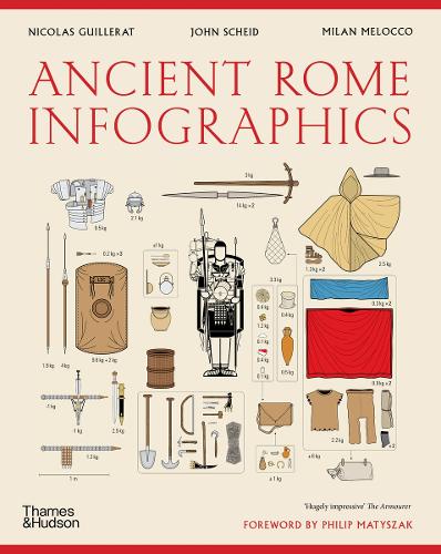
The final chapter covers war, I was a bit surprised to learn that the Roman army and navy were not that great but they made good use of local fighters and were good at simply being present. There are descriptions, and infographics of Roman marching orders, camp construction processes and the the evolving equipment of a Roman soldier. I sometimes wonder how accurately such prescriptions were followed, I assume there is at least one documentary source for these processes but how closely were they followed in the field?
I liked the visualisation showing movements of one Roman legionary through his career around Armenia and Eastern Europe. The Social Wars, Punic Wars, conquering Gaul and Spartacus have their own sections in this chapter. I’m assuming these are the most important of the Roman wars.
Overall I enjoyed this book, although I was sometimes frustrated by the complexity of the infographics. It works well as a taster for further investigation.