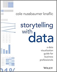
 This book, Storytelling with data by Cole Nussbaumer Knaflic, fits in with my work, and my interests. It relates to data visualisation, an area in which I have read a number of books including The Visual Display of Quantitative Information by Edward R. Tufte, Visualize This by Nathan Yau, Data Visualization: a successful design process by Andy Kirk and Interactive Data Visualization for the web by Scott Murray. These range from the intensely theoretical (Tufte) to the deeply technical (Murray).
Storytelling with data is closest in content to Andy Kirk’s book and his website is cited in the (very good) additional resources list. A second similarity with Andy Kirk’s book is that Storytelling is “the book of the course” – the book is derived from her the author’s training courses.
The differentiating factor with Knaflic’s book is the focus on storytelling, presenting a case to persuade rather than focussing on on the production of a data visualisation, although that is part of the process. The book is divided into 6 key lessons, each of which gets a chapter, with a couple of chapters of examples, an introduction and an epilogue this makes 10 chapters. The six key lessons are:
1. understand the context
2. choose an appropriate visual display
3. eliminate clutter
4. focus attention where you want it
5. think like a designer
6. tell a story
I think I got the most out of the understand the context and tell a story chapters, technically I am quite experienced but my knowledge is around how to make charts and process the data to make charts rather than telling a story. The understanding the context chapter talks about the “Big Idea” and the “3-minutes story”. The Big Idea is the single idea you are trying to get across in a presentation, and the 3-minute story is the elevator pitch – how you would put your story into 3 minutes. I liked a callout box with a list of verbs (accept, agree, begin, believe…) used to prompt you for what action you want your audience to take having seen your presentation.
The chapter on choosing an appropriate visual display is quite straightforward, Knaflic presents the 12 types of display she finds herself using frequently (which includes simple text, and text tables). This is a fairly small set since variations of bar charts – horizontal, vertical, stacked and waterfall cover off 5 types. This is appropriate, if you are telling a story to persuade then you don’t want to be spending your time explaining how your esoteric display works. Knaflic steers away from specific technology, only mentioning at the beginning of the book that all the charts shown were made in Microsoft Excel and Adobe Illustrator was sometimes used to get a chart looking just right at the end of the process.
There is a list of sins in data visualisation including the reviled pie chart, and 3D plots but perhaps surprisingly the use of secondary axes to plot data on different scales together.
The chapters on eliminate clutter, focus attention where you want it, and think like a designer are all about making sure that the viewer is paying attention where you want them to pay attention. Some of this is about the Tuftian “eliminate clutter” much of which creeps into charts through default behaviour in software. Some is about using gestalt theories of attention to group items together through similarity, proximity and so forth and some is about using pre-attentive attributes such as colour and type face to draw attention to certain elements. This reminded me of The Programmer’s Brain by Felienne Hermans, which links theories of how our brain works with the practices of programming.
The chapter on tell a story introduces some resources on storying telling from playwrights and screenwriters – basically the idea of the three act play with a setup, conflict and resolution. This is a different way of thinking for me, my presentations tend to follow the traditional structure of a scientific paper but it is interesting to see the link with creative writing and drama – which is generally excluded from scientific writing.
One of the lessons I learnt from this book was to make better use of of chart titles and PowerPoint titles, I tend to go for descriptive chart titles (“Ticket Trend”, to use an example from the book) and PowerPoint titles which simply labelled a section of a talk (“Methodology”). Knaflic encourages us to use this valuable “real estate” in a presentation for a call to action: “Please Approve the Hire of 2 FTEs”.
The six lessons are reinforced with a chapter which covers a single worked example from beginning to end, and another chapter of case studies which looks at fixing particular issues with single charts.
I enjoyed this book, its beautifully produced and fairly easy reading. It also led me to buy two more books Resonate by Nancy Duarte and Data Points by Nathan Yau, and so the “to be read” pile grows again!

