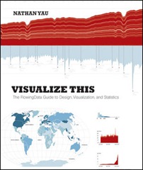
 This book review is of Nathan Yau’s “Visualize This: The FlowingData Guide to Design, Visualization and Statistics”. It grows out of Yau’s blog: flowingdata.com, which I recommend, and also his experience in preparing graphics for The New York Times, amongst others.
The book is a run-through of pragmatic methods in visualisation, focusing on practical means of achieving ends rather more abstract design principles for data visualisation; if you want that then I recommend Tufte’s “The Visual Display of Quantitative Information”.
The book covers a bit of data scraping, extracting useful numerical data from disparate sources, as Yau comments this is the thing that takes the time in this type of activity. It also details methods for visualising time series data, proportions, geographic data and so forth.
The key tools involved are the R and Python programming languages; I already have these installed in the form of R Studio and Python(x,y), distributions which provide an environment that looks like the Matlab one with which I have long been familiar with but which sadly is somewhat expensive for a hobby programmer. Alongside this are the freely available Processing language and the Protovis Javascript library which are good for interactive, online visualisations, and the commercial packages Adobe Illustrator, for vector graphic editing, and Adobe Flash Builder for interactive web graphics. Again these are tools I find out of my range financially for my personal use although Inkscape seems to be a good substitute for Illustrator.
With no prior knowledge of Flash and no Flash Builder, I found the sections on Flash a bit bewildering. It also highlights how perhaps this will be a book very distinctively of its time, with Apple no longer supporting Flash on iPhone its quite possible that the language will die out. And I notice on visiting the Protovis website that this is no longer under development: the authors have moved on to D3.js, Openzoom which is also mentioned is no longer supported. Python has been around for sometime now and is the lightweight language of choice for many scientists, similarly R has been around for a while and is increasing in popularity.
You won’t learn to program from this book: if you can already program you’ll see that R is a nice language in which to quickly make a wide range of plots. If you can’t program then you may be surprised how few commands R requires to produce impressive results. As someone who is a beginner in R, the examples are a nice tour of what is possible and some little tricks, such as the fact that plot functions don’t take data frames as arguments: you need to extract arrays.
As well as programming the book also includes references to a range of data sources and online tools, for example colorbrewer2.org – a tool for selecting colour schemes, and links to the various mapping APIs.
Readers of this blog will know that I am an avid data scraper and visualiser myself, and in a sense this book is an overview of that way of working – in fact I see I referenced flowingdata in my attempts to colour in maps (here).
The big thing I learned from the book in terms of workflow is the application of a vector graphics package, such as Adobe Illustrator or, Inkscape, to tidy up basic graphics produced in R. This strikes me as a very good idea, I’ve spent many a frustrating hour trying to get charts looking just right in the programming or plotting language of my choice and now I discover that the professionals use a shortcut! A quick check shows that R exports to PDF, which Inkscape can read.
Stylistically the book is exceedingly chatty, including even the odd um and huh, which helps make it quick and easy read although is a little grating. Many of the examples are also available over on flowingdata.com, although I notice that some are only accessible for paid membership. You might want to see the book as a way of showing your appreciation for the blog in physical and monetary form.
Look out for better looking visualisations from me in the future!

