Author's posts
Jun 14 2011
Choosing to die
Terry Pratchett was recently diagnosed with Alzheimer’s disease and has made a programme, Choosing to die, about his enquiries into assisted suicide. It’s pretty difficult viewing: Pratchett visits the widow of a Belgian writer who, like him, had Alzheimer’s disease and had chosen to end his life. He visits a former taxidriver in a hospice with motor neuron disease, who had chosen not to die. The bulk of the programme is spent with two men who went to the Dignitas clinic in Switzerland, where they were helped to die. Andrew, only a couple of years older than me, with multiple sclerosis and Peter, born in 1939, with motor neuron disease. The death of Peter is shown in full. It’s not this that is my abiding memory though, that will be of the courage and dignity of the wife and mother of these two dying men. Neither woman wants their loved one to go.
The striking thing for me was how both men appeared to be heading off to Switzerland before their time, for fear of not being able to go when they felt they had to. The current legislation seems to be wilfully sadistic, obliging early death for those that chose whilst holding out the threat of prosecution to the family.
The Swiss are allowed to be helped to die at home, whilst foreigners go to die in a small blue apartment in an industrial estate. Incongruously the shallow steps to the front door are protected by black and yellow safety tape: because if you’re going to die you don’t want to fall over and crack your head open. This seems a great pity since in the background you could see the snow clad Swiss Alps, a glorious place to die.
A number of members of my close family have died over the last ten years. I don’t think we’re an unusual family, we’ve discussed assisted dying, often in the aftermath of a death. My paternal grandparents both died in their nineties in retirement homes, very much reduced from their previous vigorous selves, moving gradually to death. My maternal grandparents both died at home, quite suddenly. My stepfather died at home in a hospital bed, cared for by my mum with the support of nurses. He’d known he was going to die since cancer stopped him eating a couple of months earlier. Mum is the bravest person I know.
The consensus in the family appears to be for assisted dying but I think we all know privately that as the law stands now it will not happen. We will be left to face what lingering or sudden deaths nature serves up to us, in the knowledge that modern medicine has got so much better at keeping us alive but not necessarily living.
This is one of the few places where my atheism collides with the established church: any time the right to die is discussed it appears to be a Christian or one of the Lords Spiritual who is called upon to make the case against: often citing the idea that my life is a gift from God, and that I have no right to dispose of it. Clearly for an atheist this is an argument discarded in a moment.
I may die in an accident tomorrow. I may hang on to the absolute end waiting to see what is over the the next ridge. Or maybe, when I am old and have had enough, I’ll want to go at a time and place of my choosing.
How I choose to die is none of your business – I won’t presume to choose for you.
Jun 11 2011
How do I setup my own website?
A post in the style of random notes today: I’ve been making a new website for The Inelegant Gardener – there’s a teaser here, I’ve done this before for the Chester Liberal Democrats. I thought it might be handy to provide a compact description of the process as a reminder to me and a warning to others…
The steps are as follows:
- Getting a domain name
- Finding a web host
- Making your website
- Going live
1. Getting a domain name
The domain name is the www bit. You can put your domain name registration with your web host but conventional wisdom is that it’s better to separate the two. I chose http://www.just-the-name.co.uk/ based on a twitter recommendation. Once you’ve chosen your domain name, you get access to a simple control panel which can be used to redirect your domain name to another site (such as this one), set up e-mail redirection and so forth. Mine gives me access to DNS Settings but I left these alone. When the time comes you’ll need to set the names servers to those provided by your web host.
2. Finding a web host
A web host is where your website will live. In the end I settled with EvoHosting for a few of reasons: they have live status updates for their servers, they have a twitter account and mentions of evohosting on twitter do not reveal any frustrated users, a search for the term “evohosting is crap” reveals no worrying hits in Google! They’re also reassuring slightly more expensive than the cheapest hosting solutions which seem to suffer from the “X is crap” syndrome. I selected a scheme that allows me to host several sites.
3. Making your website
You can make a website using WordPress – the blogging software. Building a website is a question of managing content – and for a small site WordPress does this nicely and is free. You don’t have to be blogging to use it – you can just make a set of static pages. I understand that for bigger sites Joomla is good. WordPress is a combination of a PHP application talking to a SQL database. I found a passing familiarity with SQL databases quite handy, not so much to write queries but just to know the basics of accounts and tables.
WordPress handles the mechanics of your website, what goes where, posting and making pages whilst the “theme” determines appearance. I’ve used the Atahualpa theme for my two websites so far – it’s pretty flexible, although if you want to put anything top-right in the logo area I’d find a good reason not to – I’ve spent days trying to do it to my satisfaction! For debugging your own website and snooping into others the developer tools available on all major browsers are very handy. I use Google Chrome, for which the Window Resizer and MeasureIt extensions are useful. Window Resizer allows you to test your site at different screen sizes, and MeasureIt measures the size in pixels of screen elements.
I’ve found Paint .NET useful for wrangling images, it’s either the old Windows Paint program on steroids or a very limited Photoshop.
For my efforts I have created the website locally, on my own PC, before transferring it to web hosting. I’m not sure if this is standard practice but it seemed a better idea than potentially thrashing around in public as you learnt to build your website. To do this I installed xampplite, this gives my PC web serving capabilities and provides everything needed to run WordPress –except WordPress which you need to download separately.
WordPress can be extended by plugins, and I’ve found I can achieve most the functionality I’ve wanted by searching out the appropriate plugin. Here are a few I’m using:
- Contact Form 7 – to create forms
- Drop cap shortcode – to easily add drop caps (big letters) to posts and pages.
- Dynamic Widgets – to put different widgets on different pages
- NextGEN Gallery – more advanced photo gallery software
- Simple Page Ordering – allows you to shuffle the order pages appear in your static menus, which is a bit tricky in basic WordPress
- WP-dtree – a dynamic tree structure for showing the blog archive, as found in Blogger.
- WP Maintenance Mode – for hiding your site whilst you’re fiddling with it!
- WordPress Mobile Pack – a switcher for making your blog more readable if someone arrives using a mobile browser
Since WordPress is a very heavily used platform there’s a lot of help around, you identify WordPress sites by looking in the site footer, or viewing the page source (WordPress sites tend to have references to files starting “wp-“)
4. Going live
I must admit I find the process of moving a site from my own machine to a web server the most complicated bit of the process – you can see the instructions on the WordPress site here. The basic idea is to change the base URL for your website to the target address then copy the pages (zipped them all up before upload) and the database (using phpmyadmin import/export) of the WordPress installation to the web host. If you want to keep your local copy running then you need to take a copy before changing the base URL and load it back up once you’ve done moving. Things that caught me out this time: I had to use MySQL to create a database into which to import the database, and it wasn’t enough to create a user, I also needed to attach it to the appropriate account, and I had to save the settings on the permalinks for pages to show up. Finally, I also had some typed links in my website, which needed manually adjusting (although you can do this automatically in MySQL).
I wish I knew a bit more CSS, my current technique for fine tuning appearance involves a lot of rather ignorant typing, a bit more knowledge of good graphic design wouldn’t go amiss either!
This is the way I did it – I’d be interested in any suggestions for improvements.
Jun 06 2011
The New College of the Humanities
AC Grayling is fronting the formation of a new private institution, The New College of the Humanities (NCH) providing degree level education, based in London and charging £18k per year. The degrees will be awarded by the University of London, under an existing scheme, the University of London International Programmes, the NCH simply being a new supplier.
The New College of Humanities is heading for the prestige market with its headline fees of £18k per year, a list of celebrity professors, a Bloomsbury location and a staff to student ratio of 1:10. It’s clear from the supporting material that the celebrity professors will not be providing all of the teaching. The novelty here is that the NCH will be a private institution. The University of Buckingham has been plugging away quietly for the last 30 years or so as the UK’s only private university, it is now getting increasing company. Buckingham has achieved very good student approval ratings, and has been innovative in the way it delivers degrees, managing to offer degree courses at around £18k, so it’s going for a different unique selling point.
Returning to the NCH: as usual for stories involving universities in the UK, a comparison to the universities of Oxford and Cambridge must be made by commentators in the press (here and here, for example). These should be ignored as fatuous and ill-conceived – there’s much more to universities in the UK than Oxford and Cambridge.
I’ve been rather bemused by the reaction to NCH on twitter by the people I follow, they generally have the character of “How dare a private university be created”. This is bizarre to me, the thesis that some big names should endow an institution with prestige is wobbly, however opposing the idea that people should be free to decide how to spend their money on how they attain their degree seems to me rather illiberal. To cover some of the points thrown around:
- It’s not a research university. Much is made of the research / teaching link, in my experience Russell Group universities recruit lecturers on the basis of research potential (or achievement) rather than any teaching ability or teaching qualification. Having done both I can’t help thinking that if I’d spent more time learning and doing teaching I’d be better at teaching.
- It’ll be like Jamie’s University, a reference to Jamie’s School where celebrities were sent to teach some of our more difficult pupils with hilarious consequences. In a way we already operate this system when we recruit our top-flight researchers to teach.
- The professoriate are not ethnically or gender diverse. Well neither are our current institutions!
- It teaches to the University of London syllabus, which is unsurprising since that who’s awarding the degree!
- It’s narrowly parasitic, in the sense that it is taking advantage of the University of London’s “public” facilities for free. This is contradicted by statements by both the University of London and the NCH, it will pay for facilities it uses.
- It’s broadly parasitic. This seems to be based on the idea that people trained with public money should only serve public institutions. Not sure where this puts people trained abroad, coming to the UK, or even worse those trained here and emigrating or myself – trained by public funds and working in a private company. It does sound like indentured slavery to me. I don’t buy the idea that the UK is short of people capable of teaching at degree level.
- They professoriate are doing it for money. Take a look at professorial salaries in the current institutions – £80k a year is not at all bad, they’re already doing it for money.
- It only teaches humanities, no science. My experience is that outside the Oxbridge college system the intermingling of disciplines in universities is poor, particularly across the great divide.
- A GP in the neighbourhood offers complementary medicine.
- It’s straightforward evil because private money is involved.
There is still a “to do” list for NCH:
- they need to finalise their relationship with University of London;
- they need to fill a large part of the teaching roster;
- they need to demonstrate the £18k per year price point will attract sufficient students to be economically viable;
I also see it having little wider significance to the teaching of humanities in the UK.
I must admit I quite like the idea of teaching degree level science to students at a 1:10 staff to student ratio without having to worry about all that grant application stuff – when do we get the New College of Science?
In summary, the NCH is a novel proposition based on a premise whose value is to be established – it’s ultimately about how other people wish to spend their money and, in the absence of any obvious harm to others, they should be left to get on with it. We should be welcoming new ideas in providing degree level education: like this initiative, the Open University and the University of Buckingham, not trying to put them down at birth.
Footnotes
Some background on Cambridge Colleges, teaching and tuition fees by me.
May 29 2011
House of Lords Reform
At the 2010 General Election nearly 90% of us voted for parties enthusiastic for an elected House of Lords. The Conservatives said in their manifesto:
“We will work to build a consensus for a mainly-elected second chamber to replace the current House of Lords”
The Liberal Democrats said in their manifesto:
“Replace the House of Lords with a fully-elected second chamber with considerably fewer members than the current House.”
And Labour said in their manifesto:
“We will ensure that the hereditary principle is removed from the House of Lords. Further democratic reform to create a fully elected Second Chamber will then be achieved in stages.”
This is also reflected in the Coalition Agreement:
“We will establish a committee to bring forward proposals for a wholly or mainly elected upper chamber on the basis of proportional representation.”
The reasons for this unanimity is several-fold:
- There is a current pressing problem of overcrowding of the House of Lords. This arises because although there is a mechanism for appointing Lords there is no mechanism for retiring them, as a consequence Britain has one of the largest legislaturesin the world relative to the population. The convention in recent years has been to add members such that the composition of the house reflects the proportion of votes for each party at the most recent general election – with no exit route this is unsustainable.
- The British scheme of appointing a second chamber is almost unique in western nations, with only Canada following suit, it’s wholly appointed nature raises serious questions of democratic legitimacy. Attempts to make the composition match recent elections are a recognition of this lack of legitimacy but are an inadequate solution to the problem.
- The appointed nature of the House of Lords leads to transparency issues. It serves in part as an honours system for services rendered to political parties as well as a working revision chamber. Although the current composition contains 23% crossbenchers it is still very substantially a political chamber.
- The current average attendance in the House of Lords is around 388, nearly 20% of members only attend once or twice a year.
The Labour government made a start on House of Lords reform by removing the voting rights of all but 92 of the hereditary peers with an intention of moving to a House of Lords with a larger elected component. These subsequent changes ran into the sands of complex parliamentary procedures and an obstinate upper House.
The proposals put forward by Nick Clegg, backed by David Cameron, are for a second chamber containing 300 members elected using a proportional system based on large constituencies. The proposal is to elect one third of the house at each general election with members elected for 15 years but no possibility of re-election. The draft bill includes provision for 20% of the house to be appointed but there is a consultation with the option that the house be 100% elected.
These proposals are evolutionary: the legislative powers of the House of Lords remaining as now; an elected house is only attained after 15 years and the membership will only be 25% smaller than the current active membership.
I look forward to the parties at Westminster fulfilling their commitments to an elected second house!
May 22 2011
The House of Lords by numbers
Reform is in the air for the House of Lords, to be fair reform has been in the air for large parts of the last hundred years. Currently reform comes in the form of a proposal put forward by Nick Clegg and backed by David Cameron – you can see the details here. It comes in the context of all three main Westminster parties supporting a largely elected House of Lords in their 2010 General Election manifestos.
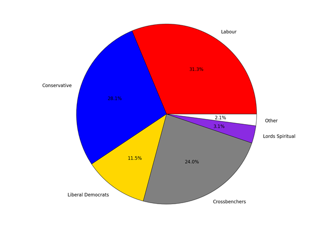
The purpose of this post is not to go through the proposals in detail but simply to provide some charts on appointments to the House of Lords over the years. The current composition of the House is shown in the pie-chart below:
The membership of the House of Lords currently numbers 789, I have excluded the handful of members from UKIP, DUP, UUP, the Greens and Plaid Cymru since they are too few to show up in such a chart.
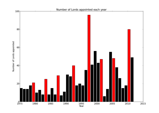
The website www.theyworkforyou.com provides a handy list of peers in an easily readable format, this list includes data such as when they were appointed, what party they belong to, what name they have chosen and when they left and whether they used to be an MP. We can plot the number of appointments each year:
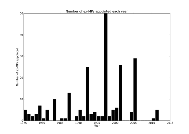
I’ve highlighted election years in red, as you can see election years are popular for the appointment of new members, and it would seem many of those appointed in such years are former MPs, as shown in the graph below:
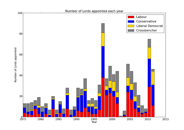
But to which parties do these appointees belong? This question is answered below:
I hope this provides a useful backdrop to subsequent discussions on reform.


