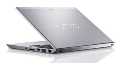
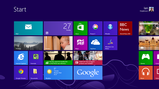
I thought I’d mix together a review of my shiny new laptop (a Sony Vaio T13) with one of Windows 8 which came pre-installed on the laptop.
The laptop
Six years after buying my last laptop I have replaced it with another Sony Vaio. At the time I bought the first one I didn’t think I would do this, my old Sony Vaio (VGN-SZ2M) is a nice machine but it was infested with Sony cruftware which added little functionality and what it did try to add didn’t seem to work and the couriers Sony selected left it with a neighbour without asking whether this was appropriate. It had a weird black plastic finish which was probably described as "carbon fibre". It’s worked fine although I found the 80GB hard disk a little cramped and as the years went by it felt slower and slower when compared to the other machines I use.
After poking around extensively I finally decided on another Sony Vaio, other contenders were the Lenovo Yoga 13 (limited availability and would that hinge really hold out?), the Acer Aspire S7 (more pricey for a poorer config and apparently no option for a big conventional drive) and offerings from Samsung, Toshiba and Dell – the bar for being a contender in this limited set was the touchscreen. I did look at non-touchscreen variants too and particularly liked the look of the Lenovo IdeaPad U410.
Having decided, I bought direct from Sony getting to get a bit more configuration flexibility adding 8GB RAM, an i7 processor and going for the 32GB SSD/500GB conventional hard drive combination, this is an ultrabook class laptop with a 13.3" touchscreen, no optical drive, and Windows 8. I liked the idea of getting a pure SSD system but the price Sony charges for the upgrade is about double the price of the highly regarded Samsung 840 Pro series SSDs so maybe I’ll be opening the thing up soon. It weighs 1.5kg which is light but not the lightest in this class, I decided on a touchscreen since it didn’t seem to add hugely to the cost and it isn’t something you can retrofit should the desire arise.
It is a very beautiful thing: brushed metal with chromed highlights, and in its pristine state it comes out of hibernate very quickly.
Compared to my old laptop it has the same footprint, unsurprising since the screen is the same size. The keyboard is narrower though, losing a column of keys, but the device is about half the thickness – having lost the optical drive.
I worried a little about the monolithic touchpad with no separate left and right mouse buttons but it has a positive click in these two locations so I’ve not noticed the lack of separate buttons.
The screen resolution may be a little deficient (1366×768) but it is comparable with most of the laptops in its class and I intend using it on an external monitor anyway.
There is a small infestation of cruftware, featuring an update centre which seems to struggle to provide the necessary bandwith and an update-able electronic manual which I can’t seem to get hold of because the instructions for downloading it take you around in a loop.
As if in pique my old desktop PC failed shortly after I got the new Vaio so I’m using it as my sole computer for now, this works fine except it is a pain to install CD based software for various bits of hardware (quite why my video camera shipped with 4 CDs of software I don’t understand).
So overall – the Sony Vaio gets an A, a tick or some number of stars between 5 and 10.
Windows 8
I have a bit of a habit for getting computers with brand new Microsoft operating systems, although fortunately I skipped Windows Vista. Windows 8 takes a bit of getting used to, the best way of thinking about it is as Windows 7 with a mobile phone interface dropped on top of it. This is both good and bad. Personally I rather like Windows 7, and I’m also rather pleased with the Android-based touchscreen interface on my HTC Desire phone but the combination of the two is a bit disturbing.
Actually "a bit disturbing" is wrong "crap" would be better, the new style apps follow very different UI rules from conventional Windows apps and major in form over content – for example the pre-installed twitter app, although pretty and swooshy with the touchscreen is utterly useless as a twitter client. Not only does it have limited functionality but in order to view anything but the briefest of timelines you need to flap your arm about like a deranged semaphorist. The twitter app from twitter is marginally more functional but looks like the portrait aspect ratio phone screen placed in the middle of a wide laptop screen. Comparing my Android phone and tablet it strikes me few people have cracked scaling apps from phone to tablet size screens, let alone all the way to laptop screen sizes.
Live tiles offer interesting possibilities but they are constrained to one of two sizes, and I’ve yet to find one which does anything particularly interesting.
Microsoft is very keen for developers to write the mobile phone style apps, at one point the (free) Express version of Visual Studio was only going to allow developers to target the mobile phone style apps.
The only real redeeming feature of the new Windows 8 additions is that, once you’ve accepted the concept, the Start screen is better than the old Start button.
Not so long ago I would have "struck down upon thee with great vengeance and furious anger those who" touched the screen of any device I owned, these days I’m a little bit more relaxed: I find the touchscreen a nice adjunct to more conventional input but I have a smeary screen now.
It seems to me there are a limited number of things you need to "get" about an operating system in order to use it with a peaceful mind, for Windows 7 a big one was that you didn’t need to go stumbling through a cascade of entries in the Start menu – you just start typing the name of your desired application into the search box and it was revealed fairly promptly. Start typing when you are on the Windows 8 Start screen and you launch just such a search – how the hell you’re supposed to know this is a mystery to me. And this seems like one of the core problems with Windows 8 – there are some nice little interface features but there’s no way you would guess they were there or find them by accident.
Windows 8 is keen for you to login using a Microsoft account, it is possible to just use a local account but I thought “in for a penny, in for a pound” and went ahead and set one up. Interestingly you can see the benefit of this approach when using Google Chrome, when I installed Chrome it automatically installed the plugins I have on other PCs, my autocorrect settings and so forth – instantly I was at home. I guess this is the longer term plan for Windows 8. It also wants me to have an xbox account to buy music and video.
Some hints for new users of Windows 8:
- To shift tiles around on the Start page, hold them and drag then up or down initially (not left-right), to zoom out drag them towards the bottom of the screen;
- If you use Google Chrome as your default browser the title bar icons (minimise, maximise and close) disappear, to fix this don’t use it as your default browser;
- There exist both new style and old style applications, some things are available in both formats, for example Dropbox. The new-style apps resemble phone apps but offer limited functionality;
- New-style apps don’t have an "exit" button, simply navigate away from them as you would a phone app;
- The Start screen replaces the Start menu on the old Windows 7 desktop, to search for anything just start typing!
- Windows 8 style apps cannot play MPEG2 files, this is only available for Windows 8 Pro with added Windows Media Centre. Windows Media Player will play them (suitable codecs installed – I used Shark007) and VLC player works fine.
On the last item: this seems a bit bonkers – the video app on the mobile-style interface can see your video library perhaps containing an unrelenting series of videos of your growing child which will almost inevitably be in MPEG2 format as a default so crippling this functionality seems a bit stupid.
Bottom line: Windows 8 is very pretty and the Start screen is, in my view, better than the old Windows 7 Start menu once you’ve got your head around it. The idea of putting a mobile phone interface, with mobile phone style apps, on top of a desktop interface is stupid – my opinion on this may change if I see some apps that are optimised for laptops. Mobile interfaces such as iOS and Android are optimised for consumption which is fine, but many people will still be getting PC class devices to do “work” and for the main the new mobile interface in Windows 8 gets in the way of that.
And now to install Ubuntu on it… a process so exciting I have made it the subject of a second blog post.


