
I recently reviewed Cole Nussbaumer Knaflic’s Storytelling with data, as a result the storytelling team sent me a (pre-publication) copy of their latest book, Daphne Draws Data scheduled for publication 29th October 2024 (UK) and 4th September 2024 (US). This is something of a change for me in the sense that the book is targeted at teaching data visualisation to the 6-9 year old age group. I am 54 – however, I have a 12 year old son and an interest in education. I have never reviewed a book intended for children before.
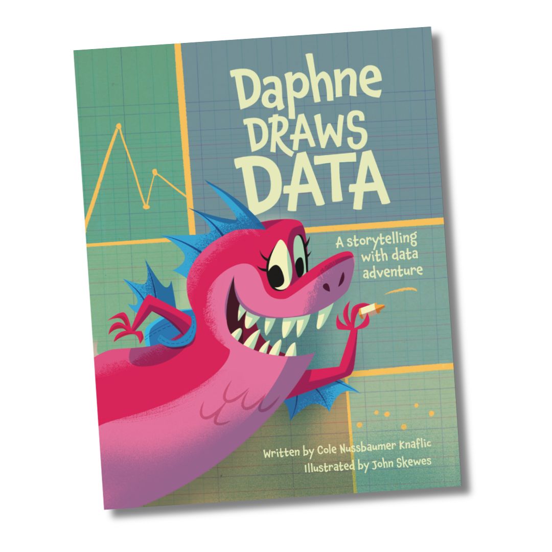
The first thing to say about this book is that it is beautifully illustrated by John Skewes. As I write this review Daphne (a dragon) is looking out at me from the cover of the book which has put a smile on my face.
The book follows Daphne as she visits various locations, and helps the creatures she finds there by collecting data and drawing graphs (having first reassured them that she was not going to incinerate them!). This is very much like my own career. I particularly liked the visit to the ocean where she draws a graph showing that shrimp and crabs move at the same speed if you allow for the size of the creature. This is quite sophisticated scaling analysis that I’ve taught to undergraduate physics students.
The book finishes with a glossary of chart types which is reminiscent of the material in Knaflic’s books for adults. I was slightly disturbed to see the caption “Eat a rainbow” close to an illustration of some coloured crayons but it is an exhortation for children to record the colour of the food they eat during a day and make a bar chart, rather than eating the crayons!
A children’s book fits very well with the central theme of Knaflic’s work on data visualisation which is the importance of storytelling. To be honest working out who is eating the monkey’s bananas is more engaging than the usual stories we tell in our business presentations.
I guess a key feature of books for children in this age group is that they are read with an adult, I imagine a lot of adults would learn from it too.
Alongside the book there is a website daphnedrawsdata.com which includes resources for educators, amongst much else. This shows how the book fits in with the Common Core requirements in the US school system, I’m sure this will align pretty well with the UK standards.
I’d have definitely bought this book during the COVID lockdowns as material for home-schooling, not only does it cover some data visualisation techniques but it also encourages the data collection that has been central to my life as a scientist. I’d probably also borrow the illustrations for any presentations (to adults) I might give on data visualisation.
