
Dr Administrator
Author's posts
Jul 29 2013
pdftables – a Python library for getting tables out of PDF files
This post was first published at ScraperWiki.
One of the top searches bringing people to the ScraperWiki blog is “how do I scrape PDFs?” The answer typically being “with difficulty”, but things are getting better all the time.
PDF is a page description format, it has no knowledge of the logical structure of a document such as where titles are, or paragraphs, or whether it’s two column format or one column. It just knows where characters are on the page. The plot below shows how characters are laid out for a large table in a PDF file.

This makes extracting structured data from PDF a little challenging.
Don’t get me wrong, PDF is a useful format in the right place, if someone sends me a CV – I expect to get it in PDF because it’s a read only format. Send it in Microsoft Word format and the implication is that I can edit it – which makes no sense.
I’ve been parsing PDF files for a few years now, to start with using simple online PDF to text converters, then with pdftohtml which gave me better location data for text and now using the Python pdfminer library which extracts non-text elements and as well as bonding words into sentences and coherent blocks. This classification is shown in the plot below, the blue boxes show where pdfminer has joined characters together to make text boxes (which may be words or sentences). The red boxes show lines and rectangles (i.e. non-text elements).

More widely at ScraperWiki we’ve been processing PDF since our inception with the tools I’ve described above and also the commercial, Abbyy software.
As well as processing text documents such as parliamentary proceedings, we’re also interested in tables of numbers. This is where the pdftables library comes in, we’re working towards making scrapers which are indifferent to the format in which a table is stored, receiving them via the OKFN messytables library which takes adapters to different file types. We’ve already added support to messytables for HTML, now its time for PDF support using our new, version-much-less-than-one pdftables library.
Amongst the alternatives to our own efforts are Mozilla’s Tabula, written in Ruby and requiring the user to draw around the target table, and Abbyy’s software which is commercial rather than open source.
pdftables can take a file handle and tell you which pages have tables on them, it can extract the contents of a specified page as a single table and by extension it can return all of the tables of a document (at the rate of one per page). It’s possible, for simple tables to do this with no parameters but for more difficult layouts it currently takes hints in the form of words found on the top and bottom rows of the table you are looking for. The tables are returned as a list of list of lists of strings, along with a diagnostic object which you can use to make plots. If you’re using the messytables library you just get back a tableset object.
It turns out the defining characteristic of a data scientist is that I plot things at the drop of a hat, I want to see the data I’m handling. And so it is with the development of the pdftables algorithms. The method used is inspired by image analysis algorithms, similar to the Hough transforms used in Tabula. A Hough transform will find arbitrarily oriented lines in an image but our problem is a little simpler – we’re interested in vertical and horizontal rows.
To find these vertical rows and columns we project the bounding boxes of the text on a page onto the horizontal axis ( to find the columns) and the vertical axis to find the rows. By projection we mean counting up the number of text elements along a given horizontal or vertical line. The row and column boundaries are marked by low values, gullies, in the plot of the projection. The rows and columns of the table form high mountains, you can see this clearly in the plot below. Here we are looking at the PDF page at the level of individual characters, the plots at the top and left show the projections. The black dots show where pdftables has placed the row and column boundaries.

pdftables is currently useful for supervised use but not so good if you want to just throw PDF files at it. You can find pdftables on Github and you can see the functionality we are still working on in the issue tracker. Top priorities are finding more than one table on a page and identifying multi-column text layouts to help with this process.
You’re invited to have a play and tell us what you think – ian@scraperwiki.com
Jul 25 2013
Book review: The Subterranean Railway by Christian Wolmar
 To me the London underground is an almost magically teleportation system which brings order to the chaos of London. This is because I rarely visit London and know it only via Harry Beck’s circuit diagram map of the underground. To find out more about the teleporter, I have read The Subterranean Railway by Christian Wolmar.
London’s underground system was the first in the world, it predated any others by nearly 40 years. This had some drawbacks, for the first 30 years of its existence it ran exclusively using steam engines which are not good in an enclosed, underground environment. In fact travel in the early years of the Underground sounds really rather grim, despite its success.
The context for the foundation of the Underground was the burgeoning British rail network, it had started with one line between Manchester and Liverpool in 1830 by 1850 the country had a system spanning the country. The network did not penetrate to the heart of London, it had been stopped by a combination of landowner interests and expense. This exclusion was enshrined in the report of the 1846 Royal Commission on Metropolis Railway Termini. This left London with an ever-growing transport problem, now increased by the railway’s ability to get people to the perimeter of the city but no further.
The railways were the largest human endeavours since Roman times, as well as the engineering challenges there were significant financial challenges in raising capital and political challenges in getting approval. This despite the fact the the railway projectors were exempted from the restrictions on raising capital from groups of more than five people introduced after the South Seas Bubble.
The first underground line, the Metropolitan, opened in 1863 it ran from Paddington to Farringdon – it had been 20 years in the making, although construction only took 3 years. The tunnels were made by the cut-and-cover method, which works as described – a large trench is dug, the railway built in the bottom and then covered over. This meant the tunnels were relatively shallow, mainly followed the line of existing roads and involved immense disruption on the surface.
In 1868 the first section of the District line opened, this was always to be the Metropolitan’s poorer relative but would form part of the Circle line, finally completed in 1884 despite the animosity between James Staats Forbes and Edward Watkin – the heads of the respective companies at the time. It’s worth noting that it wasn’t until 1908 that the first London Underground maps were published; in its early days the underground “system” was the work of disparate private companies who were frequently at loggerheads and certainly not focussed on cooperating to the benefit of their passengers.
The underground railways rarely provided the returns their investors were looking for but they had an enormous social impact, for the first time poorer workers in the city could live out of town in relatively cheap areas and commute in, the railway companies positively encouraged this. The Metropolitan also invested in property in what are now the suburbs of London, areas such as Golders Green were open fields before the underground came. This also reflects the expansion of the underground into the surrounding country.
The first deep line, the City and South London was opened in 1890, it was also the first electric underground line. The deep lines were tunnelled beneath the city using the tunnelling shield developed by Marc Brunel, earlier in the 19th century. Following the first electrification the District and Metropolitan lines eventually electrified their lines, although it took some time (and a lot of money). The finance for the District line came via the American Charles Tyson Yerkes, who would generously be described as a colourful character, engaging in financial engineering which we likely imagine is a recent invention.
Following the First World War the underground was tending towards a private monopoly, government was looking to invest to make work and ultimately the underground was nationalised, at arms length, to form London Transport in 1933, led by the same men (Lord Ashfield and Frank Pick) who had run the private monopoly.
The London underground reached its zenith in the years leading up to the Second World War, gaining its identity (roundel, font and iconic map) and forming a coherent, widespread network. After the war it was starved of funds, declining – overtaken by the private car. Further lines were added such as the Victoria and Jubilee lines but activity was much reduced from the early years.
More recently it has seen something of a revival with the ill-fated Public-Private Partnership running into the ground, but not before huge amounts of money had been spent, substantially on improvements. As I write, the tunnelling machines are building Crossrail.
I felt the book could have done with a construction timeline, something like this on wikipedia (link), early on there seems to be a barrage of new line openings, sometimes not in strictly chronological order and to someone like me, unfamiliar with London it is all a bit puzzling. Despite this The Subterranean Railway is an enjoyable read.
Jul 22 2013
Book Review: Clean Code by Robert C. Martin

This review was first published at ScraperWiki.
Following my revelations regarding sharing code with other people I thought I’d read more about the craft of writing code in the form of Clean Code: A Handbook of Agile Software Craftmanship by Robert C. Martin.
Despite the appearance of the word Agile in the title this isn’t a book explicitly about a particular methodology or technology. It is about the craft of programming, perhaps encapsulated best by the aphorism that a scout always leaves a campsite tidier than he found it. A good programmer should leave any code they touch in a better state than they found it. Martin has firm ideas on what “better” means.
After a somewhat sergeant-majorly introduction in which Martin tells us how hard this is all going to be, he heads off into his theme.
Martin doesn’t like comments, he doesn’t like switch statements, he doesn’t like flag arguments, he doesn’t like multiple arguments to functions, he doesn’t like long functions, he doesn’t like long classes, he doesn’t like Hungarian* notation, he doesn’t like output arguments…
This list of dislikes generally isn’t unreasonable; for example comments in code are in some ways an anachronism from when we didn’t use source control and were perhaps limited in the length of our function names. The compiler doesn’t care about the comments and does nothing to police them so comments can be actively misleading (Guilty, m’lud). Martin prefers the use of descriptive function and variable names with a clear hierarchical structure to the use of comments.
The Agile origins of the book are seen with the strong emphasis on testing, and Test Driven Development. As a new convert to testing I learnt a couple of things here: clearly written tests being as important as clearly written code, the importance of test coverage (how much of you code is exercised by tests).
I liked the idea of structuring functions in a code file hierarchically and trying to ensure that each function operates at a single layer of abstraction, I’m fairly sold on the idea that a function should do one thing, and one thing only. Although to my mind the difficulty is in the definition of “thing”.
It seems odd to use Java as the central, indeed only, programming language in this book. I find it endlessly cluttered by keywords used in the specification of functions and variables, so that any clarity in the structure and naming that the programmer introduces is hidden in the fog. The book also goes into excruciating detail on specific aspects of Java in a couple of chapters. As a testament to the force of the PEP8 coding standard, used for Python, I now find Java’s prevailing use of CamelCase visually disturbing!
There are a number of lengthy examples in the book, demonstrating code before and after cleaning with a detailed description of the rationale for each small change. I must admit I felt a little sleight of hand was involved here, Martin takes chunks of what he considers messy code typically involving longish functions and breaks them down into smaller functions, we are then typically presented with the highest level function with its neat list of function calls. The tripling of the size of the code in function declaration boilerplate is then elided.
The book finishes with a chapter on “[Code] Smells and Heuristics” which summarises the various “code smells” (as introduced by Martin Fowler in his book Refactoring: Improving the Design of Existing Code) and other indicators that your code needs a cleaning. This is the handy quick reference to the lessons to be learned from the book.
Despite some qualms about the style, and the fanaticism of it all I did find this an enjoyable read and felt I’d learnt something. Fundamentally I like the idea of craftsmanship in coding, and it fits with code sharing.
*Hungarian notation is the habit of appending letter or letters to variables to indicate their type.
Jun 29 2013
Book review: Chasing Venus by Andrea Wulf
 I’ve been reading more of adventurous science of the Age of Enlightenment, more specifically Andrea Wulf’s book Chasing Venus: The Race to Measure the Heavens the scientific missions to measure the transit of Venus in 1761 and 1769.
Transits occur when a planet, typically Venus, lies directly between the earth and the Sun. During a transit Venus appears as a small black disc on the face of the sun. Since it’s orbit is also inside that of earth Mercury also transits the sun. Solar eclipses are similar but in this case the obscuring body is the moon, and since it is much closer to earth it completely covers the face of the sun.
Transits of Venus occur in pairs, 8 years apart separated by 100 or so years, they are predictable astronomical events. Edmund Halley predicted the 1761/1769 pair in 1716 and in addition proposed that the right type of observation would give a measure of the distance from the earth to the Sun. Once this distance is known distances of all the other planets from the sun can be calculated. In the same way as a solar eclipse can only be observed from a limited number of places on earth, the transit of Venus can only be observed from a limited number of places on earth. The observations required are the time at which Venus starts to cross the face of the sun, ingress, and the time at which it leaves, egress. These events are separated by several hours. In order to calculate the distance to the sun observations must be made at widely separate locations.
These timings had to be globally calibrated: some one in, say, London, had to be able to convert the times measured in Tahiti to the time London. This amounts to knowing precisely where the measurement was made – it is the problem of the longitude. At this time the problem of the longitude was solved given sufficient time, for land-based locations. It was still a challenge at sea.
At the time of the 1761/69 transits globe spanning travel was no easy matter, when Captain Cook landed on Tahiti in 1769 his was only the third European vessel to have done so, other ships had arrived in the two previous years; travel to the East Indies although regular was still hazardous. Even travel to the far North of Europe was a challenge, similarly across Russia to the extremes of Siberia. Therefore much of the book is given over to stories of long, arduous travel not infrequently ending in death.
Most poignant for me was the story of Jean-Baptiste Chappe d’Auteroche who managed to observe the entirety of both transits in Siberia and California but died of typhus shortly after observing the lunar eclipse critical to completing the observations he had made of Venus. His fellow Frenchman, Guillaume Joseph Hyacinthe Jean-Baptiste Le Gentil, observed the first transit onboard a ship on the way to Mauritius (his measurements were useless), remained in the area of the Indian Ocean until the second transit which he failed to observe because of the cloud cover and returned to France after 10 years, his relatives having declared him dead and the Académie des Sciences ceasing to pay him, assuming the same. Charles Green, observing for the Royal Society from Tahiti with Captain Cook and Joseph Banks, died after falling ill in Jakarta (then Batavia) after he had made his observations.
The measurements of the first transit in 1761 were plagued by uncertainty, astronomers had anticipated that they would be able to measure the times of ingress and egress with high precision but found that even observers at the same location with the same equipment measured times differing by 10s of seconds. We often see sharp, static images of the sun but viewed live through a telescope the picture is quite different; particularly close to the horizon the view of the sun the sun boils and shimmers. This is a result of thermal convection in the earth’s atmosphere, and is known as “seeing”. It’s not something I’d appreciated until I’d looked at the sun myself through a telescope. This “seeing” is what caused the problems with measuring the transit times, the disk of Venus did not cross a sharp boundary into the face of the sun, it slides slowly into a turbulent mess.
The range of calculated earth-sun distances for the 1761 measurements was 77,100,000 to 98,700,000 miles which spans the modern value of 92,960,000 miles. This represents a 22% range. By 1769 astronomers had learned from their experience, and the central estimate for the earth-sun distance by Thomas Hornsby was 93,726,000 miles, a discrepancy of less than 1% compared to the modern value. The range of the 1769 measurements was 4,000,000 miles which is only 4% of the earth-sun distance.
By the time of the second transit there was a great deal of political and public interest in the project. Catherine the Great was very keen to see Russia play a full part in the transit observations, in England George III directly supported the transit voyages and other European monarchs were equally keen.
Chasing Venus is of the same theme as a number of books I have reviewed previously: The Measure of the Earth, The Measure of All Things, Map of a Nation, and The Great Arc. The first two of these are on the measurement of the size, and to a degree, the shape of the Earth. The first in Ecuador in 1735, the second in revolutionary France. The Great Arc and Map of a Nation are the stories of the mapping by triangulation of India and Great Britain. In these books it is the travel, and difficult conditions that are the central story. The scientific tasks involved are simply explained, although challenging to conduct with accuracy at the time they were made and technically complex in practice.
There is a small error in the book which caused me initial excitement, the first transit of Venus was observed in 1639 by Jeremiah Horrocks and William Crabtree, Horrocks being located in Hoole, Cheshire according to Wulf. Hoole, Cheshire is suburb of Chester about a mile from where I am typing this. Sadly, Wulf is wrong, Horrocks appears to have made his observations either at Carr House in Bretherton or Much Hoole (a neighbouring village) both in Lancashire and 50 miles from where I sit.
Perhaps unfairly I found this book a slightly repetitive list of difficult journeys conducted first in 1761, and then in 1769. It brought home to me the level of sacrifice for these early scientific missions, and indeed global trade, simply in the separation from ones family for extended periods but quite often in death.
Jun 28 2013
Testing, testing…
This post was first published at ScraperWiki.
Data science is a distinct profession from software engineering. Data scientists may write a lot of computer code but the aim of their code is to answer questions about data. Sometimes they might want to expose the analysis software they have written to others in order they can answer questions for themselves, and this is where the pain starts. This is because writing code that only you will use and writing code someone else will use can be quite different.
ScraperWiki is a mixed environment, it contains people with a background in software engineering and those with a background in data analysis, like myself. Left to my own devices I will write code that simply does the analysis required. What it lacks is engineering. This might show up in its responses to the unexpected, its interactions with the user, its logical structure, or its reliability.
These shortcomings are addressed by good software engineering, an area of which I have theoretical knowledge but only sporadic implementation!
I was introduced to practical testing through pair programming: there were already tests in place for the code we were working on and we just ran them after each moderate chunk of code change. It was really easy. I was so excited by it that in the next session of pair programming, with someone else, it was me that suggested we added some tests!
My programming at ScraperWiki is typically in Python, for which there a number of useful testing tools. I typically work from Windows, using the Spyder IDE and I have a bash terminal window open to commit code to either BitBucket or Github. This second terminal turns out to be very handy for running tests.
Python has an internal testing mechanism called doctest which allows you to write tests into the top of a function in what looks like a comment. Typically these comprise a call to the function from a command prompt followed by the expected response. These tests are executed by running a command like:
python -m doctest yourfile.py
This file contains hidden or bidirectional Unicode text that may be interpreted or compiled differently than what appears below. To review, open the file in an editor that reveals hidden Unicode characters.
Learn more about bidirectional Unicode characters
| def threshold_above(hist, threshold_value): | |
| """ | |
| >>> threshold_above(collections.Counter({518: 10, 520: 20, 530: 20, 525: 17}), 15) | |
| [520, 530, 525] | |
| """ | |
| if not isinstance(hist,collections.Counter): | |
| raise ValueError("requires collections.Counter") | |
| above = [k for k, v in hist.items() if v > threshold_value] | |
| return above |
This is OK, and it’s “batteries included” but I find the mechanism a bit ugly. When you’re doing anything more complicated than testing inputs and outputs for individual functions, you want to use a more flexible mechanism like nose tools, with specloud to beautify the test output. The Git-Bash terminal on Windows needs a little shim in the form of ansicon to take full advantage of specloud’s features. Once you’re suitably tooled up, passed tests are marked with a vibrant, satisfying green and the failed tests by a dismal, uncomfortable red.
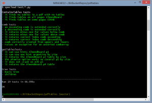
My latest project, a module which automatically extracts tables from PDF files, has testing. It divides into two categories: testing the overall functionality – handy as I fiddle with structure – and tests for mathematically or logically complex functions. In this second area I’ve started writing the tests before the functions, this is because often this type of function has a simple enough description and test case but implementation is a bit tricky. You can see the tests I have written for one of these functions here.
Testing isn’t as disruptive to my workflow as I thought it would be. Typically I would be repeatedly running my code as I explored my analysis making changes to a core pilot script. Using testing I can use multiple pilot scripts each testing different parts of my code; I’m testing more of my code more often and I can undertake moderate changes to my code, safe in the knowledge that my tests will limit the chances of unintended consequences.
About

I've worked as a scientist for the last 30 years, at various universities, a large home and personal care company, a startup in Liverpool called The Sensible Code Company (formerly ScraperWiki Ltd), GBG and now as a consultant in data science.
I write about:
* the books I have read, typically science and history (or both), partly as a reminder to myself and partly as a review;
* science, things I have done or things I find interesting;
* technology, programming and gadgets;
politics, and current affairs;
* ...and other stuff as it takes my fancy - holidays, photographs and things I want to remember.