Clown-car democracy

As the general election approaches we are being urged to vote, often with the pious imprecation that it doesn’t matter who we vote for just so long as we vote, because voting is important. After the election we will be told that we have spoken, meaning will be drawn from the deconstructed lemon cheesecake of the results.

But it’s all a bit of a lie: we live in a clown-car democracy.

Come May the 7th we’ll all leap into the clown-car and try to make it bend to our wishes. Some will try to honk the horn and get water squirted in the face for our troubles, others will wrench the steering wheel to the left or right and discover themselves heading in completely different directions. A bouquet of flowers will spring from the exhaust when someone puts an indicator on. The ringmaster will look cheery throughout.

We’ve all been trained to think that it’s entirely reasonable that a party might get 10% of the votes in the country but only one MP out of 650; that a party with a little over a third of the vote should have absolute power; that our political opponents can be described as “scum”. We’ve all been trained to accept sordid sexual metaphors when grown ups work together despite differences.

Book review: The Information Capital by James Cheshire and Oliver Uberti

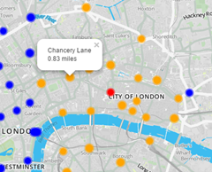
Today I review TheInformationCapitalThe Information Capital by James Cheshire and Oliver Uberti – a birthday present. This is something of a coffee table book containing a range of visualisations pertaining to data about London. The book has a website where you can see what I’m talking about (here) and many of the visualisations can be found on James Cheshire’s mappinglondon.co.uk website.

This type of book is very much after my own heart, see for example my visualisation of the London Underground. The Information Capital isn’t just pretty, the text is sufficient to tell you what’s going on and find out more.

The book is divided into five broad themes “Where We Are”, “Who We Are”, “Where We Go”, “How We’re Doing” and “What We Like”. Inevitably the majority of the visualisations are variants on a coloured map but that’s no issue to my mind (I like maps!).

Aesthetically I liked the pointillist plots of the trees in Southwark, each tree gets a dot, coloured by species and the collection of points marks out the roads and green spaces of the borough. The twitter map of the city with the dots coloured by the country of origin of the tweeter is in similar style with a great horde evident around the heart of London in Soho.

The visualisations of commuting look like thistledown, white on a dark blue background, and as a bonus you can see all of southern England, not just London. You can see it on the website (here). A Voroni tessellation showing the capital divided up by the area of influence (or at least the distance to) different brands of supermarket is very striking. To the non-scientist this visualisation probably has a Cubist feel to it.

Some of the charts are a bit bewildering, for instance a tree diagram linking wards by the prevalent profession is confusing and the colouring doesn’t help. The mood of Londoners is shown using Chernoff faces, this is based on data from the ONS who have been asking questions on life satisfaction, purpose, happiness and anxiety since 2011. On first glance this chart is difficult to read but the legend clarifies for us to discover that people are stressed, anxious and unhappy in Islington but perky in Bromley. You can see this visualisation on the web site of the book (here).

The London Guilds as app icons is rather nice, there’s not a huge amount of data in the chart but I was intrigued to learn that guilds are still being created, the most recent being the Art Scholars created in February 2014. Similarly the protected views of London chart is simply a collection of water-colour vistas.

I have mixed feelings about London, it is packed with interesting things and has a long and rich history. There are even islands of tranquillity, I enjoyed glorious breakfasts on the terrace of Somerset House last summer and lunches in Lincoln’s Inn Fields.  But I’ve no desire to live there. London sucks everything in from the rest of the country, government sits there and siting civic projects outside London seems a great and special effort for them. There is an assumption that you will come to London to serve. The inhabitants seem to live miserable lives with overpriced property and hideous commutes, these things are reflected in some of the visualisations in this book. My second London Underground visualisation measured the walking time between Tube station stops, mainly to help me avoid that hellish place at rush hour. There is a version of such a map in The Information Capital.

For those living outside London, The Information Capital is something we can think about implementing in our own area. For some charts this is quite feasible based, as they are, on government data which covers the nation such as the census or GP prescribing data. Visualisations based on social media are likely also doable although will lack weight of numbers. The visualisations harking back to classics such as John Snow’s cholera map or Charles Booth’s poverty maps of are more difficult since there is no comparison to be made in other parts of the country. And other regions of the UK don’t have Boris Bikes (or Boris, for that matter) or the Millennium Wheel.

It’s completely unsurprising to see Tufte credited in the end papers of The Information Capital. There are also some good references there for the history of London, places to get data and data visualisation.

I loved this book, its full of interesting and creative visualisations, an inspiration!

A letter to a constituent…

A constituent wrote to me asking why he received lots of election literature from Labour, Tory and UKIP candidates and not so much from the Liberal Democrats, this was my reply:

You should expect to get one Liberal Democrat leaflet over the campaign, for parliamentary elections each party gets one freepost per constituency, I received mine today. Other literature is funded by the local party, for example we’re paying for a wraparound advert on one of the local newspapers which you might see (that will cost £1000s). Aside from that I have about 300 leaflets sitting on the floor next to me waiting for delivery – it’ll take me about 3 hours to deliver them by hand. Parliamentary constituencies have about 50000 voters so it costs hundreds of pounds to print a leaflet for everyone and thousands of hours to deliver them. The City of Chester Liberal Democrats Party is quite small (a hundred or so members), and we don’t have a huge amount of money hence you receive very few leaflets.

If you see a poster in someone’s window it’s either because they are a party member or because the Liberal Democrats have canvassed (knocked on the door and asked who they will vote for) the occupant and they’ve agreed to put up a poster. Canvassing is more time consuming than leafleting, if you lived in the Hoole Ward of the city then you will likely have been canvassed and also seen Mark Williams, Alan Rollo and Bob Thompson doing their "street surgery" on the high street because Bob is local councillor for that ward (the only Liberal Democrat councillor on the local authority) and so it’s a target for the forthcoming local elections which are run on the same day as the parliamentary elections. 

Nationally, the Liberal Democrats target resources to winnable seats, at the 2010 elections we targeted Wrexham and Warrington South as local seats we might win. This is because under the first past the post electoral system it doesn’t matter what your national share of the vote is, it doesn’t matter what your share of the vote is in any particular constituency. The important thing is to have more votes than any of your opponents in a constituency. Since the 2010 election we’ve lost a lot of local councillors, and all of the MPs we currently have are under threat. So we are targeting resources at the constituencies we currently hold (with a very few exceptions) and hoping to keep as many of those as possible. As an example I get regular emails from the national party asking for help in getting Lisa Smart elected in Hazel Grove.

The City of Chester is a Labour/Conservative marginal – hence the visits by David Cameron and Ed Miliband over the last couple of weeks, and the large number of leaflets from their parties.

Other Liberal Democrats might be a bit miserable about all this but I joined the party in 1989 and the first general election I was involved in (1992), we got 20 seats and we should do better than that this time.

Hope that answers your question, and that you vote for Bob Thompson!

Adventures in Kaggle: Forest Cover Type Prediction


forest_cover_thumb
This post was first published at ScraperWiki.

Regular readers of this blog will know I’ve read quite few machine learning books, now to put this learning into action. We’ve done some machine learning for clients but I thought it would be good to do something I could share. The Forest Cover Type Prediction challenge on Kaggle seemed to fit the bill. Kaggle is the self-styled home of data science, they host a variety of machine learning oriented competitions ranging from introductory, knowledge building (such as this one) to commercial ones with cash prizes for the winners.

In the Forest Cover Type Prediction challenge we are asked to predict the type of tree found on 30x30m squares of the Roosevelt National Forest in northern Colorado. The features we are given include the altitude at which the land is found, its aspect (direction it faces), various distances to features like roads, rivers and fire ignition points, soil types and so forth. We are provided with a training set of around 15,000 entries where the tree types are given (Aspen, Cottonwood, Douglas Fir and so forth) for each 30x30m square, and a test set for which we are to predict the tree type given the “features”. This test set runs to around 500,000 entries. This is a straightforward supervised machine learning “classification” problem.

The first step must be to poke about at the data, I did a lot of this in Tableau. The feature most obviously providing predictive power is the elevation, or altitude of the area of interest. This is shown in the figure below for the training set, we see Ponderosa Pine and Cottonwood predominating at lower altitudes transitioning to Aspen, Spruce/Fir and finally Krummholz at the highest altitudes. Reading in wikipedia we discover that Krummholz is not actually a species of tree, rather something that happens to trees of several species in the cold, windswept conditions found at high altitude.

Figure1

Data inspection over I used the scikit-learn library in Python to predict tree type from features. scikit-learn makes it ridiculously easy to jump between classifier types, the interface for each classifier is the same so once you have one running swapping in another classifier is a matter of a couple of lines of code. I tried out a couple of variants of Support Vector Machines, decision trees, k-nearest neighbour, AdaBoost and the extremely randomised trees ensemble classifier (ExtraTrees). This last was best at classifying the training set.

The challenge is in mangling the data into the right shape and selecting the features to use, this is the sort of pragmatic knowledge learnt by experience rather than book-learning. As a long time data analyst I took the opportunity to try something: essentially my analysis programs would only run when the code had been committed to git source control and the SHA of the commit, its unique identifier, was stored with the analysis. This means that I can return to any analysis output and recreate it from scratch. Perhaps unexceptional for those with a strong software development background but a small novelty for a scientist.

Using a portion of the training set to do an evaluation it looked like I was going to do really well on the Kaggle leaderboard but on first uploading my competition solution things looked terrible! It turns out this was a common experience and is a result of the relative composition of the training and test sets. Put crudely the test set is biased to higher altitudes than the training set so using a classifier which has been trained on the unmodified training set leads to poorer results then expected based on measurements on a held back part of the training set. You can see the distribution of elevation in the test set below, and compare it with the training set above.

figure2

We can fix this problem by biasing the training set to more closely resemble the test set, I did this on the basis of the elevation. This eventually got me to 430 rank on the leaderboard, shown in the figure below. We can see here that I’m somewhere up the long shallow plateau of performance. There is a breakaway group of about 30 participants doing much better and at the bottom there are people who perhaps made large errors in analysis but got rescued by the robustness of machine learning algorithms (I speak from experience here!).

figure3

There is no doubt some mileage in tuning the parameters of the different classifiers and no doubt winning entries use more sophisticated approaches. scikit-learn does pretty well out of the box, and tuning it provides marginal improvement. We observed this in our earlier machine learning work too.

I have mixed feelings about the Kaggle competitions. The data is nicely laid out, the problems are interesting and it’s always fun to compete. They are a great way to dip your toes in semi-practical machine learning applications. The size of the awards mean it doesn’t make much sense to take part on a commercial basis.

However, the data are presented such as to exclude the use of domain knowledge, they are set up very much as machine learning challenges – look down the competitions and see how many of them feature obfuscated data likely for reasons of commercial confidence or to make a problem more “machine learning” and less subjectable to domain knowledge. To a physicist this is just a bit offensive.

If you are interested in a slightly untidy blow by blow account of my coding then it is available here in a Bitbucket Repo.

Book review: How Linux works by Brian Ward


hlw2e_cover-new_webThis review was first published at ScraperWiki.

A break since my last book review since I’ve been coding, rather than reading, on the commute into the ScraperWiki offices in Liverpool. Next up is How Linux Works by Brian Ward. In some senses this book follows on from Data Science at the Command Line by Jeroen Janssens. Data Science was about doing analysis with command line incantations, How Linux Works tells us about the system in which that command line exists and makes the incantations less mysterious.

I’ve had long experience with doing analysis on Windows machines, typically using Matlab, but over many years I have also dabbled with Unix systems including Silicon Graphics workstations, DEC Alphas and, more recently, Linux. These days I use Ubuntu to ensure compatibility with my colleagues and the systems we deploy to the internet. Increasingly I need to know more about the underlying operating system.

I’m looking to monitor system resources, manage devices and configure my environment. I’m not looking for a list of recipes, I’m looking for a mindset. How Linux Works is pretty good in this respect. I had a fair understanding of pipes in *nix operating systems before reading the book, another fundamental I learnt from How Linux Works was understanding that files are used to represent processes and memory. The book is also good on where these files live – although this varies a bit with distribution and time. Files are used liberally to provide configuration.

The book has 17 chapters covering the basics of Linux and the directory hierarchy, devices and disks, booting the kernel and user space, logging and user management, monitoring resource usage, networking and aspects of shell scripting and developing on Linux systems. They vary considerably in length with those on developing relatively short. There is an odd chapter on rsync.

I got a bit bogged down in the chapters on disks, how the kernel boots, how user space boots and networking. These chapters covered their topics in excruciating detail, much more than required for day to day operations. The user startup chapter tells us about systemd, Upstart and System V init – three alternative mechanisms for booting user space. Systemd is the way of the future, in case you were worried. Similarly, the chapters on booting the kernel and managing disks at a very low level provide more detail than you are ever likely to need. The author does suggest the more casual reader skip through the more advanced areas but frankly this is not a directive I can follow. I start at the beginning of a book and read through to the end, none of this “skipping bits” for me!

The user environments chapter has a nice section explaining clearly the sequence of files accessed for profile information when a terminal window is opened, or other login-like activity. Similarly the chapters on monitoring resources seem to be pitched at just the right level.

Ward’s task is made difficult by the complexity of the underlying system. Linux has an air of “If it’s broke, fix it and if ain’t broke, fix it anyway”. Ward mentions at one point that a service in Linux had not changed for a while therefore it was ripe for replacement! Each new distribution appears to have heard about standardisation (i.e. where to put config files) but has chosen to ignore it. And if there is consistency in the options to Linux commands it is purely co-incidental. I think this is my biggest bugbear in Linux, I know which command to use but the right option flags are more just blindly remembered.

The more Linux-oriented faction of ScraperWiki seemed impressed by the coverage of the book. The chapter on shell scripting is enlightening, providing the mindset rather than the detail, so that you can solve your own problems. It’s also pragmatic in highlighting where to to step in shell scripting and move to another language. I was disturbed to discover that the open-square bracket character in shell script is actually a command. This “explain the big picture rather than trying to answer a load of little questions”, is a mark of a good technical book.  The detail you can find on Stackoverflow or other Googling.

How Linux Works has a good bibliography, it could do with a glossary of commands and an appendix of the more in depth material. That said it’s exactly the book I was looking for, and the writing style is just right. For my next task I will be filleting it for useful commands, and if someone could see their way to giving me a Dell XPS Developer Edition for “review”, I’ll be made up.