 For a change I have been reading about Roman history, in the form of Pompeii: The Life of a Roman Town by Mary Beard.
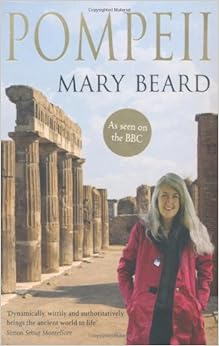
Mary Beard is a Cambridge classicist. I think it helps having seen her on TV, jabbing her figure at a piece of Roman graffiti, explaining what it meant and why it was important with obvious enthusiasm. For me it gave the book a personality.
I imagine I am not unusual in gaining my knowledge of Roman culture via some poorly remembered caricature presented in pre-16 history classes at school and films including the Life of Brian, Gladiator and Up Pompeii.
Pompeii is an ancient Italian town which was covered in a 4-6 metre blanket of ash by an eruption of nearby Vesuvius in 79 AD. Beneath the ash the town was relatively undamaged. It was rediscovered in 1599 but excavations only started in the mid 18th century. These revealed a very well-preserved town including much structure, artwork and the remains of the residents. The bodies of the fallen left voids in the ash which were reconstructed by filling them with plaster.
The book starts with a salutatory reminder that Pompeii wasn’t a town frozen in normal times but one in extremis as it succumbed to a volcanic eruption. We can’t assume that the groups of bodies found or the placement of artefacts represent how they might have been found in normal daily life.
There are chapters on the history of the city, the streets, homes, painting, occupations, administration, various bodily pleasures (food, wine, sex and bathing), entertainment (theatre and gladiators) and temples.
I’ve tended to think of the Roman’s as a homogeneous blob who occupied a chunk of time and space. But this isn’t the case, the pre-Roman history of the town features writing in the Oscan language. The Greek writer Strabo, working in the first century BC wrote about a sequence of inhabitants: Oscans, Etruscans, Pelasgians and then Samnites – who also spoke Oscan.
Much of what we know of Pompeii seems to stem from the graffiti found all about the remains. It would be nice to learn a bit more about this evidence since it seems important, and clearly something different is going on from what we find in modern homes and cities. If I look around homes I know today then none feature graffiti, granted there is much writing on paper but not on the walls.
From the depths of my memory I recall the naming of various rooms in the Roman bath house but it turns out these names may not have been in common usage amongst the Romans. Furthermore, the regimented progression from hottest to coldest bath may also be somewhat fanciful. Something I also didn’t appreciate was that the meanings of some words in ancient Latin are not known, or are uncertain. It’s obvious in retrospect that this might be the case but caveats on such things are rarely heard.
Beard emphasises that there has been a degree of “over-assumption” in the characterisation of the various buildings in Pompeii. For instance on some reckonings there are huge numbers of bars and brothels. So for instance, anything with a counter and some storage jars gets labelled a bar. Anything with phallic imagery gets labelled a brothel, the Pompeiian’s were very fond of phallic imagery. A more conservative treatment brings these numbers down enormously.
I am still mystified by the garum, the fermented fish sauce apparently loved by many, it features moderately in the book since the house of a local manufacturer is one of the better preserved ones, and one which features very explicit links to his trade. It sounds absolutely repulsive.
The degree of preservation in Pompeii is impressive, the scene that struck me most vividly was in The House of Painters at Work. In this case the modern label for the house describes exactly what was going on, other houses are labelled with the names of dignitaries present when a house was uncovered, or after key objects found in the house. It is not known what the inhabitants called the houses, or even the streets. Deliveries seemed to go by proximity to prominent buildings.
I enjoyed Pompeii, the style is readable and it goes to some trouble to explain the uncertainty and subtlety in interpreting ancient remains.
Once again I regret buying a non-fiction book in ebook form, the book has many illustrations including a set of colour plates and I still find it clumsy looking at them in more detail or flicking backwards and forwards in an ereader.


