Tag: programming

Living in code

Eric Schmidt, chairman of Google is in the news with his comments at the MacTaggart Lecture at the Edinburgh International Television Festival. The headline is a general criticism of the UK education system but what he actually said was more focussed on technology and in particular IT education: bemoaning the fact that computer science was not compulsory and what of it that there was about the use of software packages rather than how to code.

I was born in 1970, and learnt to program sometime in the early 80s. I can’t remember exactly where but I suspect it was in part at the after-school computer club my school ran. A clear memory I have is of an odd man who’d brought in a TRS-80 explaining that a FOR-NEXT loop was an instruction for a computer to “go look up its bottom” – this was at a time before CRB checks. My first computer was a Commodore VIC-20, Clive Sinclair having failed to deliver a ZX81 and the BBC Micros being rather more expensive proposition than my parents were willing to afford.

Many children of the early 80s cut their teeth programming by typing in programs from computer magazines; a tedious exercise which trained you in accurate transcription and debugging. Even at that time the focus of Computer Studies lessons was on using applications rather than teaching us to program although I do remember watching the BBC programmes on programming which went alongside the BBC Micro. As I have mentioned before, programming is in my blood – both my parents were programmers in the 60s.

About 10 years ago I was teaching programming to undergraduate physicists, from a class of 50 only 2 had any previous programming experience. The same is true in my workplace, a research lab where only a small minority of us can code.

Knowing how to code gives you a different mindset when approaching computer systems. Recently I have been experimenting with my company reports database. The reports are stored as PDF files; I was told the text inside them was not accessible – now to me that sounds like a challenge! After a bit of hacking I’d worked out how to extract the full text of reports out of the PDF files but then code that once worked stopped working. This puzzled me, so I checked the text that my program was pulling from the database and instead of being a PDF file, it was a message saying “Please don’t do that"!

At the moment I’m writing a program that takes an address list file, checks to see if the addressees have a mobile phone number and if they do uploads it to an SMS service, spitting out into a separate file those that do not have a mobile phone number. To me this is a problem that has an obvious programming solution, for the people who generate the address list it’s a bit like black magic.

These days we are surrounding by technology bearing code, just about every piece of electrical equipment in my house has code in it, but it seems that ever fewer of us have been inducted into the magic of writing our own code. These days there’s just so much more fun to be had from programming: there are endless online data sources and our phones and computers have so many programmable facilities built into them.

At what age can I teach my child Python?

More news from the shed…

CWACResults2011

In the month of May I seem to find myself playing with maps and numbers.

To the uninvolved this may appear to be rather similar to my earlier “That’s nice dear”, however the technology involved here is quite different.

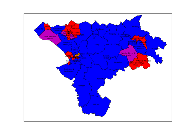
This post is about extracting the results from the local elections held on 5th May from the Cheshire West and Chester website and displaying them as a map. I could have manually transcribed the results from the website, this would probably be quicker, but where’s the fun in that?

The starting point for this exercise was noticing that the results pages have a little icon at the bottom saying “OpenElectionData”. This was part of an exercise to make local election results more easily machine-readable in order to build a database of results from across the country, somewhat surprisingly there is no public central record of local council election results. The technology used to provide machine access to the results is known as RDF (standing for Resource Description Framework), this is a way of providing “meaning” to web pages for machines to understand – this is related to the talk of the semantic web. The good folks at Southampton University have provided a browser which allows you to inspect the RDF contents of a webpage. I used this to get a human sight of the data I was trying to read.

RDF content ultimately amounts to triplets of information: “subject”,”predicate”,”object”. In the case of an election then one triplet has a subject of “specific ward identifier” the predicate is “a list of candidates” and the object is “candidate 1;candidate 2; candidate 3…”. Further triplets specify the whether a candidate was elected, how many votes they received and the party to which they belong.

I’ve taken to programming in Python recently, in particular using the Python(x,y) distribution which packages together an IDE with some libraries useful to scientists. This is the sort of thing I’d usually do with Matlab, but that costs (a lot) and I no longer have access to it at home.

There is a Python library for reading RDF data, called RDFlib, unfortunately most of the documentation is for version 2.4 and the working version which I downloaded is 3.0. Searching for documentation for the newer version normally leads to other sites where people are asking where the documentation is for version 3.0!

The base maps come from the Ordnance Survey, specifically the Boundary Line dataset which contains administrative boundary data for the UK in ESRI Shapefile format. This format is widely used for geographical information work, I found the PyShp library from GeospatialPython.com to be well-documented and straightforward way to read the format. The site also has some nice usage examples. I did look for a library to display the resulting maps but after a brief search I adapted the simple methods here for drawing maps using matlibplot.

The Ordnance Survey Open Data site is a treasure trove for programming cartophiles, along with maps of the UK of various types there’s a gazetteer of interesting places, topographic information and location data for UK postcode.

The map at the top of the page uses the traditional colour-coding of red for Labour and blue for Conservative, some wards elect multiple candidates and in those where the elected councillors are not all from the same party purple is used to show a Labour/Conservative combination and orange a Labour/Liberal Democrat combination.

In contrast to my earlier post on programming, the key elements here are the use of pre-existing libraries and data formats to achieve an end result. The RDF component of the exercise took quite a while, whilst the mapping part was the work of a couple of hours. This largely comes down to the quality of the documentation available. Python turns out to be a compact language to do this sort of work, it’s all done in 150 or so lines of code.

It would have been nice to have pointed my program to a single webpage and for it to find all the ward data from there, including the ward names, but I couldn’t work out how to do this – the program visits each ward in turn and I had to type in the ward names. The OpenElectionData site seemed to be a bit wobbly too, so I encoded party information into my program rather the pulling it from their site. Better fitting of the ward labels into the wards would have been nice too (although this is a hard problem). Obviously there’s a wide range of analysis that can be carried out on the underlying electoral data.

Footnotes

The python code to do this analysis is here. You will need to install the rdflib and PyShp libraries and download the OS Boundary Line data. I used the Python(x,y) distribution but I think it’s just the matlibplot library which is required. The CWac.py program extracts the results from the website and writes them to a CSV file, the Mapping.py program makes a map from them. You will need to adjust file paths to suit your installation.

Obsession

This is a short story about obsession: with a map, four books and some numbers.

My last blog post was on Ken Alder’s book “The Measure of All Things” on the surveying of the meridian across France, through Paris, in order to provide a definition for a new unit of measure, the metre, during the period of the French Revolution. Reading this book I noticed lots of place names being mentioned, and indeed the core of the whole process of surveying is turning up at places and measuring the angles to other places in a process of triangulation.

To me places imply maps, and whilst I was reading I popped a few of the places into Google Maps but this was unsatisfactory to me. Delambre and Mechain, the surveyors of the meridian, had been to many places. I wanted to see where they all were. Ken Alder has gone a little way towards this in providing a map: you can see it on his website but it’s an unsatisfying thing: very few of the places are named and you can’t zoom into it.

In my investigations for the last blog post, I discovered the full text of the report of the surveying mission, “Base du système métrique décimal”, was available online and flicking through it I found a table of all 115 triangles used in determining the meridian. So a plan is formed: enter the names of the stations forming the 115 triangles into a three column spreadsheet; determine the latitude and longitude of each of these stations using the Google Maps API; write these locations out into a KML file which can be viewed in Google Maps or Google Earth.

The problem is that place names are not unique and things have changed in the last 200 years. I have spent hours transcribing the tables and hunting down names of obscure places in rural France, hacking away with Python and loved every minute of it. Cassini’s earlier map of France is available online but the navigation is rather clumsy so I didn’t use it. Although now I come to writing this I see someone else has made a better job of it.

Beside three entries in the tables of triangles are the words: “Ce triangle est inutile” – “This triangle is useless”. Instantly I have a direct bond with Delambre, who wrote those words 200 years ago –  I know that feeling: in my loft is a sequence of about 20 lab books I used through my academic career and I know that besides an (unfortunately large) number of results the word “Bollocks!” is scrawled for very similar reasons.

The scheme with the the Google Maps API is that your program provides a place name “Chester, UK”, for example, and the API provides you with the latitude and longitude of the point requested. Sometimes this doesn’t work, either because there are several places with the same name or the placename is not in the database.

I did have a genuine Eureka moment: after several hours trying to find missing places on the map I had a bath and whilst there I had an idea: Google Earth supports overlay images on its maps. At the back of the “Base du système métrique décimal” there is a set of images showing where the stations are as a set of simple line diagrams. Surely I could overlay the images from Base onto Google Earth and find the missing stations? I didn’t leap straight from the bath, but I did stay up overlaying images onto maps deep into the night. It turns out the diagrams are not at all bad for finding missing stations. This manual fiddling to sort out errant stations is intellectually unsatisfying but some things it’s just quicker to do by hand!

You can see the results of my fiddling by loading this KML file into Google Earth, if you’re really keen this is a zip file containing the image overlays from “Base du système métrique décimal” – they match up pretty well given they are photocopies of diagrams subject to limitations in the original drawing and distortion by scanning.

What have I learned in this process?

  • I’ve learnt that although it’s possible to make dictionaries of dictionaries in Python it is not straightforward to pickle them.
  • I’ve enjoyed exploring the quiet corners of France on Google Maps
  • I’ve had a bit more practice using OneNote, Paint .Net, Python and Google Earth so when the next interesting thing comes along I’ll have a head start.
  • Handling French accents in Python is a bit beyond my wrangling skills.

You’ve hopefully learnt something of the immutable mind of a scientist!
View


Inordinately fond of bottles…

J.B.S. Haldane, when asked “What has the study of biology taught you about the Creator, Dr. Haldane?”, he replied:
“I’m not sure, but He seems to be inordinately fond of beetles.”

The National Museum of Science & Industry (NMSI) has recently released a catalogue of its collection in easily readable form, you can get it here. The data includes descriptions, types of object, date made, materials, sizes, and place made – although not all objects have data for all these items. Their intention was to give people an opportunity to use the data, now who would do such a thing?

The data comes in four 16mb CSV files plus a couple of other smaller ones covering the media library (pictures) and a small “events” library. I’ve focussed on the main catalogue. You can load these files individually into Microsoft Excel, each one has about 65536 rows so they’re a bit of a pain to use, alternatively you can upload them to a SQL database. This turns out to be exceedingly whizzy! I wrote a few blog posts about SQL a while back as I learnt about it and this is my first serious attempt to use it. Essentially SQL allows you to ask nearly human language looking questions of big datasets, like this:

USE sciencemuseum;
SELECT collection,
COUNT(collection)
FROM   sciencemuseum.objects
GROUP  BY collection
ORDER  BY COUNT(collection) DESC
LIMIT  0, 11000; 

This gets you a list of all the collections inside the Science Museums catalogue (there are 162) and tells you how many objects are in each of these collections. Collections have names like “SRM – Acoustics” and “NRM – Railway Timepieces”, the NMSI incorporates the National Railway Museum (NRM), and the National Media Museum (NMEM) as well as the Science Museum (SCM) – hence the first three letters of the collection name. I took the collection data and fed it into Many Eyes to make a bubble chart:
The size of the bubble shows you how many objects are in a particular collection, you can see a majority of the major collections are medical related. So what’s in these collections? As well as longer descriptions, many objects are classified into a more limited number of types. This bubble chart shows the number of objects of each type:

This is where we learn that the Science Museum is inordinately fond of bottles (or jars, or specimen jars, or albarello’s or “shop rounds”). There are also a lot of prints and posters, from the National Railway Museum. This highlights a limitation to this type of approach: the fact that there are many of an object tells you little. It perhaps tells you how pervasive medicine has been in science – it is the visible face of science and has been for many years.

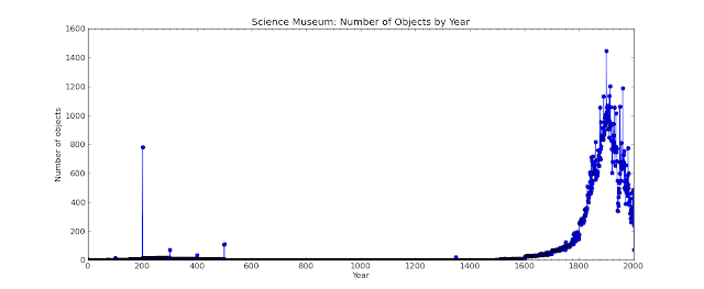
I have also plotted when the objects in the collection were made:

This turns out to be slightly tricky since over the years different curators have had different ideas about how *exactly* to describe the date when an object was made. Unsurprisingly in the 19th century they probably didn’t consider that a computer would be able to process 200,000 records in 1/4 second but simultaneously be unable to understand that circa 1680, c. 1680, c1680, ca 1680 and ca. 1680 actually all mean the same thing. This shows a number of objects in the first few centuries AD, followed by a long break and gradual rise after 1600 – the period of the Scientific Revolution. The pace picks up once again at the beginning of the 19th century.

I also made a crack at plotting where all the objects originating in the UK came from, on PC this is a live Google Map and is zoomable, beneath the red bubbles are disks sized in proportion to the number of objects from that location:

From this I learnt that there was a Pilkingtons factory in St Asaph, and a man in Chirk made railway models. To me this is the value of programming, the compilers of the catalogue made decisions as to what they included but once in my hands I can look into the catalogue according to my interests. I can explore in my own way, if I were a better programmer I could perhaps present you with a slick interface to do the same.

Finally for this post, I tried to plot when the objects arrived at the museum, this was a bit tricky: for about 60% of the objects the object reference number for objects contains the year as the first four characters so I just have the data for these:

The Science Museum started in 1857, the enormous spike in 1889 is due to the acquisition of the collection of Sir John Percy on his death, I discovered this on the the Science Museum website. Actually, I’d like to commend the whole Science Museum site to you, it’s very nice.

I visited the Science Museum a number of times in my childhood, I must admit to preferring it to the Natural History Museum, which seemed to be overwhelming large. The only record I have of these visits is this picture of a German Exchange visit to the museum, in 1985:

I must admit to not being a big fan of museums and galleries, they make my feet ache and I can’t find what I’m looking for or I don’t know what I’m looking for, and there never seems to be enough information on the things I’m looking at. This adventure into the data is my way of visiting a museum, I think I’ll spend a bit more time in wandering around the museum.

I had an alternative title for people who had never heard of J.B.S. Haldane: “It’s full of jars”

Footnote
If the Many Eyes visualisation above don’t work, you can see them in different formats from my profile page.

Photographs, videos and GPS

02 February WestendorfThis post is in part a memory aid but it may be interesting to other amateur photographers, and organisational obsessives.

My scheme for holidays and walks out is to take cameras (Canon 400D, Casio Exilim EX-S10), sometimes a video camera (Canon Legaria FS200) and a Garmin GPS 60 which I use to provide information for geotagging photos rather than navigation, although I once used it as an altimeter to find the top of a cloud covered Lake District mountain. Geotagging is the process of labelling a camera image with the location at which it was taken.

I save images as JPEG, I should probably use RAW format on the SLR but the workflow is more complicated and I rarely do anything particularly advanced with images after I’ve taken them other than cropping, straightening and a little fiddling with contrast. Once home I save all the images from a trip to a directory whose name is as follows:

Z:\My Pictures\[year]\[sequence number] – [description] – [date]

So for my recent skiing trip:

Z:\My Pictures\2011\003 – Hinterglemm – 29jan11

I leave the image file names unaltered. Padding the sequence number with zeroes helps with sorting. The idea of this is that I can easily find photos of a particular trip just using the “natural” ordering of the file system, I don’t rely on 3rd party software and I’m fairly safe from the file system playing sneaky tricks with creation dates. The Z: drive on my system is network attached storage, so it can be accessed from both my desktop and laptop computers. I back this up to the D: drive on my desktop PC using Syncback and I also copy it periodically to a portable drive which I keep at work. Syncback synchronises the files in two directories, I use this in preference to “proper” backup because it doesn’t leave my files in a big blob of an opaque backup format (I got burnt by this when using NTbackup in the past). The drawback is that I can’t go back to a snapshot in time but I’ve never felt the need to do this.

In addition to the images, I also save the GPS file in GPX format to the directory, this is downloaded and converted using Mapsource which is Garmin’s interfacing software. GPX is a format based on XML so is easy to read programmatically and even by humans. I do little inside Mapsource other than converting, and for a multi-session trip, stitching all the tracks together into a single file. Another handy tool in this area is GPSBabel which converts GPS data between a multitude of formats.

I use Picasa for photo viewing and labelling: it’s free, it has basic editing functions, it allows labelling and geotagging of photos in a fairly open manner and it does interesting stuff like face recognition too. As well as all this it links to Google’s web albums, so I can share photos, and it talks nicely to Google Earth.

Both geotagging and labelling images use EXIF (Exchangeable image file format) this is a way of adding metadata to images; nice because it’s a standard and the data goes in the image file so can’t get lost. EXIFtool is a very useful command-line tool for reading and writing EXIF data, and it can be integrated into your own programs. Software like Picasa, and websites such as Flickr are EXIF aware so data saved in this format can be visible in a range of applications.

It is possible to geotag photos manually with Picasa via Google Earth but I’ve collected a GPS track so this is not necessary. There are free software packages to do this but I’ve written my own for fun. The process is fairly simple: the GPS track has a timestamp associated with each location point and the photos from the camera each have a timestamp. All the geotagging software has to do is find the GPS point with the timestamp closest to that of the photo and write that location data to the image file in the appropriate EXIF fashion. The only real difficulty is matching up the offset between image time and GPS time – for this I take a picture of my GPS which shows what time it thinks it is and label this “GPS”.

In fact I usually label photos after they have been geotagged: photos can be exported from Picasa as a Google Earth compatible KMZ file and then upload into Google Earth along with the GPS track in GPX format making it possible to see where you were when you took the photo, which makes labelling easier.

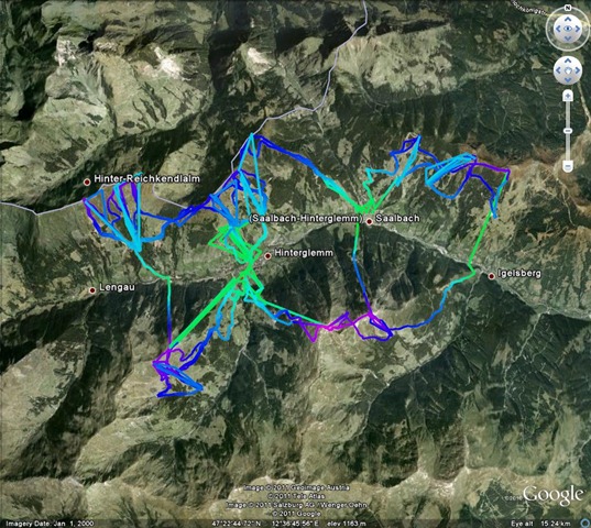
I use www.gpsvizualiser.com to create images of GPS tracks on top of satellite images, this is a bit more flexible than just using Google Earth, I must admit to being a bit bewildered with the range of options available here. Below is an example where height is coded with colour.

GPSTrackHinterglemm

As I go around I sometimes take sets of images to make a panorama. The final step is to stitch together these multiple images to make single, panoramic views, I now use Microsoft Image Composite Editor to do this, it preserves the EXIF data of the input image and does a nice auto-crop. My geotagging program flags up images that were taken close together in time as prospective panoramic images. The image below is a simple to image panoramic view (from Hinterglemm)

Panorama towards Schattberg West from below Schattberg Ost

I mentioned video in the title: at the moment I’m still a little bemused by video. I use the same directory structure for storing videos as I do for pictures but I haven’t found album software I’m happy with or a reliable way of labelling footage – Picasa seems promising although the playback quality is a bit poor. ffmpeg looks like a handy programming tool. Any suggestions welcome!