
Dr Administrator
Author's posts
Apr 05 2014
San Sebastian, aka Donostia
Once again I travel for work, more specifically to a NewsReader project meeting in San Sebastian, or in the Basque language, Donostia.
My trip there was mildly stressful, Easyjet fly direct Manchester-Bilbao but only on three days of the week – the wrong days for my meeting. Therefore I travelled via Charles De Gaulle Airport, which made a 1.5 hour transfer rather tight and led to me being obviously irritated with an immigration official. I should add that Charles De Gaulle Airport was the only stressful part of my trip.
Once at Bilbao it is a little over an hour on an express bus to reach Donostia. And it’s a rather odd experience. I’ve only visited Spain once in the past, to Barcelona and the rest of my knowledge of the country is from trashy TV about Brits on holiday and art house films (and books). The Basque country reminded me of the transfers from the airport to the ski resort I’ve made across the Alps. Steep-wooded valleys, chalet-style buildings scattered across hillsides with orchards and hay-meadows. Small towns wedged into the bottoms of valleys, apartment blocks creeping up the hillsides in the manner of the French rather than Austrian Alps. The only oddity is the occasional palm tree.
There is a fair amount of geology on display, I didn’t catch any photos from the bus but you get a hint of it from this photo of the bay at Donostia.

It was unseasonably warm whilst I was in Donostia, I remarked that I’d consider the temperature normal for Spain to one of my hosts, who replied; “You’ve made two mistakes there: (1) you’re not in Spain…”.
Once in Donostia, it is strikingly reminiscent of the North Wales coast and Llandudno! Fine buildings along a bay with a steep promontory looking down on the town.

The quality of the street furniture is rather better, and the buildings have a rather more wealthy feel. The local vegetation also reminds you that you’re not in Llandudno.

Apparently the Spanish royal family used to holiday in Donostia at the Miramar Palace, not really that palatial but it has fine views over the bay and the grounds reach down to the sea:

I wonder whether they used this rather ornate beach house:

The town hall is pretty impressive too:

I failed a bit on local cuisine only making it out one night of three, to the Cider House. Apparently a typically Basque thing. The dining room is reached past large barrels of cider, which are the main event. The cider drinking scheme is as follows: at regular intervals the patron shouted something, and the willing and able followed him to a selected barrel. He opened a small tap producing a two metre or so stream of cider, projected horizontally. The assembled drinkers catch a an inch or so of cider each in large plastic beakers. Points are awarded for catching the stream as far from the barrel as possible, and once started the drinker moves up the stream. The next drinker aligns themselves to catch the stream when the previous drinker moves out of the way. The result is quite splashy.
Between drinks there is a fixed menu of bread, cod omelette, cod and greens, the largest barbeque steaks I’ve ever seen, finishing with walnuts, quince jelly and cheese.
Aside from this my colleagues were keen on pintxos, the local take on the more widely known tapas.
I stayed at the NH Aranzazu which was very nice, not particularly expensive and very convenient for the university but not so much for the town centre.
Apr 05 2014
Book review: Darwin’s Ghosts by Rebecca Stott
 Charles Darwin’s On the Origin of Species was rushed into print after a very long gestation when it became clear that Alfred Russell Wallace was close to publishing the same ideas on evolution. Lacking from the first edition was a historical overview of what went before, pertinent to the ideas of evolution. On the occasion of the publication of the first American edition, Darwin took the opportunity to address the lack. Darwin’s Ghosts: In search of the first evolutionists by Rebecca Stott is a modern look at those influences.
After an introductory, motivating chapter Darwin’s Ghosts works in approximately chronological order. Each chapter introduces a person, or group of people, who did early work in areas of biology which ultimately related to evolution. The first characters introduced are Aristotle, and then Jahiz, a Persian scholar working around 860AD. Aristotle brought systematic observation to biology, a seemingly basic concept which was not then universal. He wrote The History of Animals in about 350BC. The theme of systematic observation and experimentation continues through the book. Jahiz extended Aristotle’s ideas to include interactions of species, or webs. His work is captured in The Book of Living Beings.
Next up was a curiosity over fossils, and the inklings that things had not always been as they were now. Leonardo Da Vinci (1452-1519) and, some time later, Bernard Palissy (1510-1590) are used to illustrate this idea. Everyone has heard of da Vinci. Palissy was a Hugenot who lived in the second half of the 16th century. He was a renowned potter, and commissioned by Catherine de Medici to build the Tuileries gardens in Paris but in addition he lectured on natural sciences.
I must admit to being a bit puzzled at the introduction of Abraham Trembley (1710-1784), he was the tutor of two sons of a prominent Dutch politician. He worked on hydra, a very simple aquatic organism and his wikipedia page credits him as being one of the first experimental zoologists. He discovered that whole hydra could regenerated from parts of a “parent”.
Conceptually the next developments were in hypothesising a great age for the earth coupled to ideas that species were not immutable, they change over time. Benoît de Maillet (1656-1739) wrote on this but only posthumously. Similarly Robert Chambers (1802-1871) was to write anonymously about evolution in Vestiges of the Natural History of Creation first published in 1844. Note that this publication date is only 15 years before the first publication of the Origin of Species.
The reasons for this reticence on the part of a number of writers is that these ideas of mutability and change collide with major religions, they are “blasphemous”. This becomes a serious issue over the years spanning 1800. Erasmus Darwin, Charles’s grandfather, was something of an evolutionist but wrote relatively cryptically about it for fear of his career as a doctor. I reviewed Desmond King-Hele’s biography of Erasmus Darwin some time ago. At the time when Erasmus wrote evolution was considered a radical idea, both in political and religious senses. This at a time when the British establishment was feeling vulnerable following the Revolution in France and the earlier American revolution.
I have some sympathy with the idea that religion suppressed evolutionary theory, however it really isn’t as simple as that. The part religion plays is as a support to wider cultural and political movements.
The core point of Darwin’s Ghosts is that a scientist working in the first half of the 19th century was standing on the shoulders of giants or at least on top of a pile of people the lowest strata of which date back a couple of millennia. Not only this, they are not on an isolated pinnacle, around them are others also standing. Culturally we are fond of stories of lone geniuses but practically they don’t exist.
In fact the theory of evolution is a nice demonstration of this interdependence – Darwin was forced to publish his theory because Wallace had essentially got the gist of it entirely independently – his story is the final chapter in the book. For Wallace the geographic ranges of species were a key insight into forming the theory. A feature very apparent in the area of southeast Asia where he was working as a freelance specimen collector.
Once again I am caught out by my Kindle – the book proper ends at 66% of the way through, although Darwin’s original essay is included as an appendix taking us to 70%. Darwin’s words are worth reading, if only for his put-down of Richard Owen for attempting to claim credit for evolutionary theory, despite being one of those who had argued against it previously.
I enjoyed this book, much of my reading is scientific mono-biography which misses the ensemble nature of science which this book demonstrates.
Mar 23 2014
The Third Way
 Operating Systems were the great religious divide of our age.
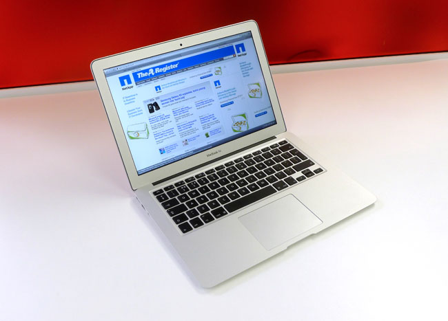
A little over a year ago I was writing about my experiences setting up my Sony Vaio Windows 8 laptop to run Ubuntu on a virtual machine. Today I am exploring the Third Way – I’m writing this on a MacBook Air. This is the result of a client requirement: I’m working with the Government Digital Service who are heavily Mac oriented.
I think this makes me a secularist in computing terms.
My impressions so far:
Things got off to a slightly rocky start, the MacBook I’m using is a hand-me-down from a departing colleague. We took the joint decision to start from scratch on this machine and as a result of some cavalier disk erasing we ended up with a non-booting MacBook. In theory we should have been able to do a reinstall over the internet, in practice this didn’t work. So off I marched to our local Apple Store to get things sorted. The first time I’d entered such an emporium. I was to leave disappointed, it turned out I needed to make an appointment for a “Genius” to triage my laptop and the next appointment was a week hence, and I couldn’t leave the laptop behind for a “Genius Triage”. Alternatively, I could call Apple Care.
As you may guess this Genius language gets my goat! My mate Zarino was an Apple College Rep – should they have called him a Jihadi? Could you work non-ironically with a job title of Genius?
Somewhat bizarrely, marching the Air to the Apple Store and back fixed the problem, and an hour or so later I had a machine with an operating system. Perhaps it received a special essence from the mothership. On successfully booting my first actions were to configure my terminal. For the initiated the terminal is the thing that looks like computing from the early 80s – you type in commands at a prompt and are rewarded with more words in return. The reason for this odd choice was the intended usage. This MacBook is for coding, so next up was installing Sublime Text. I now have an environment for coding which superficial looks like the terminal/editor combination I use in Windows and Ubuntu!
It’s worth noting that for the MacBook the bash terminal I am using is a native part of the operating system, as it is for the Ubuntu VM on Windows the bash terminal is botched on to make various open source tools work.
Physically the machine is beautiful. My Vaio is quite pretty but compared to the Air it is fat and heavy. It has no hard disk indicator light. It has no hard disk, rather a 256GB SSD which means it boots really fast. 256GB is a bit small for me these days, with a title of data scientist I tend to stick big datasets on my laptop.
So far I’ve been getting used to using cmd+c and cmd+v to copy and paste, having overwritten stuff repeatedly with “v” having done the Windows ctrl+v. I’m getting used to the @ and ” keys being in the wrong place. And the menu bar for applications always appearing at the top of the screen, not the top of the application window. Fortunately the trackpad I can configure to simulate a two button mouse, rather than the default one button scheme. I find the Apple menu bar at the top a bit too small and austere and the Dock at the bottom is a bit cartoony. The Notes application is a travesty, a little faux notebook although I notice in OS X Mavericks it is more business-like.
For work I don’t anticipate any great problems in working entirely on a Mac, we use Google Apps for email and make extensive use of Google Docs. We use online services like Trello, GitHub and Pivotal in place of client side applications. Most the coding I do is in Python. The only no go area is Tableau which is currently only available on Windows.
I’ve never liked the OS wars, perhaps it was a transitional thing. I grew up in a time when there were a plethora of home computers. I’ve written programs on TRS-80s, Commodore VIC20, Amstrad CPC464s, Sinclair ZX81 and been aware of many more. At work I’ve used Dec Alphas, VAX/VMS and also PCs and Macs. Latterly everything is one the web, so the OS is just a platform for a browser.
I’m thinking of strapping the Air and the Vaio back to back to make a triple booting machine!
Feb 26 2014
Messier and messier
Regular readers with a good memory will recall I bought a telescope about 18 months ago. I bemoaned the fact that I bought it in late Spring, since it meant it got dark rather late. I will note here that astronomy is generally incompatible with a small child who might wake you up in the middle of the night, requiring attention and early nights.
Since then I’ve taken pictures of the sun, the moon, Jupiter, Saturn and as a side project I also took wide angle photos of the Milky Way and star trails (telescope not required). Each of these bought their own challenges, and awe. The sun because it’s surprisingly difficult to find the thing in you view finder with the serious filter required to stop you blinding yourself when you do find it. The moon because it’s just beautiful and fills the field of view, rippling through the “seeing” or thermal turbulence of the atmosphere. Jupiter because of it’s Galilean moons, first observed by Galileo in 1610. Saturn because of it’s tiny ears, I saw Saturn on my first night of proper viewing. As the tiny image of Saturn floated across my field of view I was hopping up and down with excitement like a child.
I’ve had a bit of a hiatus in the astrophotography over the past year but I’m ready to get back into it.
My next targets for astrophotography are the Deep Sky Objects (DSOs), these are largish faint things as opposed to planets which are smallish bright things. My accidental wide-angle photos clued me into the possibilities here. I’d been trying to photograph constellations, which turn out to be a bit dull, at the end of the session I put the sensitivity of my camera right up and increased the exposure time and suddenly the Milky Way appeared! Even in rural Wales it was only just visible to the naked eye.
Now I’m keen to explore more of these faint objects. The place to start is the Messier Catolog of objects. This was compiled by Charles Messier and Pierre Méchain in the latter half of the 18th century. You may recognise the name Méchain, he was one of the two French men who surveyed France on the cusp of the Revolution to define a value for the meter. Ken Alder’s book The Measure of All Things, describes their adventures.
Messier and Mechain weren’t interested in the deep sky objects, they were interested in comets and compiled the list in order not to be distracted from their studies by other non-comety objects. The list is comprised of star clusters, nebula and galaxies. I must admit to being a bit dismissive of star clusters. The Messier list is by no means exhaustive, observations were all made in France with a small telescope so there are no objects from the Southern skies. But they are ideal for amateur astronomers in the Northern hemisphere since the high tech, professional telescope of the 18th century is matched by the consumer telescope of the 21st.
I’ve know of the Messier objects since I was a child but I have no intuition as to where they are, how bright and how big they are. So to get me started I found some numbers and made some plots.
The first plot shows where the objects are in the sky. They are labelled, somewhat fitfully with their Messier number and common name. Their locations are shown by declination, how far away from the celestial equator an object is, towards the North Pole and right ascension, how far around it is along a line of celestial latitude. I’ve added the moon to the plot in a fixed position close to the top left. As you can see the majority of the objects are North of the celestial equator. The size of the symbols indicates the relative size of the objects. The moon is shown to the same scale and we can see that a number of the objects are larger than the moon, these are often star clusters but galaxies such as Andromeda – the big purple blob on the right and the Triangulum Galaxy are also bigger than the moon. As is the Orion nebula.

So why aren’t we as familiar with these objects as we are with the moon. The second plot shows how bright the Messier objects are and their size. The horizontal axis shows their apparent size – it’s a linear scale so that an object twice as far from the vertical axis is twice as big. Note that these are apparent sizes, some things appear larger than others because they are closer. The Messier The vertical axis shows the apparent brightness, in astronomy brightness is measured in units of “magnitude” which is a logarithmic scale. This means that although the sun is roughly magnitude –26 and the moon is roughly magnitude –13, the sun is 10,000 times bright than the moon. The Messier objects are all much dimmer than Venus, Jupiter and Mercury and generally dimmer than Saturn.

So the Messier objects are often bigger but dimmer than things I have already photographed. But wait, the moon fills the field of view of my telescope. And not only that my telescope has an aperture of f/10 – a measure of it’s light gathering power. This is actually rather “slow” for a camera lens, my “fastest” lens is f/1.4 which represents a 50 fold larger light gathering power.
For these two reasons I have ordered a new lens for my camera, a Samyang 500mm f/6.3 this is going to give me a bigger field of view than my telescope which has a focal length of 1250mm. And also more light gathering power – my new lens should have more than double the light gathering power!
Watch this space for the results of my new purchase!
Feb 15 2014
Sublime

Sublime Text
Coders can be obsessive about their text editors. Dividing into relatively good natured camps. It is text editors not development environments over which they obsess and the great schism is between is between the followers of vim and those of Emacs. The line between text editor and development environment can be a bit fuzzy. A development environment is designed to help you do all the things required to make working software (writing, testing, compiling, linking, debugging, organising projects and libraries), whilst a text editor is designed to edit text. But sometimes text editors get mission creep.
vim and emacs are both editors with long pedigree on Unix systems. vim‘s parent, vi came into being in 1976, with vim being born in 1991, vim stands for “Vi Improved”. Emacs was also born in 1976. Glancing at the emacs wikipedia page I see there are elements of religiosity in the conflict between them.
To users of OS X and Windows, vim and emacs look and feel, frankly, bizarre. They came into being when windowed GUI interfaces didn’t exist. In basic mode they offer a large blank screen with no icons or even text menu items. There is a status line and a command line at the bottom of the screen. Users interact by issuing keyboard commands, they are interfaces with only keyboard shortcuts. It’s said that the best way to generate a random string of characters is to put a class of naive computer science undergraduates down in front of vim and tell them to save the file and exit the program! In fact to demonstrate the point, I’ve just trapped myself in emacs whilst trying to take a screen shot.

vim, image by Hermann Uwe
![GNU emacs-[1]](https://ianhopkinson.org.uk/wp-content/uploads/2014/02/GNU-emacs-1.png "GNU emacs-[1]")
emacs, image by David Mundy
vim and emacs are both incredibly extensible, they’re written by coders for coders. As a measure of their flexibility: you can get twitter clients which run inside them.
I’ve used both emacs and vim but not warmed to either of them. I find them ugly to look at and confusing, I don’t sit in front on an editor enough of the day to make remembering keyboard shortcuts a comfortable experience. I’ve used the Matlab, Visual Studio and Spyder IDEs but never felt impassioned enough to write a blog post about them. I had a bad experience with Eclipse, which led to one of my more valued Stackoverflow answers.
But now I’ve discovered Sublime Text.
Sublime Text is very beautiful, particularly besides vim and emacs. I like the little inset in the top right of my screen which shows the file I’m working on from an eagle’s perspective, the nice rounded tabs. The colour scheme is subtle and muted, and I can get a panoply of variants on the theme. At Unilever we used to talk about trying to delight consumers with our products – Sublime Text does this. My only wish is that it went the way of Google Chrome and got rid of the Windows bar at the top.
Not only this, as with emacs and vim, I can customise Sublime Text with code or use other packages other people have written and in my favoured language, Python.
I use Sublime Text mainly to code in Python, using a Git Bash prompt to run code and to check it into source control. At the moment I have the following packages installed:
- Package Control – for some reasons the thing that makes it easy to add new packages to Sublime Text comes as a separate package which you need to install manually;
- PEP8 Autoformat – languages have style guides. Soft guidelines to ensure consistent use of whitespace, capitalisation and so forth. Some people get very up tight about style. PEP8 is the Python style guide, and PEP8 autoformat allows you to effortlessly conform to the style guide and so avoid friction with your colleagues;
- Cheat Sheets – I can’t remember how to do anything, cheat sheets built into the editor make it easy to find things, and you can add your own cheat sheets too;
- Markdown Preview – Markdown is a way of writing HTML without all the pointy brackets, this package helps you view the output of your Markdown;
- SublimeRope – a handy package that tells you when your code won’t run and helps with autocompletion. Much better than cryptic error messages when you try to run faulty code. I suspect this is the most useful one so far.
- Git and GitGutter – integrating Git source control into the editor. Git provides all the Git commands on a menu whilst GitGutter adds markers in the margin (or gutter) showing the revision status. These work nicely on Ubuntu but I haven’t worked out how to configure them on Windows.
- SublimeREPL – brings a Python prompt into the editor. There are some configuration subtleties here when working with virtual environments.
I know I’ve only touched the surface of Sublime Text but unlike other editors I want to learn more!
About

I've worked as a scientist for the last 30 years, at various universities, a large home and personal care company, a startup in Liverpool called The Sensible Code Company (formerly ScraperWiki Ltd), GBG and now as a consultant in data science.
I write about:
* the books I have read, typically science and history (or both), partly as a reminder to myself and partly as a review;
* science, things I have done or things I find interesting;
* technology, programming and gadgets;
politics, and current affairs;
* ...and other stuff as it takes my fancy - holidays, photographs and things I want to remember.