Category: Technology

Programming, gadgets (reviews thereof) and computers

Of Matlab and Python

I’ve been a scientist and data analyst for nearly 25 years. Originally as an academic physicist, then as a research scientist in a large fast moving consumer goods company and now at a small technology company in Liverpool. In common to many scientists of my age I came to programming in the early eighties when a whole variety of home computers briefly flourished. My first formal training in programming was FORTRAN after which I have made my own way.

I came to Matlab in the late nineties, frustrated by the complexities of producing a smooth workflow with FORTRAN involving interaction, analysis and graphical output.

Matlab is widely used in academic circles and a number of industries because it provides a great deal of analytical power in a user-friendly environment. Its notation for handling matrix (array) calculations is slick. Its functionality is extended by a range of toolboxes, and there is a community of scientists sharing new functionality. It shares this feature set with systems such as IDL and PV-WAVE.

However, there are a number of issues with Matlab:

  • as a programming language it has the air of new things being botched onto a creaking frame. Support for unit testing is an afterthought, there is some integration of source control into the Matlab environment but it is with Source Safe. It doesn’t support namespaces. It doesn’t support common data structures such as dictionaries, lists and sets.
  • The toolbox ecosystem is heavily focused on scientific applications, generally in the physical sciences. So there is no support for natural language processing, for example, or building a web application based on the powerful analysis you can do elsewhere in the ecosystem;
  • the licensing is a nightmare. Once you’ve got core Matlab additional toolboxes containing really useful functionality (statistics, database connections, a “compiler”) are all at an additional cost. You can investigate pricing here. In my experience you often find yourself needing a toolbox for just a couple of functions. For an academic things are a bit rosier, universities get lower price licenses and the process by which this is achieved is opaque to end-users. As an industrial user, involved in the licensing process, it is as bad as line management and sticking needles in your eyes in the “not much fun thing to do” stakes;
  • running Matlab with network licenses means that your code may stop running part way through because you’ve made a call to a function to which you can’t currently get the license. It is difficult to describe the level of frustration and rage this brings. Now of course one answer is to buy individual licenses for all, or at least a significant surplus of network licenses. But tell that to the budget holder particularly when you wanted to run the analysis today. The alternative is to find one of the license holders of the required toolbox and discover if they are actually using it or whether they’ve gone off for a three hour meeting leaving Matlab open;
  • deployment to users who do not have Matlab is painful. They need to download a more than 500MB runtime, of exactly the right version and the likelihood is they will be installing it just for your code;

I started programming in Python at much the same time as I started on Matlab. At the time I scarcely used it for analysis but even then when I wanted to parse the HTML table of contents for Physical Review E, Python was the obvious choice. I have written scrapers in Matlab but it involved interfering with the Java underpinnings of the language.

Python has matured since my early use. It now has a really great system of libraries which can be installed pretty much trivially, they extend far beyond those offered by Matlab. And in my view they are of very good quality. Innovation like IPython notebooks take the Matlab interactive style of analysis and extend it to be natively web-based. If you want a great example of this, take a look at the examples provided by Matthew Russell for his book, Mining the Social Web.

Python is a modern language undergoing slow, considered improvement. That’s to say it doesn’t carry a legacy stretching back decades and changes are small, and directed towards providing a more consistent language. Its used by many software developers who provide a source of help, support and an impetus for an decent infrastructure.

Ubuntu users will find Python pre-installed. For Windows users, such as myself, there are a number of distributions which bundle up a whole bunch of libraries useful for scientists and sometimes an IDE. I like python(x,y). New libraries can generally be installed almost trivially using the pip package management system. I actually use Python in Ubuntu and Windows almost equally often. There are a small number of libraries which are a bit more tricky to install in Windows – experienced users turn to Christoph Gohlke’s fantastic collection of precompiled binaries.

In summary, Matlab brought much to data analysis for scientists but its time is past. An analysis environment built around Python brings wider functionality, a better coding infrastructure and freedom from licensing hell.

Inordinately fond of beetles… reloaded!

sciencemuseum_logo

This post was first published at ScraperWiki.

Some time ago, in the era before I joined ScraperWiki I had a play with the Science Museums object catalogue. You can see my previous blog post here. It was at a time when I was relatively inexperienced with the Python programming language and had no access to Tableau, the visualisation software. It’s a piece of work I like to talk about when meeting customers since it’s interesting and I don’t need to worry about commercial confidentiality.

The title comes from a quote by J.B.S. Haldane, who was asked what his studies in biology had told him about the Creator. His response was that, if He existed then he was “inordinately fond of beetles”.

The Science Museum catalogue comprises three CSV files containing information on objects, media and events. I’m going to focus on the object catalogue since it’s the biggest one by a large margin – 255,000 objects in a 137MB file. Each object has an ID number which often encodes the year in which the object was added to the collection; a title, some description, it often has an “item name” which is a description of the type of object, there is sometimes information on the date made, the maker, measurements and whether it represents part or all of an object. Finally, the objects are labelled according to which collection they come from and which broad group in that collection, the catalogue contains objects from the Science Museum, Nation Railway Museum and National Media Museum collections.

The problem with most of these fields is that they don’t appear to come from a controlled vocabulary.

Dusting off my 3 year old code I was pleased to discover that the SQL I had written to upload the CSV files into a database worked almost first time, bar a little character encoding. The Python code I’d used to clean the data, do some geocoding, analysis and visualisation was not in such a happy state. Or rather, having looked at it I was not in such a happy state. I appeared to have paid no attention to PEP-8, the Python style guide, no source control, no testing and I was clearly confused as to how to save a dictionary (I pickled it).

In the first iteration I eyeballed the data as a table and identified a whole bunch of stuff I thought I needed to tidy up. This time around I loaded everything into Tableau and visualised everything I could – typically as bar charts. This revealed that my previous clean up efforts were probably not necessary since the things I was tidying impacted a relatively small number of items. I needed to repeat the geocoding I had done. I used geocoding to clean up the place of manufacture field, which was encoded inconsistently. Using the Google API via a Python library I could normalise the place names and get their locations as latitude – longitude pairs to plot on a map. I also made sure I had a link back to the original place name description.

The first time around I was excited to discover the Many Eyes implementation of bubble charts, this time I now realise bubble charts are not so useful. As you can see below in these charts showing the number of items in each subgroup. In a sorted bar chart it is very obvious which subgroup is most common and the relative sizes of the subgroup. I’ve coloured the bars by the major collection to which they belong. Red is the Science Museum, Green is the National Rail Museum and Orange is the National Media Museum.

image

Less discerning members of ScraperWiki still liked the bubble charts.

image

We can see what’s in all these collections from the item name field. This is where we discover that the Science Museum is inordinately fond of bottles. The most common items in the collection are posters, mainly from the National Rail Museum but after that there are bottles, specimen bottles, specimen jars, shops rounds (also bottles), bottle, drug jars, and albarellos (also bottles). This is no doubt because bottles are typically made of durable materials like glass and ceramics, and they have been ubiquitous in many milieu, and they may contain many and various interesting things.

image

Finally I plotted the place made for objects in the collection, this works by grouping objects by location and then finding latitude and longitude for those group location. I then plot a disk sized by the number of items originating at that location. I filtered out items whose place made was simply “England” or “London” since these made enormous blobs that dominated the map.


image


You can see a live version of these visualisation, and more on Tableau Public.

It’s an interesting pattern that my first action on uploading any data like this to Tableau is to do bar chart frequency plots for each column in the data, this could probably be automated.

In summary, the Science Museum is full of bottles and posters, Tableau wins for initial visualisations of a large and complex dataset.

The London Underground: Should I walk it?

LU_logo

This post was first published at ScraperWiki.

With a second tube strike scheduled for Tuesday I thought I should provide a useful little tool to help travellers cope! It is not obvious from the tube map but London Underground stations can be surprisingly close together, very well within walking distance.

Using this tool, you can select a tube station and the map will show you those stations which are within a mile and a half of it. 1.5 miles is my definition of a reasonable walking distance. If you don’t like it you can change it!

The tool is built using Tableau. The tricky part was allowing the selection of one station and measuring distances to all the others. Fortunately it’s a problem which has been solved, and documented, by Jonathan Drummey over on the Drawing with Numbers blog.

I used Euston as an origin station to demonstrate in the image below. I’ve been working at the Government Digital Service (GDS), sited opposite Holborn underground station, for the last couple of months. Euston is my mainline arrival station and I walk down the road to Holborn. Euston is coloured red in the map, and stations within a mile and a half are coloured orange. The label for Holborn does not appear by default but it’s the one between Chancery Lane and Tottenham Court Road. In the bottom right is a table which lists the walking distance to each station, Holborn appears just off the bottom and indicates a 17 minute walk – which is about right.

Should I walk it

The map can be controlled by moving to the top left and using the controls that should appear there. Shift+left mouse button allows panning of the map view. A little glitch which I haven’t sorted out is that when you change the origin station the table of stations does not re-sort automatically, the user must click around the distance label to re-sort. Any advice on how to make this happen automatically would be most welcome.

Distances and timings are approximate. I have the latitude and longitude for all the stations following my earlier London Underground project which you can see here. The distances I calculate by taking the Euclidean distance between stations in angular units and multiplying by a factor which gives distances approximately the same as those in Google Maps. So it isn’t a true “as the crow flies” distance but is proportional to it. The walking times are calculated by assuming a walking speed of 3 miles and hour. If you put your cursor over a station you’ll see the name of the station with the walking time and distance from your origin station.

A more sophisticated approach would be to extract more walking routes from Google Maps and use that to calculate distances and times. This would be rather more complicated to do and most likely not worth the effort, except if you are going South of the river.

Mine is not the only effort in this area, you can see a static map of walking distances here.

Visualising the London Underground with Tableau

This post was first published at ScraperWiki.

I’ve always thought of the London Underground as a sort of teleportation system. You enter a portal in one place, and with relatively little effort appeared at a portal in another place. Although in Star Trek our heroes entered a special room and stood well-separated on platforms, rather than packing themselves into metal tubes.

I read Christian Wolmar’s book, The Subterranean Railway about the history of the London Underground a while ago. At the time I wished for a visualisation for the growth of the network since the text description was a bit confusing. Fast forward a few months, and I find myself repeatedly in London wondering at the horror of the rush hour underground. How do I avoid being forced into some sort of human compression experiment?

Both of these questions can be answered with a little judicious visualisation!

First up, the history question. It turns out that other obsessives have already made a table containing a list of the opening dates for the London Underground. You can find it here, on wikipedia. These sortable tables are a little tricky to scrape, they can be copy-pasted into Excel but random blank rows appear. And the data used to control the sorting of the columns did confuse our Table Xtract tool, until I fixed it – just to solve my little problem! You can see the number of stations opened in each year in the chart below. It all started in 1863, electric trains were introduced in the very final years of the 19th century – leading to a burst of activity. Then things went quiet after the Second World War, when the car came to dominate transport.

Timeline2

Originally I had this chart coloured by underground line but this is rather misleading since the wikipedia table gives the line a station is currently on rather than the one it was originally built for. For example, Stanmore station opened in 1932 as part of the Metropolitan line, it was transferred to the Bakerloo line in 1939 and then to the Jubilee line in 1979. You can see the years in which lines opened here on wikipedia, where it becomes apparent that the name of an underground line is fluid.

So I have my station opening date data. How about station locations? Well, they too are available thanks to the work of folk at Openstreetmap, you can find that data here. Latitude-longitude coordinates are all very well but really we also need the connectivity, and what about Harry Beck’s iconic “circuit diagram” tube map? It turns out both of these issues can be addressed by digitizing station locations from the modern version of Beck’s map. I have to admit this was a slightly laborious process, I used ImageJ to manually extract coordinates.

I’ve shown the underground map coloured by the age of stations below.

Age map2

Deep reds for the oldest stations, on the Metropolitan and District lines built in the second half of the 19th century. Pale blue for middle aged stations, the Central line heading out to Epping and West Ruislip. And finally the most recent stations on the Jubilee line towards Canary Wharf and North Greenwich are a darker blue.

Next up is traffic, or how many people use the underground. The wikipedia page contains information on usage, in terms of millions of passengers per year in 2012 covering both entries and exits. I’ve shown this data below with traffic shown at individual stations by the thickness of the line.

Traffic

I rather like a “fat lines” presentation of the number of people using a station, the fatter the line at the station the more people going in and out. Of course some stations have multiple lines so get an unfair advantage. Correcting for this it turns out Canary Wharf is the busiest station on the underground, thankfully it’s built for it. Small above ground beneath it is a massive, cathedral-like space.

More data is available as a result of a Freedom of Information request (here) which gives data broken down by passenger action (boarding or alighting), underground line, direction of travel and time of day – broken down into fairly coarse chunks of the day. I use this data in the chart below to measure the “commuteriness” of each station. To do this I take the ratio of people boarding trains in the 7am-10am time slot with those boarding 4pm-7pm. For locations with lots of commuters, this will be a big number because lots of people get on the train to go to work in the morning but not many get on the train in the evening, that’s when everyone is getting off the train to go home.

CommuterRatios

By this measure the top five locations for “commuteriness” are:

  1. Pinner
  2. Ruislip Manor
  3. Elm Park
  4. Upminster Bridge
  5. Burnt Oak

It was difficult not to get sidetracked during this project, someone used the Freedom of Information Act to get the depths of all of the underground stations, so obviously I had to include that data too! The deepest underground station is Hampstead, in part because the station itself is at the top of a steep hill.

I’ve made all of this data into a Tableau visualisation which you can play with here. The interactive version shows you details of the stations as your cursor floats over them, allows you to select individual lines and change the data overlaid on the map including the depth and altitude data that.

The Third Way

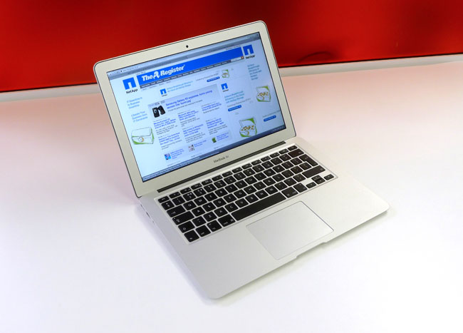
macbook_airOperating Systems were the great religious divide of our age.

A little over a year ago I was writing about my experiences setting up my Sony Vaio Windows 8 laptop to run Ubuntu on a virtual machine. Today I am exploring the Third Way – I’m writing this on a MacBook Air. This is the result of a client requirement: I’m working with the Government Digital Service who are heavily Mac oriented.

I think this makes me a secularist in computing terms.

My impressions so far:

Things got off to a slightly rocky start, the MacBook I’m using is a hand-me-down from a departing colleague. We took the joint decision to start from scratch on this machine and as a result of some cavalier disk erasing we ended up with a non-booting MacBook. In theory we should have been able to do a reinstall over the internet, in practice this didn’t work. So off I marched to our local Apple Store to get things sorted. The first time I’d entered such an emporium. I was to leave disappointed, it turned out I needed to make an appointment for a “Genius” to triage my laptop and the next appointment was a week hence, and I couldn’t leave the laptop behind for a “Genius Triage”. Alternatively, I could call Apple Care.

As you may guess this Genius language gets my goat! My mate Zarino was an Apple College Rep – should they have called him a Jihadi? Could you work non-ironically with a job title of Genius?

Somewhat bizarrely, marching the Air to the Apple Store and back fixed the problem, and an hour or so later I had a machine with an operating system. Perhaps it received a special essence from the mothership. On successfully booting my first actions were to configure my terminal. For the initiated the terminal is the thing that looks like computing from the early 80s – you type in commands at a prompt and are rewarded with more words in return. The reason for this odd choice was the intended usage. This MacBook is for coding, so next up was installing Sublime Text. I now have an environment for coding which superficial looks like the terminal/editor combination I use in Windows and Ubuntu!

It’s worth noting that for the MacBook the bash terminal I am using is a native part of the operating system, as it is for the Ubuntu VM on Windows the bash terminal is botched on to make various open source tools work.

Physically the machine is beautiful. My Vaio is quite pretty but compared to the Air it is fat and heavy. It has no hard disk indicator light. It has no hard disk, rather a 256GB SSD which means it boots really fast. 256GB is a bit small for me these days, with a title of data scientist I tend to stick big datasets on my laptop.

So far I’ve been getting used to using cmd+c and cmd+v to copy and paste, having overwritten stuff repeatedly with “v” having done the Windows ctrl+v. I’m getting used to the @ and ” keys being in the wrong place. And the menu bar for applications always appearing at the top of the screen, not the top of the application window. Fortunately the trackpad I can configure to simulate a two button mouse, rather than the default one button scheme. I find the Apple menu bar at the top a bit too small and austere and the Dock at the bottom is a bit cartoony. The Notes application is a travesty, a little faux notebook although I notice in OS X Mavericks it is more business-like.

For work I don’t anticipate any great problems in working entirely on a Mac, we use Google Apps for email and make extensive use of Google Docs. We use online services like Trello, GitHub and Pivotal in place of client side applications. Most the coding I do is in Python. The only no go area is Tableau which is currently only available on Windows.

I’ve never liked the OS wars, perhaps it was a transitional thing. I grew up in a time when there were a plethora of home computers. I’ve written programs on TRS-80s, Commodore VIC20, Amstrad CPC464s, Sinclair ZX81 and been aware of many more. At work I’ve used Dec Alphas, VAX/VMS and also PCs and Macs. Latterly everything is one the web, so the OS is just a platform for a browser.

I’m thinking of strapping the Air and the Vaio back to back to make a triple booting machine!