Tag: data visualisation

Book review: The Tableau 8.0 Training Manual – From clutter to clarity by Larry Keller

Tableau 8.0 Training Manual

This review was first published at ScraperWiki.

My unstoppable reading continues, this time I’ve polished off The Tableau 8.0 Training Manual: From Clutter to Clarity by Larry Keller. This post is part review of the book, and part review of Tableau.

Tableau is a data visualisation application which grew out of academic research on visualising databases. I’ve used Tableau Public a little bit in the past. Tableau Public is a free version of Tableau which only supports public data i.e. great for playing around with but not so good for commercial work. Tableau is an important tool in the business intelligence area, useful for getting a quick view on data in databases and something our customers use, so we are interested in providing Tableau integration with the ScraperWiki platform.

The user interface for Tableau is moderately complex, hence my desire for a little directed learning. Tableau has a pretty good set of training videos and help pages online but this is no good to me since I do a lot of my reading on my commute where internet connectivity is poor.

Tableau is rather different to the plotting packages I’m used to using for data analysis. This comes back to the types of data I’m familiar with. As someone with a background in physical sciences I’m used to dealing with data which comprises a couple of vectors of continuous variables. So for example, if I’m doing spectroscopy then I’d expect to get a pair of vectors: the wavelength of light and the measured intensity of light at those wavelengths. Things do get more complicated than this, if I were doing a scattering experiment then I’d get an intensity and a direction (or possibly two directions). However, fundamentally the data is relatively straightforward.

Tableau is crafted to look at mixtures of continuous and categorical data, stored in a database table. Tableau comes with some sample datasets, one of which is sales data from superstores across the US which illustrates this well. This dataset has line entries of individual items sold with sale location data, product and customer (categorical) data alongside cost and profit (continuous) data. It is possible to plot continuous data but it isn’t Tableau’s forte.

Tableau expects data to be delivered in “clean” form, where “clean” means that spreadsheets and separated value files must be presented with a single header line with columns which contain data all of the same type. Tableau will also connect directly to a variety of databases. Tableau uses the Microsoft JET database engine to store it’s data, I know this because for some data unsightly wrangling is required to load data in the correct format. Once data is loaded Tableau’s performance is pretty good, I’ve been playing with the MOT data which is 50,000,000 or so lines, which for the range of operations I tried turned out to be fairly painless.

Turning to Larry Keller’s book, The Tableau 8.0 Training Manual: From Clutter to Clarity, this is one of few books currently available relating to the 8.0 release of Tableau. As described in the title it is a training manual, based on the courses that Larry delivers. The presentation is straightforward and unrelenting; during the course of the book you build 8 Tableau workbooks, in small, explicitly described steps. I worked through these in about 12 hours of screen time, and at the end of it I feel rather more comfortable using Tableau, if not expert. The coverage of Tableau’s functionality seems to be good, if not deep – that’s to say that as I look around the Tableau interface now I can at least say “I remember being here before”.

Some of the Tableau functionality I find a bit odd, for example I’m used to seeing box plots generated using R, or similar statistical package. From Clutter to Clarity shows how to make “box plots” but they look completely different. Similarly, I have a view as to what a heat map looks like and the Tableau implementation is not what I was expecting.

Personally I would have preferred a bit more explanation as to what I was doing. In common with Andy Kirk’s book on data visualisation I can see this book supplementing the presented course nicely, with the trainer providing some of the “why”. The book comes with some sample workbooks, available on request – apparently directly from the author whose email response time is uncannily quick.

Making a ScraperWiki view with R


This post was first published at ScraperWiki.

In a recent post I showed how to use the ScraperWiki Twitter Search Tool to capture tweets for analysis. I demonstrated this using a search on the #InspiringWomen hashtag, using Tableau to generate a visualisation.

Here I’m going to show a tool made using the R statistical programming language which can be used to view any Twitter Search dataset. R is very widely used in both academia and industry to carry out statistical analysis. It is open source and has a large community of users who are actively developing new libraries with new functionality.

Although this viewer is a trivial example, it can be used as a template for any other R-based viewer. To break the suspense this is what the output of the tool looks like:

R-view

The tool updates when the underlying data is updated, the Twitter Search tool checks for new tweets on an hourly basis. The tool shows the number of tweets found and a histogram of the times at which they were tweeted. To limit the time taken to generate a view the number of tweets is limited to 40,000. The histogram uses bins of one minute, so the vertical axis shows tweets per minute.

The code can all be found in this BitBucket repository.

The viewer is based on the knitr package for R, which generates reports in specified formats (HTML, PDF etc) from a source template file which contains R commands which are executed to generate content. In this case we use Rhtml, rather than the alternative Markdown, which enables us to specify custom CSS and JavaScript to integrate with the ScraperWiki platform.

ScraperWiki tools live in their own UNIX accounts called “boxes”, the code for the tool lives in a subdirectory, ~/tool, and web content in the ~/http directory is displayed. In this project the http directory contains a short JavaScript file, code.js, which by the magic of jQuery and some messy bash shell commands, puts the URL of the SQL endpoint into a file in the box. It also runs a package installation script once after the tool is first installed, the only package not already installed is the ggplot2 package.


function save_api_stub(){
scraperwiki.exec('echo "' + scraperwiki.readSettings().target.url + '" > ~/tool/dataset_url.txt; ')
}
function run_once_install_packages(){
scraperwiki.exec('run-one tool/runonce.R &> tool/log.txt &')
}
$(function(){
save_api_stub();
run_once_install_packages();
});

view raw

code.js

hosted with ❤ by GitHub

The ScraperWiki platform has an update hook, simply an executable file called update in the ~/tool/hooks/ directory which is executed when the underlying dataset changes.

This brings us to the meat of the viewer: the knitrview.R file calls the knitr package to take the view.Rhtml file and convert it into an index.html file in the http directory. The view.Rhtml file contains calls to some functions in R which are used to create the dynamic content.


#!/usr/bin/Rscript
# Script to knit a file 2013-08-08
# Ian Hopkinson
library(knitr)
.libPaths('/home/tool/R/libraries')
render_html()
knit("/home/tool/view.Rhtml",output="/home/tool/http/index.html")

view raw

knitrview.R

hosted with ❤ by GitHub

Code for interacting with the ScraperWiki platform is in the scraperwiki_utils.R file, this contains:

  • a function to read the SQL endpoint URL which is dumped into the box by some JavaScript used in the Rhtml template.
  • a function to read the JSON output from the SQL endpoint – this is a little convoluted since R cannot natively use https, and solutions to read https are different on Windows and Linux platforms.
  • a function to convert imported JSON dataframes to a clean dataframe. The data structure returned by the rjson package is comprised of lists of lists and requires reprocessing to the preferred vector based dataframe format.

Functions for generating the view elements are in view-source.R, this means that the R code embedded in the Rhtml template are simple function calls. The main plot is generated using the ggplot2 library. 


#!/usr/bin/Rscript
# Script to create r-view 2013-08-14
# Ian Hopkinson
source('scraperwiki_utils.R')
NumberOfTweets<-function(){
query = 'select count(*) from tweets'
number = ScraperWikiSQL(query)
return(number)
}
TweetsHistogram<-function(){
library("ggplot2")
library("scales")
#threshold = 20
bin = 60 # Size of the time bins in seconds
query = 'select created_at from tweets order by created_at limit 40000'
dates_raw = ScraperWikiSQL(query)
posix = strptime(dates_raw$created_at, "%Y-%m-%d %H:%M:%S+00:00")
num = as.POSIXct(posix)
Dates = data.frame(num)
p = qplot(num, data = Dates, binwidth = bin)
# This gets us out the histogram count values
counts = ggplot_build(p)$data[[1]]$count
timeticks = ggplot_build(p)$data[[1]]$x
# Calculate limits, method 1 – simple min and max of range
start = min(num)
finish = max(num)
minor = waiver() # Default breaks
major = waiver()
p = p+scale_x_datetime(limits = c(start, finish ),
breaks = major, minor_breaks = minor)
p = p + theme_bw() + xlab(NULL) + theme(axis.text.x = element_text(angle=45,
hjust = 1,
vjust = 1))
p = p + xlab('Date') + ylab('Tweets per minute') + ggtitle('Tweets per minute (Limited to 40000 tweets in total)')
return(p)
}

view raw

view-source.R

hosted with ❤ by GitHub

So there you go – not the world’s most exciting tool but it shows the way to make live reports on the ScraperWiki platform using R. Extensions to this would be to allow some user interaction, for example by allowing them to adjust the axis limits. This could be done either using JavaScript and vanilla R or using Shiny.

What would you do with R in ScraperWiki? Let me know in the comments below or by email: [email protected]

Book review: Interactive Data Visualization for the web by Scott Murray

interactivevisualisation

This post was first published at ScraperWiki.

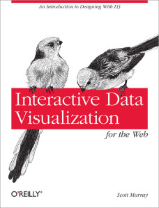
Next in my book reading, I turn to Interactive Data Visualisation for the web by Scott Murray (@alignedleft on twitter). This book covers the d3 JavaScript library for data visualisation, written by Mike Bostock who was also responsible for the Protovis library.  If you’d like a taster of the book’s content, a number of the examples can also be found on the author’s website.

The book is largely aimed at web designers who are looking to include interactive data visualisations in their work. It includes some introductory material on JavaScript, HTML, and CSS, so has some value for programmers moving into web visualisation. I quite liked the repetition of this relatively basic material, and the conceptual introduction to the d3 library.

I found the book rather slow: on page 197 – approaching the final fifth of the book – we were still making a bar chart. A smaller effort was expended in that period on scatter graphs. As a data scientist, I expect to have several dozen plot types in that number of pages! This is something of which Scott warns us, though. d3 is a visualisation framework built for explanatory presentation (i.e. you know the story you want to tell) rather than being an exploratory tool (i.e. you want to find out about your data). To be clear: this “slowness” is not a fault of the book, rather a disjunction between the book and my expectations.

From a technical point of view, d3 works by binding data to elements in the DOM for a webpage. It’s possible to do this for any element type, but practically speaking only Scaleable Vector Graphics (SVG) elements make real sense. This restriction means that d3 will only work for more recent browsers. This may be a possible problem for those trapped in some corporate environments. The library contains a lot of helper functions for generating scales, loading up data, selecting and modifying elements, animation and so forth. d3 is low-level library; there is no PlotBarChart function.

Achieving the static effects demonstrated in this book using other tools such as R, Matlab, or Python would be a relatively straightforward task. The animations, transitions and interactivity would be more difficult to do. More widely, the d3 library supports the creation of hierarchical visualisations which I would struggle to create using other tools.

This book is quite a basic introduction, you can get a much better overview of what is possible with d3 by looking at the API documentation and the Gallery. Scott lists quite a few other resources including a wide range for the d3 library itself, systems built on d3, and alternatives for d3 if it were not the library you were looking for.

I can see myself using d3 in the future, perhaps not for building generic tools but for custom visualisations where the data is known and the aim is to best explain that data. Scott quotes Ben Schniederman on this regarding the structure of such visualisations:

overview first, zoom and filter, then details on demand

Book review: Data Visualization: a successful design process by Andy Kirk

datavisualization_andykirk

This post was first published at ScraperWiki.

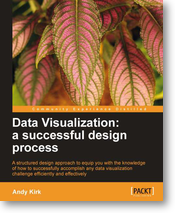
My next review is of Andy Kirk’s book Data Visualization: a successful design process. Those of you on Twitter might know him as @visualisingdata, where you can follow his progress around the world as he delivers training. He also blogs at Visualising Data.

Previously in this area, I’ve read Tufte’s book The Visual Display of Quantitative Information and Nathan Yau’s Visualize ThisTufte’s book is based around a theory of effective visualisation whilst Visualize This is a more practical guide featuring detailed code examples. Kirk’s book fits between the two: it contains some material on the more theoretical aspects of effective visualisation as well as an annotated list of software tools; but the majority of the book covers the end-to-end design process.

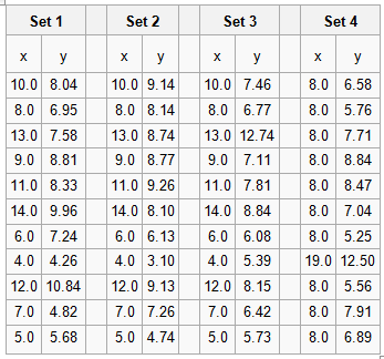
Data Vizualisation introduced me to Anscombe’s Quartet. The Quartet is four small datasets, eleven (x,y) coordinate pairs in each. The Quartet is chosen so the common statistical properties (e.g. mean values of x and y, standard deviations for same, linear regression coefficients) for each set are identical, but when plotted they look very different. The numbers are shown in the table below.

anscombesdata

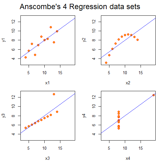
Plotted they look like this:

anscombequartetAside from set 4, the numbers look unexceptional. However, the plots look strikingly different. We can easily classify their differences visually, despite the sets having the same gross statistical properties. This highlights the power of visualisation. As a scientist, I am constantly plotting the data I’m working on to see what is going on and as a sense check: eyeballing columns of numbers simply doesn’t work. Kirk notes that the design criteria for such exploratory visualisations are quite different from those highlighting particular aspects of a dataset, more abstract “data art” presentations, or a interactive visualisations prepared for others to use.

In contrast to the books by Tufte and Yau, this book is much more about how to do data visualisation as a job. It talks pragmatically about getting briefs from the client and their demands. I suspect much of this would apply to any design work.

I liked Kirk’s “Eight Hats of data visualisation design” metaphor; which name the skills a visualiser requires: Initiator, Data Scientist, Journalist, Computer Scientist, Designer, Cognitive Scientist, Communicator and Project Manager. In part, this covers what you will require to do data visualisation, but it also gives you an idea of whom you might turn to for help  –  someone with the right hat.

The book is scattered with examples of interesting visualisations, alongside a comprehensive taxonomy of chart types. Unsurprisingly, the chart types are classified in much the same way as statistical methods: in terms of the variable categories to be displayed (i.e. continuous, categorical and subdivisions thereof). There is a temptation here though: I now want to make a Sankey diagram… even if my data doesn’t require it!

In terms of visualisation creation tools, there are no real surprises. Kirk cites Excel first, but this is reasonable: it’s powerful, ubiquitous, easy to use and produces decent results as long as you don’t blindly accept defaults or get tempted into using 3D pie charts. He also mentions the use of Adobe Illustrator or Inkscape to tidy up charts generated in more analysis-oriented packages such as R. With a programming background, the temptation is to fix problems with layout and design programmatically which can be immensely difficult. Listed under programming environments is the D3 Javascript library, this is a system I’m interested in using  –  having had some fun with Protovis, a D3 predecessor.

Data Visualization works very well as an ebook. The figures are in colour (unlike the printed book) and references are hyperlinked from the text. It’s quite a slim volume which I suspect compliments Andy Kirk’s “in-person” courses well.

Enterprise data analysis and visualization

This post was first published at ScraperWiki.

The topic for today is a paper[1] by members of the Stanford Visualization Group on interviews with data analysts, entitled “Enterprise Data Analysis and Visualization: An Interview Study”. This is clearly relevant to us here at ScraperWiki, and thankfully their analysis fits in with the things we are trying to achieve.

The study is compiled from interviews with 35 data analysts across a range of business sectors including finance, health care, social networking, marketing and retail. The respondents are harvested via personal contacts and predominantly from Northern California; as such it is not a random sample, we should consider results to be qualitatively indicative rather than quantitatively accurate.

The study identifies three classes of analyst whom they refer to as Hackers, Scripters and Application Users. The Hacker role was defined as those chaining together different analysis tools to reach a final data analysis. Scripters, on the other hand, conducted most of their analysis in one package such as R or Matlab and were less likely to scrape raw data sources. Scripters tended to carry out more sophisticated analysis than Hackers, with analysis and visualisation all in the single software package. Finally, Application Users worked largely in Excel with data supplied to them by IT departments. I suspect a wider survey would show a predominance of Application Users and a relatively smaller relative population of Hackers.

The authors divide the process of data analysis into 5 broad phases Discovery – Wrangle – Profile – Model – Report. These phases are generally self explanatory – wrangling is the process of parsing data into a format suitable for further analysis and profiling is the process of checking the data quality and establishing fully the nature of the data.

This is all summarised in the figure below, each column represents an individual so we can see in this sample that Hackers predominate.

table

At the bottom of the table are identified the tools used, divided into database, scripting and modeling types. Looking across the tools in use SQL is key in databases, Java and Python in scripting, R and Excel in modeling. It’s interesting to note here that even the Hackers make quite heavy use of Excel.

The paper goes on to discuss the organizational and collaborative structures in which data analysts work, frequently an IT department is responsible for internal data sources and the productionising of analysis workflows.

Its interesting to highlight the pain points identified by interviewees and interviewers:

  • scripts and intermediate data not shared;
  • discovery and wrangling are time consuming and tedious processes;
  • workflows not reusable;
  • ingesting semi-structured data such as log files is challenging.

Why does this happen? Typically the wrangling scraping phase of the operation is ad hoc, the scripts used are short, practioners don’t see this as their core expertise and they’ll typically draw from a limited number of data sources meaning there is little scope to build generic tools. Revision control tends not to be used, even for the scripting tools where it is relatively straightforward perhaps because practioners have not been introduced to revision control or simply see the code they write as too insignificant to bother with revision control.

ScraperWiki has its roots in data journalism, open source software and community action but the tools we build are broadly applicable, as one of the respondents to the survey said:

“An analyst at a large hedge fund noted their organization’s ability to make use of publicly available but poorly-structured data was their primary advantage over competitors.”

References

[1] S. Kandel, A. Paepcke, J. M. Hellerstein, and J. Heer, “Enterprise Data Analysis and Visualization : An Interview Study,” IEEE Trans. Vis. Comput. Graph., vol. 18(12), (2012), pp. 2917–2926.