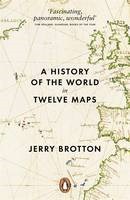
 As a fan of maps, I was happy to add A History of the World in Twelve Maps by Jerry Brotton to my shopping basket (I bought it as part of a reduced price multi-buy deal in an actual physical book shop).
A History traces history through the medium maps, various threads are developed through the book: what did people call the things we now call maps? what were they trying to achieve with their maps? what geography was contained in the maps? what technology was used to make the maps?
I feel the need to explicitly list, and comment on, the twelve maps of the title:
1. Ptolemy’s Geography 150 AD, distinguished by the fact that it probably contained no maps. Ptolemy wrote about the geography of the known world in his time, and amongst this he collated a list of locations which could be plotted on a flat map using one of two projection algorithms. A projection method converts (or projects) the real life geography of the spherical earth onto the 2D plane of a flat map. Project methods are all compromises, it is impossible to simultaneously preserve relative directions, areas and lengths when making the 3D to 2D transformation. The limitation of the paper and printing technology to hand meant that Ptolemy was not able to realise his map. Also the relatively small size of the known world meant that projection was not a pressing problem. The Geography exists through copies created long after the original was written.
2. Al-idrisi’s Entertainment, 1154AD. The Entertainment is not just a map, it is a description of the world as it was known at the time. This was the early pinnacle in terms of the realisation of the roadmap laid out by Ptolemy. Al-Idrisi, a Muslim nobelman, made the Entertainment for a Christian Sicilian king. It draws on both Christian and Muslim sources to produce a map which will look familiar to modern eyes (except for being upside down). There is some doubt as to exactly which map was included in the Entertainment since no original intact copies exist.
3. Hereford Mappamundi, 1300AD this is the earliest original map in the book but in many ways it is a step backward in terms of the accuracy of its representation of the world. Rather than being a geography for finding places it is a religious object placing Jerusalem at the top and showing viewers scenes of pilgrimage and increasing depravity as one moves away from salvation. It follows the T-O format which was common among such mappmundi.
4. Kangnido world map, 1402AD. To Western eyes this is a map from another world: Korea, again it only exists in copies but not that distant from the original. Here we see strongly the influence of the neighbouring China. The map is about administration and bureaucracy (and contains errors thought to have been added to put potential invaders off the scent). An interesting snippet is that the Chinese saw the nonogram (a square made of 9 squares) as the perfect form – in a parallel with the Greek admiration for the circle. The map also contains elements of geomancy, which was important to the Koreans.
5. Waldseemuller world map, 1507AD. This is the first printed map, it hadn’t really struck me before but printing has a bigger impact than simply price and availability when compared to manuscripts. Printed books allow for all sorts of useful innovations such as pagination, indexes, editions and so forth which greatly facilitate scholarly learning. With manuscripts stating that something is on page 101 of you handwritten manuscript is of little use to someone else with his handwritten copy of the same original manuscript. The significance of the Waldseemuller map is that it is the first European map to name America, it applies the label to the south but it is sometimes seen as the “birth certificate” of the USA. Hence the US Library of Congress recently bought it for $10 million.
6. Diogo Ribeiro, world map, 1529AD. A map to divide the world between the Spanish and Portuguese, who had boldly signed a treaty dividing the world into two hemispheres with them to own one each. The problem arose on the far side of the world, where it wasn’t quite clear where the lucrative spice island of Moluccas lay.
7. Gerard Mercator world map, 1569AD. I wrote about Mercator a while back, in reviewing The World of Gerard Mercator by Andrew Taylor. The Mercator maps are important for several reasons, they introduce new technology in the form of copperplate rather than woodcut printing, copperplate printing enables italic script, rather than the Gothic script that is used in woodcut printing; they make use of the newly developed triangulation method of surveying (in places); the Mercator projection is one of several methods developed at the time for placing a spherical world onto a flat map – it is the one that maintained – despite limitations.And finally he brought the Atlas to the world – a book of maps.
8. Joan Blaeu Atlas maier, 1662. Blaeu was chief cartography for the Dutch East India Company (VOC), and used the mapping data his position provided to produce the most extravagant atlases imaginable. They combined a wide variety of previously published maps with some new maps and extensive text. These were prestige objects purchased by wealthy merchants and politicians.
9. Cassini Family, map of France, 1793. The Cassini family held positions in the Paris Observatory for four generations, starting in the late 17th Century when the first geodesic studies were conducted, these were made to establish the shape of the earth, rather than map it’s features. I reviewed The Measure of the Earth by Larry D. Ferriero which related some of this story. Following on from this the French started to carry systematic triangulation surveys of all of France. This was the first time the technique had been applied at such scale, and was the forbearer to the British Ordnance Survey, the origins of which are described in Map of a Nation by Rachel Hewitt. The map had the secondary effect of bringing together France as a nation, originally seen by the king as a route to describing his nation (and possibly taxing it), for the first time Parisian French was used to describe all of the country and each part was mapped in an identical manner.
10. The Geographical Pivot of History, Halford Mackinder, 1904. In a way the Cassini map represents the pinnacle of the technical craft of surveying. Mackinder’s intention was different, he used his map to persuade. He had long promoted the idea of geography as a topic for serious academic study and in 1904 he used his map to press his idea of central Asia as being central to the politics and battle for resources in the world. He used a map to present this idea, its aspect and details crafted to reinforce his argument.
11. The Peters Projection, 1973. Following the theme of map as almost-propaganda the Peters projection – an attempted equal-area projection – shows a developing world much larger than we are used to in the Mercator projection. Peters attracted the ire of much of the academic cartographic communities, partly because his projection is nothing new but also because he promoted it as being the perfect, objective map when, in truth it was nothing of the kind. This is sort of the point of the Peters projection, it is open to criticism but highlights that the decisions made about the technical aspects of a map have a subjective weight. Interestingly, many non-governmental organisations took to using the Peters projection because it served their purpose of emphasising the developing world.
12. Google Earth, 2012. The book finishes with a chapter on Google Earth, initially on the technical innovations required to make such a map but then moving on to the wider commercial implications. Brotton toys with the idea that Google Earth is somehow “other“ from previous maps in its commercial intent and the mystery of its methods, this seems wrong to me. A number of the earlier maps he discusses were of limited circulation and one does not get the impression that methods were shared generously. Brotton makes no mention of the Openstreetmap initiative that seems to address these concerns.
In the beginning I found the style of A History a little dry and academic but once I’d got my eye in it was relatively straightforward reading. I liked the broader subject matter, and greater depth than some of my other history of maps reading.


