This time last year we had a photovoltaic solar power system installed, a few years after we had a thermal solar system installed. This post is an update on how we’ve got on with the photovoltaic solar system. This is facilitated by my weekly collection of electric, solar and gas meter readings – I suspect this data collection is a bit of a minority sport. A couple of months ago the company that the installed the system did offer me a fancy monitoring system… which cost about £1500!
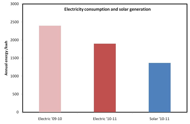
As my earlier blog post highlights the calculated output for our system, given the latitude and orientation of our roof and the peak capacity of our system is 1393kwh per year. The first meter reading was on 28th August 2010, as of 25th August 2011 the reading is 1362.9kwh. So the measured output is 98.5% of the predicted output – not bad at all! Our import from the grid for the same period was 1896.2kwh compared with an annual consumption of 2397.5kwh in the previous year. So a 20% reduction in consumption and generation of 57% of our pre-installation level. The difference here is because our peak generation (mid-late morning) does not match our peak usage (early evening), since we can’t store any electricity the excess goes onto the grid. These figures are illustrated graphically below:
We receive the feed-in tariff and payments for exported electricity from our supplier, npower. This seems to be a small scale operation since to set this up you interact with named individuals who don’t change! So far we’ve received two cheques from them for £105.29 for the period 16/9/10-04/03/11 and £174.38 for the period 4/3/11-21/5/11. I should probably go prod them about whether they want another meter reading.
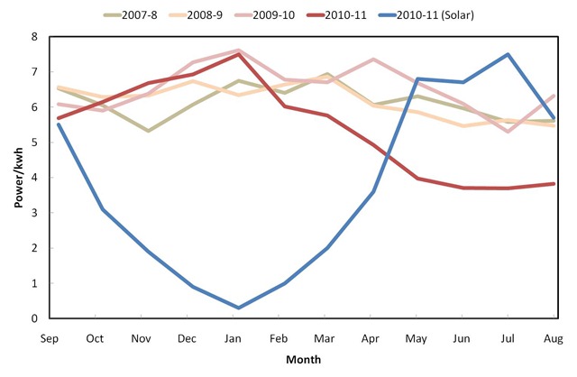
We can dig a little deeper into the data, below I show our monthly electricity consumption (red/green lines) from the grid for the last few years along with the last year of solar generation (the blue line).
 Our electricity consumption has been fairly constant through the year with a hint of an increase during the deep winter months due to the shortening days and an increased use of electric lighting. Since about March this year our electricity consumption has been significantly reduced compared to previous years, offset by our solar generation. This pattern wasn’t maintained in the September / October / November last year – I think because I was at home (using electricity) for an extended period following an operation.
The amount of solar generation varies smoothly through the winter months but seems to plateau during the summer. We did have a week of zero generation when the panels were covered in snow. I suspect in principle that the average power generation will vary sinusoidally through the year, since the variation in day length is sinusoidal, but that this can disturbed by “weather”, in particular the figure for May includes the very sunny Easter period without this boost the curve would have varied smoothly through the summer rather than plateauing.
In summary: we’ve generated almost exactly the amount of solar electricity we anticipated which amounts to nearly 60% of our annual consumption of electricity.


6 comments
Skip to comment form
Hi.
I’d picked up on your original post when the system was installed; I’m delighted that your 12 month update has justified the investment. As a PV panel 1st year virgin, (our system was installed in June 2011) I’d be interested in your thoughts on the relationship between daylight hours and the output from the system. On my blog http://www.solarpowerdiary.co.uk/p/installation-costs-comments.html I’ve charted the projected output each month based on monthly daylight hour percentages. To date we’ve exceeded the prediction, but based on your experience does it seem a reasonable way to project output? Obviously, I take your point that weather can affect any predictions.
Best regards
Icarus..
PS. I love the graphs displayed on your page. I have to resort to remote Excel sheets to display my readings, is this something thats easy to replicate on my website?
Hi Ian,
I think day length is a pretty good first approximation but the incidence angle will change with day length too so on average you’d expect straight day length to over estimate in summer and under estimate in winter.
The graphs are actually exports from Excel 2007! You could probably do something nice with one of the javascript graphing libraries (Google Chart API or protovis) to make a proper online system I’m not sure Blogger, which you use for your site, is flexible enough for this approach to work.
I suspect it’s not a minority sport – my husband is an obsessive data-collector for our solar panels, too. It’s actually quite a relief to see that he’s not the only one! One thing I found interesting is that the panels perform better when the weather is not too hot. Although perhaps that’s not such as issue in the UK as it is here in Ontario with a continental climate…
This is a relief for me too! I was brought up in a household where the petrol consumption for the car was recorded in a little book in the glove compartment, so I have a distorted view of “normal behaviour”.
The weather here is permanently “not too hot”!
Very interesting! I want to get these. For one thing it would be the ideal incentive to clear out our very cluttered loft. I’m going to send a link to my husband now to see what he says. Thanks Ian.
No problem! The electrical engineering gear in the loft sits on a board which is about 1mx1m with some trunking beneath that, the panels and their mounts don’t really impinge at all.