Category: Book Reviews

Reviews of books featuring a summary of the book and links to related material

Pevsner Architectural Guide – Liverpool by Joseph Sharples

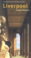
Pevsner-LiverpoolI reach Pevsner’s Architectural Guide – Liverpool (additional material Joseph Sharples) by a somewhat winding route: I take the Merseyrail train to Liverpool; my normal route is changed and I must walk across the city; it turns out the buildings are spectacular; I take photos and then I want to know what I have photoed. This is where the Pevsner Guide enters the picture.

Sir Nickolaus Pevsner was a German born art historian who moved to the UK in 1933, he felt that the academic study of architecture in Britain was lacking, and furthermore there were was no convenient source of information on the many and wondrous buildings of the country. In 1945 he proposed a series of books: Buildings of England to address this lack. The series ultimately ran to 46 volumes, 32 written by Pevsner, a further 10 which he co-authored and 4 written by others.

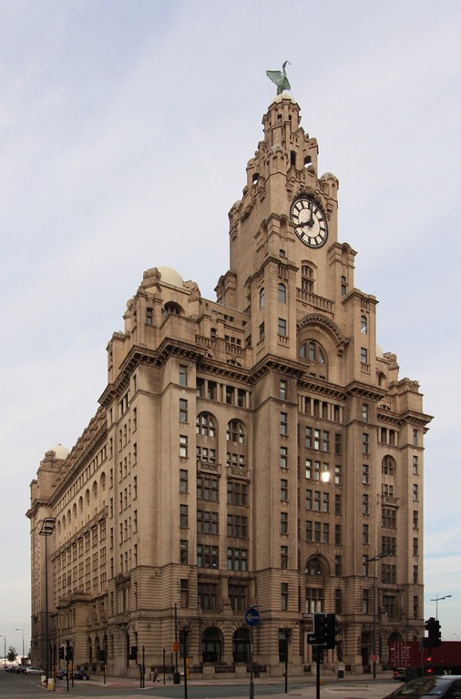
This Guide – Liverpool is a city specific reworking of the original guides. The book is large-pocket sized, well produced with a fair number of images. It starts with an overview of the history of Liverpool. I have to admit, shame-faced, that I was woefully ignorant of the city I now work in. For nearly 10 years I have lived just down the line in Chester, and yet I had visited Liverpool a handful of times, in the evening for works dinners. My perceptions of Liverpool are coloured by the time I grew up, in the 1980s, when Liverpool was host to riots in the Toxteth area of the city, mass unemployment and far-left politics. Walking around now what I see is completely at odds with my perceptions, you can see in my earlier post. To add some decoration to this post, below is the Royal Liver Building, one of the Three Graces, built on the waterfront at the beginning of the 20th century.

Royal Liver Building, corrected

Royal Liver Building, wide angle view with perspective “correction” applied

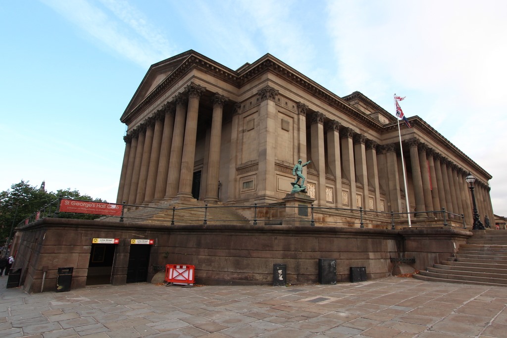
And St George’s Hall:

St George's Hall

St George’s Hall

Liverpool has long been Britain’s second port and probably has a strong claim for second city status (both following London). Initially it grew through exporting Cheshire salt, than as part of the triangle route carrying slaves, then as a point of exit for Britain’s manufactured goods and finally as a passenger terminus. Liverpool is not blessed with the best of conditions for shipping, this meant it was an early pioneer of gated docks. This was significant engineering work, only possible through the collective action of the city Corporation. It’s worth noting that one of the first railways in Britain was between Liverpool and Manchester, providing a link between the manufacturing centre and the port. Liverpool remained preeminent until the sixties when British manufacturing declined, and shipping became containerized, much reducing the labour required. It had no “second fiddle” so with the loss of shipping it went into rapid decline.

Nowadays Liverpool is making a resurgence, the fine buildings from its early high water mark are joined by some excellent new ones.

After a historical overview the Guide covers six major buildings / areas of the city: the Town Hall (dating to mid 18th century and the oldest major building in the city), St George’s Hall and the Plateau (up by Liverpool Lime Street Station); the William Brown Street Group and St. John’s Gardens; Pier Head where the outstanding Three Graces are to be found and finally the two cathedrals (Anglican and Catholic) both built in the 20th century. The majority of the buildings date from the latter half of the 19th century and early 20th century, the burgeoning wealth of the city having little time for preserving the relatively meagre past. The city suffered significant bombing during the Second World War, as a result of its importance as a port.

After the major buildings the remainder of the the Guide is broken down into a set of 10 walks around the central area of the city, spanning a few miles with an interlude covering the city centre. I’d spotted the grand building of the Marks & Spencer store in the centre of town on my previous perambulations, it is in fact Compton House (see below) built as one of the earliest department stores in 1867.


35 Church Street, Marks and Spencer

Compton House, Church Street


As a bonus the book finishes with three short pieces from areas outside the city: Speke Hall, Port Sunlight and Hamilton Square.

The Pevsner Guides are not really designed to be read sitting on the train, as I did, they are to be held as you walk around with a map. Despite the relatively large number of photos it doesn’t feel like enough, I was frustrated by reading the words but not being able to see the buildings. I think a few more walks with the camera are in order.

The Guide is a staccato recounting of what you can see, listing locations, architectural features, architects and the occasion blunt opinion, this is his comment on the re-development of the Prince’s Dock:

“The results so far, though, are inadequate. The architecture is both bland and overly fussy”

It feels like an excellent opportunity for a smartphone app. The current publishers seem a bit bewildered by this newfangled app world and have produced a digital companion in the form of a glossary of architectural terms. Elsewhere someone is selling a database of all of the Pevsner entries, the Guide is a database rendered in prose form.

It seems the components are there for a Pevsner App, who is with me in making it happen?

Footnote

Here‘s a Google Map of the Major Buildings from the Guide.

Book review: The Tableau 8.0 Training Manual – From clutter to clarity by Larry Keller

Tableau 8.0 Training Manual

This review was first published at ScraperWiki.

My unstoppable reading continues, this time I’ve polished off The Tableau 8.0 Training Manual: From Clutter to Clarity by Larry Keller. This post is part review of the book, and part review of Tableau.

Tableau is a data visualisation application which grew out of academic research on visualising databases. I’ve used Tableau Public a little bit in the past. Tableau Public is a free version of Tableau which only supports public data i.e. great for playing around with but not so good for commercial work. Tableau is an important tool in the business intelligence area, useful for getting a quick view on data in databases and something our customers use, so we are interested in providing Tableau integration with the ScraperWiki platform.

The user interface for Tableau is moderately complex, hence my desire for a little directed learning. Tableau has a pretty good set of training videos and help pages online but this is no good to me since I do a lot of my reading on my commute where internet connectivity is poor.

Tableau is rather different to the plotting packages I’m used to using for data analysis. This comes back to the types of data I’m familiar with. As someone with a background in physical sciences I’m used to dealing with data which comprises a couple of vectors of continuous variables. So for example, if I’m doing spectroscopy then I’d expect to get a pair of vectors: the wavelength of light and the measured intensity of light at those wavelengths. Things do get more complicated than this, if I were doing a scattering experiment then I’d get an intensity and a direction (or possibly two directions). However, fundamentally the data is relatively straightforward.

Tableau is crafted to look at mixtures of continuous and categorical data, stored in a database table. Tableau comes with some sample datasets, one of which is sales data from superstores across the US which illustrates this well. This dataset has line entries of individual items sold with sale location data, product and customer (categorical) data alongside cost and profit (continuous) data. It is possible to plot continuous data but it isn’t Tableau’s forte.

Tableau expects data to be delivered in “clean” form, where “clean” means that spreadsheets and separated value files must be presented with a single header line with columns which contain data all of the same type. Tableau will also connect directly to a variety of databases. Tableau uses the Microsoft JET database engine to store it’s data, I know this because for some data unsightly wrangling is required to load data in the correct format. Once data is loaded Tableau’s performance is pretty good, I’ve been playing with the MOT data which is 50,000,000 or so lines, which for the range of operations I tried turned out to be fairly painless.

Turning to Larry Keller’s book, The Tableau 8.0 Training Manual: From Clutter to Clarity, this is one of few books currently available relating to the 8.0 release of Tableau. As described in the title it is a training manual, based on the courses that Larry delivers. The presentation is straightforward and unrelenting; during the course of the book you build 8 Tableau workbooks, in small, explicitly described steps. I worked through these in about 12 hours of screen time, and at the end of it I feel rather more comfortable using Tableau, if not expert. The coverage of Tableau’s functionality seems to be good, if not deep – that’s to say that as I look around the Tableau interface now I can at least say “I remember being here before”.

Some of the Tableau functionality I find a bit odd, for example I’m used to seeing box plots generated using R, or similar statistical package. From Clutter to Clarity shows how to make “box plots” but they look completely different. Similarly, I have a view as to what a heat map looks like and the Tableau implementation is not what I was expecting.

Personally I would have preferred a bit more explanation as to what I was doing. In common with Andy Kirk’s book on data visualisation I can see this book supplementing the presented course nicely, with the trainer providing some of the “why”. The book comes with some sample workbooks, available on request – apparently directly from the author whose email response time is uncannily quick.

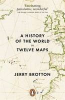
Book review: A history of the world in twelve maps by Jerry Brotton

HistoryOfTheWorldInTwelveMapsAs a fan of maps, I was happy to add A History of the World in Twelve Maps by Jerry Brotton to my shopping basket (I bought it as part of a reduced price multi-buy deal in an actual physical book shop).

A History traces history through the medium maps, various threads are developed through the book: what did people call the things we now call maps? what were they trying to achieve with their maps? what geography was contained in the maps? what technology was used to make the maps?

I feel the need to explicitly list, and comment on, the twelve maps of the title:

1. Ptolemy’s Geography 150 AD, distinguished by the fact that it probably contained no maps. Ptolemy wrote about the geography of the known world in his time, and amongst this he collated a list of locations which could be plotted on a flat map using one of two projection algorithms. A projection method converts (or projects) the real life geography of the spherical earth onto the 2D plane of a flat map. Project methods are all compromises, it is impossible to simultaneously preserve relative directions, areas and lengths when making the 3D to 2D transformation. The limitation of the paper and printing technology to hand meant that Ptolemy was not able to realise his map. Also the relatively small size of the known world meant that projection was not a pressing problem. The Geography exists through copies created long after the original was written.

2. Al-idrisi’s Entertainment, 1154AD. The Entertainment is not just a map, it is a description of the world as it was known at the time. This was the early pinnacle in terms of the realisation of the roadmap laid out by Ptolemy. Al-Idrisi, a Muslim nobelman, made the Entertainment for a Christian Sicilian king. It draws on both Christian and Muslim sources to produce a map which will look familiar to modern eyes (except for being upside down). There is some doubt as to exactly which map was included in the Entertainment since no original intact copies exist.

3. Hereford Mappamundi, 1300AD this is the earliest original map in the book but in many ways it is a step backward in terms of the accuracy of its representation of the world. Rather than being a geography for finding places it is a religious object placing Jerusalem at the top and showing viewers scenes of pilgrimage and increasing depravity as one moves away from salvation. It follows the T-O format which was common among such mappmundi.

4. Kangnido world map, 1402AD. To Western eyes this is a map from another world: Korea, again it only exists in copies but not that distant from the original. Here we see strongly the influence of the neighbouring China. The map is about administration and bureaucracy (and contains errors thought to have been added to put potential invaders off the scent). An interesting snippet is that the Chinese saw the nonogram (a square made of 9 squares) as the perfect form – in a parallel with the Greek admiration for the circle. The map also contains elements of geomancy, which was important to the Koreans.

5. Waldseemuller world map, 1507AD. This is the first printed map, it hadn’t really struck me before but printing has a bigger impact than simply price and availability when compared to manuscripts. Printed books allow for all sorts of useful innovations such as pagination, indexes, editions and so forth which greatly facilitate scholarly learning. With manuscripts stating that something is on page 101 of you handwritten manuscript is of little use to someone else with his handwritten copy of the same original manuscript. The significance of the Waldseemuller map is that it is the first European map to name America, it applies the label to the south but it is sometimes seen as the “birth certificate” of the USA. Hence the US Library of Congress recently bought it for $10 million.

6. Diogo Ribeiro, world map, 1529AD. A map to divide the world between the Spanish and Portuguese, who had boldly signed a treaty dividing the world into two hemispheres with them to own one each. The problem arose on the far side of the world, where it wasn’t quite clear where the lucrative spice island of Moluccas lay.

7. Gerard Mercator world map, 1569AD. I wrote about Mercator a while back, in reviewing The World of Gerard Mercator by Andrew Taylor. The Mercator maps are important for several reasons, they introduce new technology in the form of copperplate rather than woodcut printing, copperplate printing enables italic script, rather than the Gothic script that is used in woodcut printing; they make use of the newly developed triangulation method of surveying (in places); the Mercator projection is one of several methods developed at the time for placing a spherical world onto a flat map – it is the one that maintained – despite limitations.And finally he brought the Atlas to the world – a book of maps.

8. Joan Blaeu Atlas maier, 1662. Blaeu was chief cartography for the Dutch East India Company (VOC), and used the mapping data his position provided to produce the most extravagant atlases imaginable. They combined a wide variety of previously published maps with some new maps and extensive text. These were prestige objects purchased by wealthy merchants and politicians.

9. Cassini Family, map of France, 1793. The Cassini family held positions in the Paris Observatory for four generations, starting in the late 17th Century when the first geodesic studies were conducted, these were made to establish the shape of the earth, rather than map it’s features. I reviewed The Measure of the Earth  by Larry D. Ferriero which related some of this story. Following on from this the French started to carry systematic triangulation surveys of all of France. This was the first time the technique had been applied at such scale, and was the forbearer to the British Ordnance Survey, the origins of which are described in Map of a Nation by Rachel Hewitt. The map had the secondary effect of bringing together France as a nation, originally seen by the king as a route to describing his nation (and possibly taxing it), for the first time Parisian French was used to describe all of the country and each part was mapped in an identical manner.

10. The Geographical Pivot of History, Halford Mackinder, 1904. In a way the Cassini map represents the pinnacle of the technical craft of surveying. Mackinder’s intention was different, he used his map to persuade. He had long promoted the idea of geography as a topic for serious academic study and in 1904 he used his map to press his idea of central Asia as being central to the politics and battle for resources in the world. He used a map to present this idea, its aspect and details crafted to reinforce his argument.

11. The Peters Projection, 1973. Following the theme of map as almost-propaganda the Peters projection – an attempted equal-area projection – shows a developing world much larger than we are used to in the Mercator projection. Peters attracted the ire of much of the academic cartographic communities, partly because his projection is nothing new but also because he promoted it as being the perfect, objective map when, in truth it was nothing of the kind. This is sort of the point of the Peters projection, it is open to criticism but highlights that the decisions made about the technical aspects of a map have a subjective weight. Interestingly, many non-governmental organisations took to using the Peters projection because it served their purpose of emphasising the developing world.

12. Google Earth, 2012. The book finishes with a chapter on Google Earth, initially on the technical innovations required to make such a map but then moving on to the wider commercial implications. Brotton toys with the idea that Google Earth is somehow “other“ from previous maps in its commercial intent and the mystery of its methods, this seems wrong to me. A number of the earlier maps he discusses were of limited circulation and one does not get the impression that methods were shared generously. Brotton makes no mention of the Openstreetmap initiative that seems to address these concerns.

In the beginning I found the style of A History a little dry and academic but once I’d got my eye in it was relatively straightforward reading. I liked the broader subject matter, and greater depth than some of my other history of maps reading.

Book review: The Subterranean Railway by Christian Wolmar

large-the-subterranean-railwayTo me the London underground is an almost magically teleportation system which brings order to the chaos of London. This is because I rarely visit London and know it only via Harry Beck’s circuit diagram map of the underground. To find out more about the teleporter, I have read The Subterranean Railway by Christian Wolmar.

London’s underground system was the first in the world, it predated any others by nearly 40 years. This had some drawbacks, for the first 30 years of its existence it ran exclusively using steam engines which are not good in an enclosed, underground environment. In fact travel in the early years of the Underground sounds really rather grim, despite its success.

The context for the foundation of the Underground was the burgeoning British rail network, it had started with one line between Manchester and Liverpool in 1830 by 1850 the country had a system spanning the country. The network did not penetrate to the heart of London, it had been stopped by a combination of landowner interests and expense. This exclusion was enshrined in the report of the 1846 Royal Commission on Metropolis Railway Termini. This left London with an ever-growing transport problem, now increased by the railway’s ability to get people to the perimeter of the city but no further.

The railways were the largest human endeavours since Roman times, as well as the engineering challenges there were significant financial challenges in raising capital and political challenges in getting approval. This despite the fact the the railway projectors were exempted from the restrictions on raising capital from groups of more than five people introduced after the South Seas Bubble.

The first underground line, the Metropolitan, opened in 1863 it ran from Paddington to Farringdon – it had been 20 years in the making, although construction only took 3 years. The tunnels were made by the cut-and-cover method, which works as described – a large trench is dug, the railway built in the bottom and then covered over. This meant the tunnels were relatively shallow, mainly followed the line of existing roads and involved immense disruption on the surface.

In 1868 the first section of the District line opened, this was always to be the Metropolitan’s poorer relative but would form part of the Circle line, finally completed in 1884 despite the animosity between James Staats Forbes and Edward Watkin – the heads of the respective companies at the time. It’s worth noting that it wasn’t until 1908 that the first London Underground maps were published; in its early days the underground “system” was the work of disparate private companies who were frequently at loggerheads and certainly not focussed on cooperating to the benefit of their passengers.

The underground railways rarely provided the returns their investors were looking for but they had an enormous social impact, for the first time poorer workers in the city could live out of town in relatively cheap areas and commute in, the railway companies positively encouraged this. The Metropolitan also invested in property in what are now the suburbs of London, areas such as Golders Green were open fields before the underground came. This also reflects the expansion of the underground into the surrounding country.

The first deep line, the City and South London was opened in 1890, it was also the first electric underground line. The deep lines were tunnelled beneath the city using the tunnelling shield developed by Marc Brunel, earlier in the 19th century. Following the first electrification the District and Metropolitan lines eventually electrified their lines, although it took some time (and a lot of money). The finance for the District line came via the American Charles Tyson Yerkes, who would generously be described as a colourful character, engaging in financial engineering which we likely imagine is a recent invention.

Following the First World War the underground was tending towards a private monopoly, government was looking to invest to make work and ultimately the underground was nationalised, at arms length, to form London Transport in 1933, led by the same men (Lord Ashfield and Frank Pick) who had run the private monopoly.

The London underground reached its zenith in the years leading up to the Second World War, gaining its identity (roundel, font and iconic map) and forming a coherent, widespread network. After the war it was starved of funds, declining – overtaken by the private car. Further lines were added such as the Victoria and Jubilee lines but activity was much reduced from the early years.

More recently it has seen something of a revival with the ill-fated Public-Private Partnership running into the ground, but not before huge amounts of money had been spent, substantially on improvements. As I write, the tunnelling machines are building Crossrail.

I felt the book could have done with a construction timeline, something like this on wikipedia (link), early on there seems to be a barrage of new line openings, sometimes not in strictly chronological order and to someone like me, unfamiliar with London it is all a bit puzzling. Despite this The Subterranean Railway is an enjoyable read.

Book Review: Clean Code by Robert C. Martin

Clean Code Bookcover

This review was first published at ScraperWiki.

Following my revelations regarding sharing code with other people I thought I’d read more about the craft of writing code in the form of Clean Code: A Handbook of Agile Software Craftmanship by Robert C. Martin.

Despite the appearance of the word Agile in the title this isn’t a book explicitly about a particular methodology or technology. It is about the craft of programming, perhaps encapsulated best by the aphorism that a scout always leaves a campsite tidier than he found it. A good programmer should leave any code they touch in a better state than they found it. Martin has firm ideas on what “better” means.

After a somewhat sergeant-majorly introduction in which Martin tells us how hard this is all going to be, he heads off into his theme.

Martin doesn’t like comments, he doesn’t like switch statements, he doesn’t like flag arguments, he doesn’t like multiple arguments to functions, he doesn’t like long functions, he doesn’t like long classes, he doesn’t like Hungarian* notation, he doesn’t like output arguments…

This list of dislikes generally isn’t unreasonable; for example comments in code are in some ways an anachronism from when we didn’t use source control and were perhaps limited in the length of our function names. The compiler doesn’t care about the comments and does nothing to police them so comments can be actively misleading (Guilty, m’lud). Martin prefers the use of descriptive function and variable names with a clear hierarchical structure to the use of comments.

The Agile origins of the book are seen with the strong emphasis on testing, and Test Driven Development. As a new convert to testing I learnt a couple of things here: clearly written tests being as important as clearly written code, the importance of test coverage (how much of you code is exercised by tests).

I liked the idea of structuring functions in a code file hierarchically and trying to ensure that each function operates at a single layer of abstraction, I’m fairly sold on the idea that a function should do one thing, and one thing only. Although to my mind the difficulty is in the definition of “thing”.

It seems odd to use Java as the central, indeed only, programming language in this book. I find it endlessly cluttered by keywords used in the specification of functions and variables, so that any clarity in the structure and naming that the programmer introduces is hidden in the fog. The book also goes into excruciating detail on specific aspects of Java in a couple of chapters. As a testament to the force of the PEP8 coding standard, used for Python, I now find Java’s prevailing use of CamelCase visually disturbing!

There are a number of lengthy examples in the book, demonstrating code before and after cleaning with a detailed description of the rationale for each small change. I must admit I felt a little sleight of hand was involved here, Martin takes chunks of what he considers messy code typically involving longish functions and breaks them down into smaller functions, we are then typically presented with the highest level function with its neat list of function calls. The tripling of the size of the code in function declaration boilerplate is then elided.

The book finishes with a chapter on “[Code] Smells and Heuristics” which summarises the various “code smells” (as introduced by Martin Fowler in his book Refactoring: Improving the Design of Existing Code) and other indicators that your code needs a cleaning. This is the handy quick reference to the lessons to be learned from the book. 

Despite some qualms about the style, and the fanaticism of it all I did find this an enjoyable read and felt I’d learnt something. Fundamentally I like the idea of craftsmanship in coding, and it fits with code sharing.

*Hungarian notation is the habit of appending letter or letters to variables to indicate their type.