Category: Science

Science, usually research I have done or topics on which I have lectured

Compare and contrast

I thought I might try describing my job as an academic in a physics department, and comparing that to my current work as an industrial scientist.

Some scene setting: in the UK undergraduates are students who study taught degree courses lasting 3-4 years, typically they start at age 18 or 19. Postgraduates are studying for PhD’s, research courses lasting 3-4 years (after which research councils start getting nasty). After PhD. level there are postdoctoral workers who typically do contract research lasting 2-3 years per contract – they may do multiple contracts at an institution but it’s a rather unstable existence. Permanent academic staff are lecturers, senior lecturers, readers and professors in increasing order of seniority/pay.

As a lecturer-level academic, the shape of the year revolves around teaching, if not the effort involved. Undergraduate students start their year in September, with breaks over Christmas and Easter followed by exams in May/June. The teaching year amounts to about 30 weeks. Should you be lecturing the students, you will spend time preparing and giving lectures; how long this takes depends on your conscientiousness, the number of times you have lectured the course and the number of other things you have to do. In addition you will probably give tutorials, small groups of students working through questions set by other lecturers, practical classes and manage final year undergraduate projects and literature surveys. Compared to a school teacher or further education college lecturer your “contact” time with students will be relatively low – maybe 10 hours a week.

Final year projects are of particular interest to you as a researcher since there’s always vigorous competition amongst academics to attract the best undergraduates to do PhD.’s as postgraduates. A final year project done by a good student can be an excellent way to try an idea out. To be fair to students though, their performance in a final project and talking about that final year project can be the strongest part of a CV – since it demonstrates the ability to work individually in an unknown area.

In between undergraduate teaching there’s grant application writing, doing research of your own, writing papers, and then, come the end of term, the possibility of conferences.

In the end it was the apparently endless futility of writing grant applications which did for me as an academic. My success rate was zero, furthermore I had this terrible feeling that even after successfully winning a grant I would struggle to recruit postdocs or PhD students to do the work and there was little chance that having started a fruitful line of research there would be a good chance of continuing it with further successful grants.

I was recruited to my current company by a recruitment agency, who found my webpage still hanging around at Cambridge University a couple of years after I had left. I didn’t actually end up doing the job they nominally recruited me for but what I do is relevant to my research background and can be rather interesting.

I turned up to my new workplace on the Friday before I started and was shown my desk – in a shared office. I did wonder at that point whether I had done the right thing, back in academia I had an office roughly the size of a squash court and could go days without seeing anyone. As it turns out sharing an office isn’t too bad, you get to find out what’s going on, but it can be a pain when your neighbour decides to have a long, detailed meeting next to you.

Another novel aspect to working in industry is that someone seems interested in my career within the company. In getting on for 15 years as an academic I can remember rarely ever talking about my career with anyone who might have influence on its direction whilst in a company it’s at least an annual occasion. It’s true that the company’s enthusiasm for management-speak can be excessive (and changeable) as new human resources fads come and go.

I get to go to lots of meetings.

Relevant to current discussions on the public sector we have regular restructuring, and in the past year or so: pay freezes, arbitrary cuts in travel budget mid-year, a change to pensions for new recruits, and redundancies – the latest round equivalent to losing about 15% of the people on the site I work at. It’s fair to say that we are not necessarily models of efficiency internally: I heard on the news that it takes 5 signatures for someone in the NHS to buy a new bed costing about £1000 – sounds about par for the course.

One noticeable difference is that largely I feel much more wanted, inasmuch that if I’m put on a project then the project leader will be keen to get some sort of intellectual exertion on my part and will even appear quite pleased when this is achieved. Even better, people for whom I do “a bit on the side” are even more grateful. This is a big difference from being an academic, where the odd student (undergraduate or postgraduate) may appreciate your efforts but largely nobody shows much sign of caring about your research.

Looking back on my time as an academic: I think I would have benefited from some sort of master plan and career direction. I’d quite liked to have carried on as a postdoc, i.e. actually doing research work rather than trying to manage other people doing research. However, this isn’t a career option and is a rather unstable existence.

Book review: The World of Gerard Mercator by Andrew Taylor

Once again I have been reading, this time “The World of Gerard Mercator” by Andrew Taylor. As before this blog post could be viewed as a review or, alternatively, as some notes to remind of what I have read. Overall I enjoyed the book, it provides the right amount of background information and doesn’t bang on interminably about minutiae. I would have liked to have seen some better illustrations, but I suspect good illustrations of maps of this period are hard to come by and a full description of Mercator’s projection was probably not appropriate.

The book starts off with some scene setting: at the beginning of the 16th century the Catholic church were still keen on Ptolemy’s interpretation of world geography in fact to defy this interpretation was a heresy and could be severely punished. Ptolemy had put down his thoughts in Geographia produced around 150AD, which combined a discussion of the methods of cartography with a map of the known world. As a precedent Ptolemy’s work was excellent, however by the time of the 16th century it was beginning to show it’s antiquity. Geographical data, in Ptolemy’s time, from beyond the Roman Empire was a little fanciful, and since the known world was a relatively small fraction of the surface of the globe the problems associated with showing the surface of a 3D object on a 2D map were not pressing. Ptolemy was well aware of the spherical nature of the world, Eratothenes had calculated the size of the earth in around 240BC, he stated that a globe would be the best way of displaying a map of the world. However, a globe large enough to display the whole world at sufficient detail would have to be very large, and thus difficult to construct and transport.

Truly global expeditions were starting to occur in the years before Mercator’s birth: Columbus had “discovered”  the West Indies in 1492, John Cabot made landfall on the North American landmass in 1497. Bartolomeu Dias had sailed around the Southern tip of Africa in 1488, Vasco da Gama had continued on to India in 1497, around the Cape of Good Hope. The state of the art in geography could be found in Waldseemüller’s map of 1507, showing a recognisable view of most of our world. Magellan‘s expedition would make the first circumnavigation of the globe in the early years of Mercator’s life (1519-1522).

Mercator was born in Rupelmonde in Flanders on 5 March 1512, he died 2 December 1594 in Duisburg in what is now Germany at the age of 82. This was a pretty turbulent time in the Netherlands, the country was ruled by Charles V (of Spain) and there appears to have been significant repression of the somewhat rebellious and potentially Protestant population. Mercator was imprisoned for heresy in Rupelmonde in February 1543, remaining in custody until September, many in similar circumstances were executed, however Mercator seems to have avoided this by a combination of moderately powerful friends and a lack of any evidence of heresy.

Mercator’s skill was in the collation and interpretation of geographical data from a wide range of sources including his own surveys. In addition he was clearly a very skilled craftsman in the preparation of copperplate engravings. He was commercially successful, manufacturing his globe throughout his life, as well as many maps and scientific instruments for cartographers. He also had a clear insight into the power of patronage.

His early work was in the preparation of maps of the Holy Land (in 1537) and Europe (in 1554), along with a globe produced in 1541. The globe seems to be popular amongst reproducers of antiquities, you can see details of it on the Harvard Map Collection Website.

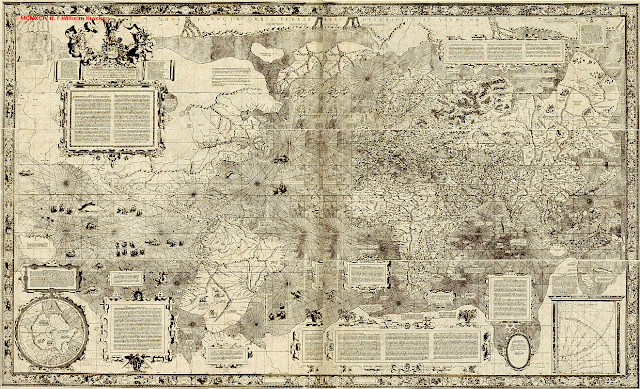
Mercator is best known for his “projection”, in this context a projection is a way of converting the world – which is found on the surface of a 3D sphere into a flat, 2D map. Mercator introduced his eponymous projection for his 1569 map of the world, illustrated at the top of this post. The particular feature of this projection is that if you follow a fixed compass bearing you find yourself following a straight line on the Mercator projected map. This is good news for navigators! The price you pay for this property is that, although all regions are in the correct places relative to each other, their areas are distorted so those regions near the poles appear much larger than those near the equator. Mercator seems to have made little of this discovery, nor described the method by which the projection is constructed – this was done some time later, in 1599, by Edward Wright. Prior to maps following Mercator’s projection navigation was a bit hit and miss, basically you headed up to a convenient latitude and then followed it back to your destination – an inefficient way to plan your course. If you’re interested in the maths behind the projection see here.

In terms of it’s content the 1569 map shows Europe, Africa and a large fraction of Asia much as we would see it today, certainly in terms of outline. The Eastern coast of North and South America is fairly recognisable. The map fails in it’s representation of the West coast of America – although to give credit where it is due, it at least has a west coast. The landmasses indicated at the northern and southern poles are close to pure fantasy. The Southern continent had been proposed by Ptolemy as a counterbalance to the known Northern continents – with no supporting evidence. Exploration of the far North was starting to occur during Mercator’s life, with expedition such as that of Frobisher.

Mercator is also responsible for the word “atlas” to describe a book containing a set of maps, in this instance he coined the term to describe the volumes of maps he was preparing towards the end of his life, the last of which was published published posthumously by his son, Rumold, in 1595.

Following my efforts on Joseph Banks, I thought I’d make a map of significant locations in Mercator’s life. You can find them here in Google Maps, zoom out and you will see the world in Mercator projection – a legacy from a man that lived nearly 500 years ago.

Understanding mayonnaise

Some time ago I wrote a post on confocal microscopy – a way of probing 3D structure at high spatial resolution. This post is about using confocal microscope to understand mayonnaise (and a bunch of other things)

As young scientists we are introduced to the ideas of solids, liquids and gases very early on. We make these distinctions, amongst other things, to understand their mechanical properties, to answer questions such as: How thick do I have to make the legs of my chair to support my weight? How fast will liquid run out of a bucket? How high will my balloon fly?

But what is mayonnaise? It’s very soft, and can be made to flow but it’s not a proper liquid – you can make a pile of mayonnaise. How do we describe grain in a silo, or an avalanche? In some senses they have properties similar to a liquid: they flow – yet they form heaps which is something a solid does. What about foams –  a pile of shaving foam looks pretty similar to mayonnaise? Starch paste is an even weirder example, it acts like a liquid if you treat it gently but a solid if you try anything quick. (This is known as shear thickening). These mixed systems are known as colloids.

The programme for understanding solids, liquids, gases and these odd systems is to understand the interactions between the “fundamental” particles in the system. For our early courses in solids, liquids, and gases this means understanding what the atoms (or molecules) are doing – how many of them are there in a unit volume, how are they ordered, how do they move and how they interact. Typically there are many “fundamental” particles in whatever you’re looking at so rather than trying to work out in detail what all of them are up to you resort to “statistical mechanics”: finding the right statistical properties of your collection of particles to inform you of their large scale behaviour.

The distinguishing feature of all of our new systems (mayonnaise, grain piles, avalanches, foams, starch paste) is that they are made from lumps of one phase (gas, liquid, solid) in another. Avalanches and grain piles are solid particles in a gas; mayonnaise is an emulsion: liquid droplets (oil) inside another liquid (water); foams are air inside a liquid and starch paste is a solid inside a liquid. These systems are more difficult to analyse than our traditional gases, solids and liquids: firstly their component parts aren’t all simple and aren’t all the same. Particles most likely have different sizes and shapes. Atoms and molecules are all the same size and all the same shape. Secondly, they’re athermal – ambient temperatures don’t jiggle all their bits around to make nice averages.

Confocal microscopy looked like an interesting way to answer some of these important questions about the structures to be found in these complex systems. Mayonnaise turns out not to be a good model system to work with – you can’t see through it. However, you can make an emulsion of different combinations of oil and water, and if you’re cunning you can make an emulsion with over 50% of droplets by volume which is still transparent. Using even more cunning you can make the distribution of droplet sizes relatively small.

Having spent a fair bit of time getting the emulsions transparent with reasonable droplet size distributions, my student, Jasna, came in with some pictures of an emulsion from the confocal microscope: where the oil droplets touched each other the image was brighter, you can see this in the image at the top of this post. This was rather unexpected, and useful. The thing about squishy balls, is that the amount by which they are squished tells you something about how hard they are being squeezed. The size of the little patches tells you how much force each droplet is feeling. So all we have to do to find the force network in an emulsions is measure the size of the bright patches between them.

In the end our work measured the forces between droplets in a compressed emulsion and we found that these measurements agreed with a theory and some computer simulations. Criticisms of the work were that the relationship between luminous patch size and force was more complicated than we had assumed, and that the force distribution was all very well but the interesting thing was the arrangement of those forces. These criticisms are fair enough. Must have been pretty good though, because someone wrote a paper for Science claiming to have done it first, whilst citing our paper (they had to publish a correction)!

Footnotes
This work can be found in this paper:

Brujic, J., S. F. Edwards, D. V. Grinev, I. Hopkinson, D. Brujic, and H. A. Makse. “3D bulk measurements of the force distribution in a compressed emulsion system.” Faraday  Discussions 123, (2003), 207-220.  (pdf file on Scribd)
Jasna Brujic was the PhD student who did the experimental work, Sir Sam Edwards is a theoretician who works on granular materials, Dmitri Grinev worked with Sir Sam on the theory, I supervised Jasna, Djordje Brujic is Jasna’s dad and wrote the image analysis code and Hernan Makse is a computer simulator of granular materials.

Opinion polls and experimental errors

I thought I might make a short post about opinion polls, since there’s a lot of them about at the moment, but also because they provide an opportunity to explain experimental errors – of interest to most scientists.

I can’t claim great expertise in this area, physicists tend not to do a great deal of statistics unless you count statistical mechanics which is a different kettle of fish to opinion polling. Really you need a biologist or a consumer studies person. Physicists are all very familiar with experimental error, in a statistical sense rather than the “oh bollocks I just plugged my 110 volt device into a 240 volt power supply” or “I’ve dropped the delicate critical component of my experiment onto the unyielding floor of my lab” sense. 
There are two sorts of error in the statistical sense: “random error” and “systematic error”. Let’s imagine I’m measuring the height of a group of people, to make my measurement easier I’ve made them all stand in a small trench, whose depth I believe I know. I take measurements of the height of each person as best I can but some of them have poor posture and some of them have bouffant hair so getting a true measure of their height is a bit difficult: if I were to measure the same person ten times I’d come out with ten slightly different answers. This bit is the random error.

To find out everybody’s true height I also need to add the depth of the trench to each measurement, I may have made an error here though – perhaps a boiled sweet was stuck to the end of my ruler when I measured the depth of the trench. In this case my mistake is added to all of my other results and is called a systematic error. 

This leads to a technical usage of the words “precision” and “accuracy”. Reducing random error leads to better precision, reducing systematic error leads to better accuracy.
This relates to opinion polling: I want to know the result of the election in advance, one way to do this would be to get everyone who was going to vote to tell me in advance what their voting intentions. This would be fairly accurate, but utterly impractical. So I must resort to “sampling”: asking a subset of the total voting population how they are going to vote and then by a cunning system of extrapolation working out how everybody’s going to vote. The size of the electorate is about  45million, the size of a typical sampling poll is around 1000. That’s to say one person in a poll represents 45,000 people in a real election.
To get this to work you need to know about the “demographics” of your sample and the group you’re trying to measure. Demographics is stuff like age, sex, occupation, newspaper readership and so forth – all things that might influence the voting intentions of a group. Ideally you want the demographics of your sample to be the same as the demographics of the whole voting population, if they’re not the same you will apply “weightings” to the results of your poll to adjust for the different demographics. You will, of course, try to get the right demographics in the sample, but people may not answer the phone or you might struggle to find the right sort of person in the short time you have available.The problem is you don’t know for certain what demographic variables are important in determining the voting intentions of a person. This is a source of systematic error, and some embarrassment for pollsters. 
Although the voting intentions of the whole population may be very definite (and even that’s not likely to be the case), my sampling of that population is subject to random error. You can improve your random error by increasing the number of people you sample but the statistics are against you because the improvement in error goes as one over the square root of the sample size. That’s to say a sample which is 100 times bigger only gives you 10 times better precision. The systematic error arises from the weightings, problems with systematic errors are difficult to track down in polling as in science.
So after this lengthy preamble I come to the decoration in my post, a graph: This is a representation of a recent opinion poll result shown in the form of probability density distributions, the area under each curve (or part of each curves) indicates the probability that the voting intention lies in that range. The data shown is from the YouGov poll published on 27th April. The full report on the poll is here, you can find the weighting they applied on the back page of the report. The “margin of error” of which you very occasionally hear talk gives you a measure of the width of these distributions (I assumed 3% in this case, since I couldn’t find it in the report), the horizontal location of the middle of each peak tells you the most likely result for that party.

For the Conservatives I have indicated the position of the margin of error, the polling organisation believe that the result lies in the range indicated by the double headed arrow with 95% probability. However there is a 5% chance (1 in 20) that it lies outside this range. This poll shows that the Labour and Liberal Democrat votes are effectively too close to call and the overlap with with the Conservative peak indicates some chance that they do not truly lead the other two parties. And this is without considering any systematic error. For an example of systematic error causing problems for pollsters see these wikipedia article on The Shy Tory Factor.

Actually for these data it isn’t quite as simple as I have presented since a reduction in the percentage polled of one party must appear as an increase in the percentages polled of other parties.

On top of all this the first-past-the-post electoral systems means that the overall result in terms of seats in parliament is not simply related to the percentage of votes cast. 

Lasers go oooooommmmmmm

In a previous post I mentioned, in passing, surface quasi-elastic light scattering (SQELS). SQELS is a fancy way of measuring the surface tension of a liquid using light, it has some advantages over the alternative method: sticking something into the surface of the liquid and measuring the pull but it is technically challenging to do.

The basic idea of SQELS is this: if you take a liquid surface, even in the absence of breezes or shakes, it is perturbed by tiny waves the properties of which tell you about the surface properties of the liquid. These waves have frequencies of 10kHz, wavelengths of 0.1mm and amplitudes of only a few angstroms. They are driven by the thermal motion that means everything, on a small enough scale, is jiggling away incessantly. To measure these waves laser light is shone on the surface, most of the light is scattered elastically that’s to say it stays exactly the same colour. However, some of the light is scattered inelastically (or quasi-elastically since the effect is small) – it changes colour slightly, the power spectrum of the surface waves is imprinted onto the laser light in terms of shifts in its colour. So all we need to do is measure the power spectrum of the light reflected from the surface to find out about the surface properties of the liquid.

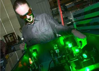
It turns out I don’t have any photos of the SQELS apparatus in all its glory, so I shall describe it in words. The whole thing is found on an 8 foot by 4 foot by 1 foot thick optical table. A fine, very solid table whose top surface is a sheet of brushed steel, pierced by a grid of threaded holes 25mm apart. The apparatus is in the form of a large U covering two long sides and one short side of the table. A laser is bolted at the start of the U; light heads from the laser along the table through a set of lenses, polarisers, a diffraction grating, then upwards through a periscope before being directed down onto the liquid in Langmuir trough. The Langmuir trough is protected by a cardboard box, decorated in the style of a Freisian cow with holes cut roughly in the sides to allow light in and out. Captured after reflection from the surface of the liquid, the laser light is directed back down to the table surface by a second periscope from where it passes back along the long side of the table into a photomultiplier tube – the detector.

The cardboard box is there to stop air currents disturbing the surface of the liquid, vibration is the enemy for this experiment because the liquid in the Langmuir trough picks up the slightest disturbance and wobbles around. Sitting on an optical table weighing a large fraction of a tonne isn’t enough – it needs to be on the ground floor too because buildings wobble and in this instance the Langmuir trough sat on an active anti-vibration table – a bit like noise cancellation headphones but the size of a small coffee table. You can manage without active anti-vibration if you’re willing to do your experiments in the dead of night.

The cardboard box is emblematic of a piece of research apparatus: much of it is constructed from pre-fabricated components, some of it is custom-made in the departmental workshop but then there are the finishing touches that depend on your ingenuity and black masking tape. I did have plans to get the cardboard box remade in perspex but the box was just the right size and if I wanted more holes in it I could easily cut them with a knife so it was never worth the effort. I seem to remember a bit of drainpipe being involved too. As an experimental scientist you get your eye tuned in to spot things just right to add to your apparatus.

The laser is a single mode solid-state laser producing light of 532nm wavelength – a brilliant green colour. Three things are important about lasers: firstly, they are fantastically bright; secondly, they produce light of a very pure colour – a single wavelength. Thirdly, lasers go “oooooooommmmmmmmm”, whilst conventional light-sources go “pip-pip—-pip-pip—pip”. Technically this is described as “coherence”, we’re using a laser in part because we want something to compare against and a conventional light-source isn’t going to work for this. If you’re measuring a small change, it’s very handy to have a “ruler” close at hand, and in this case the elastically scattered light is that ruler.

You’ll notice that I’ve not said anything about the results we obtained using the SQELS; truth be told, despite all the hours spent building the apparatus, doing the experiments and analysing the data the results we obtained told us little more than that which we could get by easier and simpler means that I described in my earlier post. I also had the sneaking suspicion that it would have helped if I knew more about optical engineering.

(I got distracted in the middle of this post, browsing through the Newport optical components catalogue site!)

Reference
Cicuta, P., and I. Hopkinson. “Studies of a weak polyampholyte at the air-buffer interface: The effect of varying pH and ionic strength.” Journal of Chemical Physics 114(19), 2001, 8659-8670. (pdf)