Category: Technology

Programming, gadgets (reviews thereof) and computers

Living in code

Eric Schmidt, chairman of Google is in the news with his comments at the MacTaggart Lecture at the Edinburgh International Television Festival. The headline is a general criticism of the UK education system but what he actually said was more focussed on technology and in particular IT education: bemoaning the fact that computer science was not compulsory and what of it that there was about the use of software packages rather than how to code.

I was born in 1970, and learnt to program sometime in the early 80s. I can’t remember exactly where but I suspect it was in part at the after-school computer club my school ran. A clear memory I have is of an odd man who’d brought in a TRS-80 explaining that a FOR-NEXT loop was an instruction for a computer to “go look up its bottom” – this was at a time before CRB checks. My first computer was a Commodore VIC-20, Clive Sinclair having failed to deliver a ZX81 and the BBC Micros being rather more expensive proposition than my parents were willing to afford.

Many children of the early 80s cut their teeth programming by typing in programs from computer magazines; a tedious exercise which trained you in accurate transcription and debugging. Even at that time the focus of Computer Studies lessons was on using applications rather than teaching us to program although I do remember watching the BBC programmes on programming which went alongside the BBC Micro. As I have mentioned before, programming is in my blood – both my parents were programmers in the 60s.

About 10 years ago I was teaching programming to undergraduate physicists, from a class of 50 only 2 had any previous programming experience. The same is true in my workplace, a research lab where only a small minority of us can code.

Knowing how to code gives you a different mindset when approaching computer systems. Recently I have been experimenting with my company reports database. The reports are stored as PDF files; I was told the text inside them was not accessible – now to me that sounds like a challenge! After a bit of hacking I’d worked out how to extract the full text of reports out of the PDF files but then code that once worked stopped working. This puzzled me, so I checked the text that my program was pulling from the database and instead of being a PDF file, it was a message saying “Please don’t do that"!

At the moment I’m writing a program that takes an address list file, checks to see if the addressees have a mobile phone number and if they do uploads it to an SMS service, spitting out into a separate file those that do not have a mobile phone number. To me this is a problem that has an obvious programming solution, for the people who generate the address list it’s a bit like black magic.

These days we are surrounding by technology bearing code, just about every piece of electrical equipment in my house has code in it, but it seems that ever fewer of us have been inducted into the magic of writing our own code. These days there’s just so much more fun to be had from programming: there are endless online data sources and our phones and computers have so many programmable facilities built into them.

At what age can I teach my child Python?

Lead mining in the Yorkshire Dales

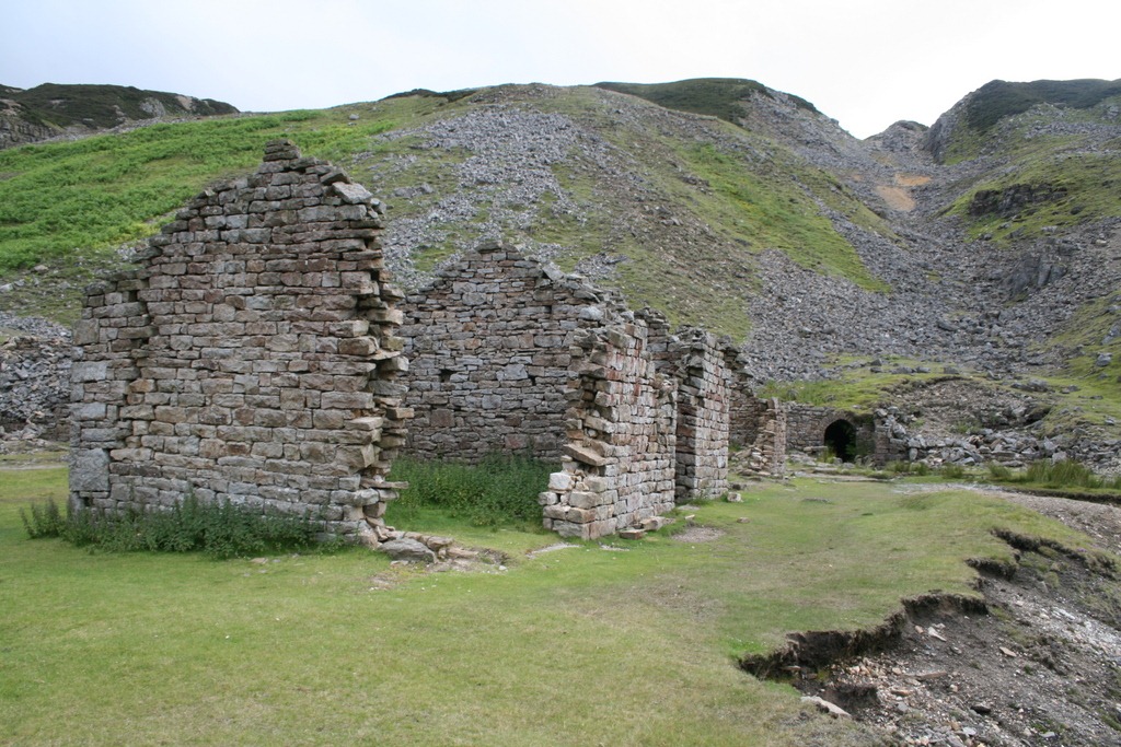
Bunting level: building, level entrance and hush

Bunting level: building, level entrance and hush

On a recent trip to the Yorkshire Dales we came across the remnants of lead mining; as with many things in the field these are blank discoveries with no indication of what they mean at the site. A very long time ago I did an OA level in geology, and I seem to have inherited an interest in industrial archaeology, so I resolved to find out more…

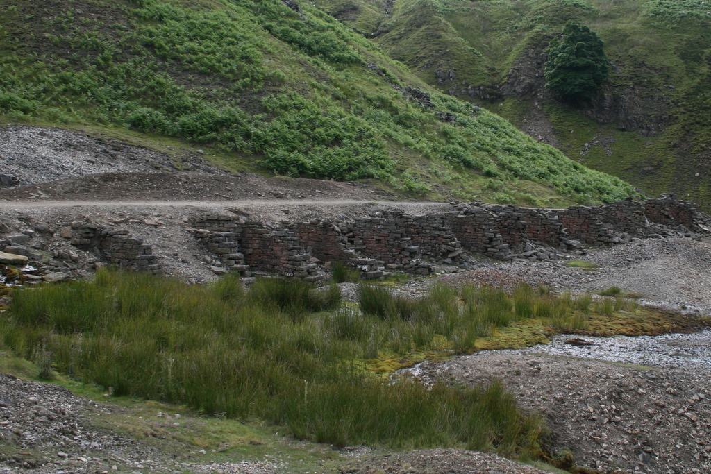
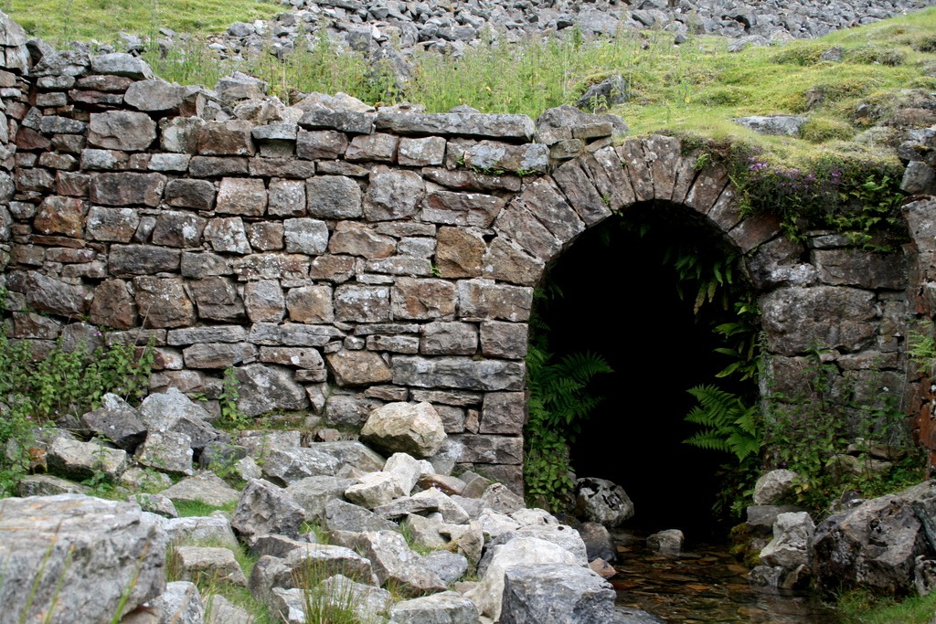
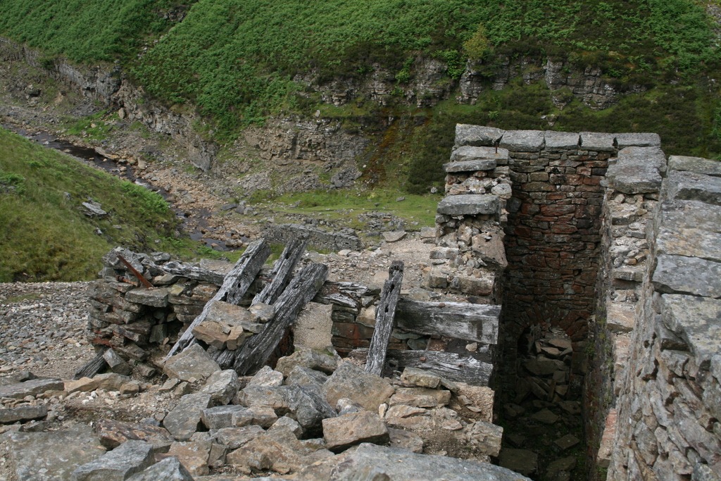
The majority of the mine workings we saw were in Gunnerside Gill, which extends north from Swaledale shown on the map below. On the ground we found rock strewn gullies and heaps of gravel, still devoid of vegetation. There were also ruined mine buildings, the occasional opening into the hillside and the odd bit of rusting ironwork. The most distinctive elements of the remains are the “bouse teams”, these are sets of bunkers – just the dividing walls remain – which were used to store the ore (or bouse). Quite a few of the stone surfaces are covered in a reddish deposit; elsewhere this has been identified as a lichen, but I believe it’s lead oxide. The workings are named by the “level” or horizontal tunnel which they served, the photos here are taken around the Bunting (or Bunton) level.


Lead mining, bouse teams

Lead mining: bouse teams at Bunting Level

Further down the Gill, closer to Gunnerside, are the Sir Francis Level workings; although these are less extensive at ground level, they turn out to have quite fantastic remains underground. Intrepid cavers have been down and taken some impressive photos, and you can read more about the Sir Francis Level workings in this report , here and here too. These were the most recent workings in Gunnerside Gill and were in operation from 1864 until 1891.

Lead mining has been carried out in the Yorkshire Dales since Roman times, the workings at Gunnerside Gill started in the 16th century but the majority of the visible surface remains are from the 19th century. The Bunting (or Bunton) level where the photos were taken was opened in 1802 and closed in 1898.

Lead mining: entrance to Bunting level

Lead mining: entrance to Bunting level

The Yorkshire Dales are substantially formed from limestone and gritstone outcrops laid down in the Carboniferous Period some 320 million years ago1. The lead ore occurs in veins which were deposited hydrothermally: hot pressurised liquids containing a range of minerals were forced through cracks in the native rock and deposited what they carried when the pressure and/or temperature dropped. The minerals are not conveniently deposited by type but mixed together. The veins are quite narrow – typically only a metre wide – but stretch deep underground.

This is reflected in the manner in which they are mined: initially vertical shafts were mined down to follow the veins. Later horizontal “levels” were mined to meet up with these vertical shafts which made the extraction of both ore and water easier – water will drain out of a level but puddle in the bottom of a shaft. In addition to this type of mining “hushing” was also used: this involves sluicing large quantities of water down the line of the vein to erode out the rock. This process was used in the Gunnerside Gill area from the 1780s to 1820s, and is what has left a large part of the surface remains. These are marked on the map as “hushes”. The extent of the workings can be seen quite clearly in Google Earth images (here).

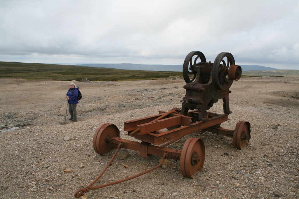
The particular mineral in which the lead occurred is galena (lead sulphide), it is relatively dense and this property was used to separate out the galena from other minerals using a process akin to panning for gold. The ore containing rock is broken up into pieces and as far as possible the galena rich chunks are picked out and chipped off using hammers – this is known as dressing. This ore is then further broken up into smaller pieces. Earlier, this would have been done manually but later it was done using a water-powered mills, and still later it was done by steam-powered machines. These smaller pieces of ore are then buddled in troughs or hotching tubs – basically this simply means add water then shake, this separates out the material by density.

Lead mining, mill culvert

Lead mining: mill culvert at Bunting Level

Stonebreaker, with Sharon in background

Stonebreaker above Bunting Level with Sharon in background

Once reasonably well-separated ore is obtained it is converted to metal in two chemical steps. First the ore is roasted to drive off the sulphur and convert it to lead oxide, then the oxide is smelted with carbon which removes the oxygen from the lead to produce the metal. There were smelting mills in Gunnerside Gill but ore was also transported underground to the next valley and smelted in the Old Gang Smelting Mills. We didn’t visit these but they had flues extending up the hillside a distance of hundreds of metres. The reason for this was two-fold: firstly, the gases driven off the ore during smelting were pretty noxious and secondly, the long flue allows soot to condense back out as it cools and this soot can be contain high concentrations of minerals.

Life for the miners sounds pretty grim; they were expected to work for 6 hours a day underground and the mine workings were often inaccessible without accommodation so their days may well have started with an hour or so walking simply to get to work. The Swaledale Museum, in Reeth, as well has having a great deal of other information on lead mining has some mining company rules, dated 1872. One of them states: “Children aged 12-16years only allowed to work 54 hours per week, or 10 hours per day.”

Footnotes

1. See p13-22 of this report by the North Yorkshire Geodiversity Partnership for more geology.

2. Related is this report on the Peak District Lead Mining Industry

3. English Heritage scheduled monument report

Computational Photography

Lightfielddemo

Lytro, Inc, a technology spin-off company founded by Ren Ng, have been in the news recently with their announcement of a re-focusable camera: take one “image”, and change where the focal plane lies after the fact. This is illustrated in the images above, generated from a single shot from the prototype camera. As you move from left to right across this sequence you can see the focus shifting from the front left of image to back right.I saw this work a few years ago at the mighty SIGGRAPH conference, it comes out of a relatively new field of “computational photography”.

All photography is computational to a degree. In the past the computation was done using lenses and chemicals, different chemical mixes and processing times led to different colour effects in the final image. Nowadays we can do things digitally, or in new combinations of physical and digital.

These days your digital camera will already be doing significant computation on any image. The CCD sensor in a camera is fundamentally a photon-counting device – it doesn’t know anything about colour. Colour is obtained by putting a Bayer mask over the sensor, a cunning array of red, green and blue filters. It requires computation to unravel the effect of this filter array to make a colour image. Your camera will also make a white balance correction to take account of lighting colour. Finally, the manufacturer may apply image sharpening and colour enhancement, since colour is a remarkably complex thing there are a range of choices about how to present measured colours. These days compact cameras often come with face recognition, a further level of computation.

The Lytro system works by placing a microlens array in the optical train, the prototype device (described here) used a 296×296 array of lenses focusing onto a 16 million pixel medium format CCD chip, just short 40mmx40mm in size. The array of microlenses means means that for each pixel on the sensor you can work out the direction in which it was travelling, rather than just where it landed. For this reason this type of photography is sometimes called 4D or light-field photography. The 4 dimensions are the 2 dimensions locating where on the sensor the photon lands, and the direction in which it travels, described by another two dimensions. Once you have this truckload of data you can start doing neat tricks, such as changing the aperture and focal position of the displayed image, you can even shift the image viewpoint.

As well as refocusing there are also potentially benefits in being able to take images before accurate autofocus is achieved and then using computation to recover a focused image.

The work leading to Lytro was done by Ren Ng in Marc Levoy’s group at Stanford, home of the Stanford Multi-Camera Array: dispense with all that fiddly microlens stuff: just strap together 100 separate digital video cameras! This area can also result in terrible things being done to innocent cameras, for example in this work on deblurring images by fluttering the shutter, half a camera has been hacked off! Those involved have recognized this propensity and created the FrankenCamera.

Another example of computational photography is in high dynamic range imaging, normal digital images are acquired in a limited dynamic range: the ratio of the brightest thing they can show to the darkest thing they can show in a single image. The way around this is to take multiple images with different exposures and then combine together. This seems to lead, rather often, to some rather “over cooked” shots. However, this is a function of taste, fundamentally there is nothing wrong with this technique. The reason that such processing occurs is that although we can capture very high dynamic range images, displaying them is tricky so we have to look for techniques to squish the range down for viewing. There’s more on high dynamic range imaging here on the Cambridge in Colour website, which I recommend for good descriptions of all manner of things relating to photography.

I’m not sure whether the Lytro camera will be a commercial success. Users of mass market cameras are not typically using the type of depth-of-field effect shown at the top of the post (and repeated ad nauseum on the Lytro website). However, the system does offer other benefits, and it may be that ultimately it ends up in cameras without us really being aware of it. It’s possible Lytro will never make a camera, but instead license the technology to the big players like Canon, Panasonic or Nikon. As it stands we are part way through the journey from research demo to product.

Book Review: The Visual Display of Quantitative Information by Edward R. Tufte


tufteThe Visual Display of Quantitative Information” by Edward R. Tufte is a classic in the field of data graphics which I’ve been meaning to read for a while, largely because the useful presentation of data in graphic form is a core requirement for a scientist who works with experimental data. This is both for ones own edification, helping to explore data, and also to communicate with an audience.

There’s been something of a resurgence in quantitative data graphics recently with the Gapminder project led by Hans Gosling, and the work of David McCandless and Nathan Yau at FlowingData.


The book itself is quite short but beautifully produced. It starts with a little history on the “data graphic”, by “data graphic” Tufte specifically means a drawing that is intended to transmit data about quantitative information in contrast to a diagram which might be used to illustrate a method or facilitate a calculation. On this definition data graphics developed surprisingly late, during the 18th century. Tufte cites in particular work by William Playfair, who was an engineer and political economist who is credited with the invention of line chart, bar chart and pie chart which he used to illustrate economic data. There appears to have been a fitful appearance of what might have been a data graphic in the 10th century but to be honest it more has the air of a schematic diagram.

Also referenced are the data maps of Charles Joseph Minard, the example below shows the losses suffered by Napoleon’s army in it’s 1812 Russian campaign. The tan line shows the army’s advance on Moscow, it’s width proportional to the number of men remaining. The black line shows their retreat from Moscow. Along the bottom is a graph showing the temperature of the cold Russian winter at dates along their return.

800px-MinardInterestingly adding data to maps happened before the advent of the more conventional x-y plot, for example in Edmund Halley’s map of 1686 showing trade winds and monsoons.

Next up is “graphic integrity”: how graphics can be deceptive, this effect is measured using a Lie Factor: the size of the effect shown in graphic divided by the size of the effect in data. Particularly heroic diagrams achieve Lie Factors as large as 59.4. Tufte attributes much of this not to malice but to the division of labour in a news office where graphic designers rather than the owners and explainers of the data are responsible for the design of graphics and tend to go for the aesthetically pleasing designs rather than quantitatively accurate design.


Tufte then introduces his core rules, based around the idea of data-ink – that proportion of the ink on a page which is concerned directly with showing quantitative data:

  • Above all else show the data
  • Maximize the data-ink ratio
  • Erase non-data-ink
  • Erase redundant date-ink
  • Revise and edit.

A result of this is that some of the elements of graph which you might consider essential, such as the plot axes, are cast aside and replaced by alternatives. For example the dash-dot plot where instead of solid axes dashes are used which show a 1-D projection of the data:

ddp

Or the range-frame plot where the axes are truncated at the limits of the data, actually to be fully Tufte the axes labels would be made at the ends of the data range, not to some rounded figure:

range

Both of these are examples are from Adam Hupp’s etframe library for Python. Another route to making Tufte-approved data graphics is by using the Protovis library which was designed very specifically with Tufte’s ideas in mind.

Tufte describes non-data-ink as “chartjunk”, several things attract his ire – in particular the moiré effect achieved by patterns of closely spaced lines used for filling areas, neither is he fond of gridlines except of the lightest sort. He doesn’t hold with colour or patterning in graphics, preferring shades of grey throughout. His argument against colour is that there is no “natural” sequence of colours which link to quantitative values.

What’s striking is that the styles recommended by Tufte are difficult to achieve with standard Office software, and even for the more advanced graphing software I use the results he seeks are not the out-of-the-box defaults and take a fair bit of arcane fiddling to reach.  Not only this, some of his advice contradicts the instructions of learned journals on the production of graphics.

Two further introductions I liked were Chernoff faces which use the human ability to discriminate faces to load a graph with meaning, and sparklines – tiny inline graphics showing how a variable varies in time without any of the usual graphing accoutrements: – in this case one I borrowed from Joe Gregorio’s BitWorking.

In the end Tufte has given me some interesting ideas on how to present data, in practice I fear his style is a little too austere for my taste.There’s a quote attributed to Blaise Pascal:

I would have written a shorter letter, but I did not have the time.

I suspect the same is true of data graphics.

Footnote

Mrs SomeBeans has been referring to Tufte as Tufty, who UK readers of a certain age will remember well.

How do I setup my own website?

A post in the style of random notes today: I’ve been making a new website for The Inelegant Gardener – there’s a teaser here, I’ve done this before for the Chester Liberal Democrats. I thought it might be handy to provide a compact description of the process as a reminder to me and a warning to others…

The steps are as follows:

  1. Getting a domain name
  2. Finding a web host
  3. Making your website
  4. Going live

1. Getting a domain name

The domain name is the www bit. You can put your domain name registration with your web host but conventional wisdom is that it’s better to separate the two. I chose http://www.just-the-name.co.uk/ based on a twitter recommendation. Once you’ve chosen your domain name, you get access to a simple control panel which can be used to redirect your domain name to another site (such as this one), set up e-mail redirection and so forth. Mine gives me access to DNS Settings but I left these alone. When the time comes you’ll need to set the names servers to those provided by your web host.

2. Finding a web host

A web host is where your website will live. In the end I settled with EvoHosting for a few of reasons: they have live status updates for their servers, they have a twitter account and mentions of evohosting on twitter do not reveal any frustrated users, a search for the term “evohosting is crap” reveals no worrying hits in Google! They’re also reassuring slightly more expensive than the cheapest hosting solutions which seem to suffer from the “X is crap” syndrome. I selected a scheme that allows me to host several sites.

3. Making your website

You can make a website using WordPress – the blogging software. Building a website is a question of managing content – and for a small site WordPress does this nicely and is free. You don’t have to be blogging to use it – you can just make a set of static pages. I understand that for bigger sites Joomla is good. WordPress is a combination of a PHP application talking to a SQL database. I found a passing familiarity with SQL databases quite handy, not so much to write queries but just to know the basics of accounts and tables.

WordPress handles the mechanics of your website, what goes where, posting and making pages whilst the “theme” determines appearance. I’ve used the Atahualpa theme for my two websites so far – it’s pretty flexible, although if you want to put anything top-right in the logo area I’d find a good reason not to – I’ve spent days trying to do it to my satisfaction! For debugging your own website and snooping into others the developer tools available on all major browsers are very handy. I use Google Chrome, for which the Window Resizer and MeasureIt extensions are useful. Window Resizer allows you to test your site at different screen sizes, and MeasureIt measures the size in pixels of screen elements.

I’ve found Paint .NET useful for wrangling images, it’s either the old Windows Paint program on steroids or a very limited Photoshop.

For my efforts I have created the website locally, on my own PC, before transferring it to web hosting. I’m not sure if this is standard practice but it seemed a better idea than potentially thrashing around in public as you learnt to build your website. To do this I installed xampplite, this gives my PC web serving capabilities and provides everything needed to run WordPress –except WordPress which you need to download separately.

WordPress can be extended by plugins, and I’ve found I can achieve most the functionality I’ve wanted by searching out the appropriate plugin. Here are a few I’m using:

  1. Contact Form 7 – to create forms
  2. Drop cap shortcode – to easily add drop caps (big letters) to posts and pages.
  3. Dynamic Widgets – to put different widgets on different pages
  4. NextGEN Gallery – more advanced photo gallery software
  5. Simple Page Ordering – allows you to shuffle the order pages appear in your static menus, which is a bit tricky in basic WordPress
  6. WP-dtree – a dynamic tree structure for showing the blog archive, as found in Blogger.
  7. WP Maintenance Mode – for hiding your site whilst you’re fiddling with it!
  8. WordPress Mobile Pack – a switcher for making your blog more readable if someone arrives using a mobile browser

Since WordPress is a very heavily used platform there’s a lot of help around, you identify WordPress sites by looking in the site footer, or viewing the page source (WordPress sites tend to have references to files starting “wp-“)

4. Going live

I must admit I find the process of moving a site from my own machine to a web server the most complicated bit of the process – you can see the instructions on the WordPress site here. The basic idea is to change the base URL for your website to the target address then copy the pages (zipped them all up before upload) and the database (using phpmyadmin import/export) of the WordPress installation to the web host. If you want to keep your local copy running then you need to take a copy before changing the base URL and load it back up once you’ve done moving. Things that caught me out this time: I had to use MySQL to create a database into which to import the database, and it wasn’t enough to create a user, I also needed to attach it to the appropriate account, and I had to save the settings on the permalinks for pages to show up. Finally, I also had some typed links in my website, which needed manually adjusting (although you can do this automatically in MySQL).

I wish I knew a bit more CSS, my current technique for fine tuning appearance involves a lot of rather ignorant typing, a bit more knowledge of good graphic design wouldn’t go amiss either!

This is the way I did it – I’d be interested in any suggestions for improvements.