This post is about making the bridge between how a physicist understands colour, and something a bit more useful.
Light is a collection of electromagnetic waves; for a physicist the most important property of a wave is its wavelength, its “size”. The wavelengths of visible light fall roughly in the range 1/1000 of a millimetre to 1/2000 of a millimetre. (1/1000 of a millimetre is a micron). Blue light has a shorter wavelength than red light.
Things have colour either because they generate light or because of the way they interact with light that falls upon them. The light we see is made of many different wavelengths, the visible spectrum. Each wavelength has a colour, and the colour we perceive is a result of adding all of these colours together.
The diagram to the right summarises this: it’s called a chromaticity diagram, the numbers around the edge are wavelengths in nanometres (a millionths of a millimetre), pure, single wavelength light falls on this line; any point inside the line is formed from the mixture of wavelengths. The line represents “all the colours of the rainbow”; colours inside the line are not in the rainbow. The chromaticity diagram is the “periodic table” for colour scientists, it’s iconic and it summarises the world of colour.
This chromaticity diagram is just a slice through a volume, we could draw another one a little bit dimmer, and a little bit dimmer than that until we reached black.
How do we get to this diagram? The central issue to understanding perceived colour is that although the light in the environment comes as a mixture of a multitude of wavelengths, our eyes are limited by the light sensitive cells they contain, known as “cones”. In humans cones come in three types, which are sensitive in three different ranges of the spectrum. Roughly there are red-, blue- and green sensitive cones. So the eye gives just three readings in terms of colour description. The chromaticity diagram comes from a calculation trying to predict these three values and combining them to fit on a flat page (which only gives you two dimensions to play with).
Some other animals don’t have three sorts of cones. Birds, for example, have four – this is known as tetrachromacy which sounds to me like some sort of wizardry involving chairs (I’m reading Terry Pratchett at the moment). Birds have an extra type of cone in the ultra-violet part of the spectrum – so they are sensitive to wavelengths which we are not. Most mammals are dichromatic, but other primates, like humans, are also trichromatic. Dichromatic animals will be able to perceive a smaller range of colours than us. The evolutionary implication here is that earlier mammals lost some colour sensing ability, possibly for a gain in low light sensitivity but some mammals subsequently regained the ability.
The chromaticity diagram is still something of a physicists play-thing, it’s useful for doing calculations. There are other ways of describing colour which are related to human perception, they are developments based on the first steps used in constructing the chromaticity diagram. The aim of these methods is to similar numbers to colours that look similar; make those numbers reasonably easy to explain from a conceptual standpoint and try to give numbers twice as big to colours that are twice as bright. My favoured system in this respect is the CIE LAB system. The colours are expressed as three numbers L, a and b: L tells you something about overall brightness, a tells you the point on a scale between red and green and b tells you a point on the scale between yellow and blue.
But all of this is a bit of a fraud, because actually the colours you’re seeing on your monitor aren’t the real colours I’m trying to show you. The problem is that display devices contain red, green and blue elements but they don’t fall anywhere near the extremes of the chromaticity diagram and we can only get colours inside the the triangle defined by the red, green and blue elements in the monitor. A typical monitor gamut is shown here.
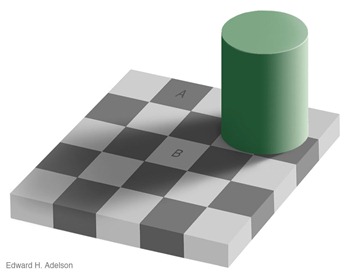
All this is based on the study of ideal colour stimuli (little square patches) on grey backgrounds, things get an awful lot more complicated if we start to worry about context. This is best illustrated with an image:
As far as my computer is concerned squares A and B have the same colour, my brain and your brain are interpreting the scene context and giving them different colours. This is called Adelson’s checker shadow illusion.


