Tag: data science

Book review: R in Action by Peter Harrington

rinaction

This post was first published at ScraperWiki.

This is a review of Robert I. Kabacoff’s book R in Action which is a guided tour around the statistical computing package, R.

My reasons for reading this book were two-fold: firstly, I’m interested in using R for statistical analysis and visualisation. Previously I’ve used Matlab for this type of work, but R is growing in importance in the data science and statistics communities; and it is a better fit for the ScraperWiki platform. Secondly, I feel the need to learn more statistics. As a physicist my exposure to statistics is relatively slight  –  I’ve wondered why this is the case and I’m eager to learn more.

In both cases I see this book as an atlas for the area rather than an A-Z streetmap. I’m looking to find out what is possible and where to learn more rather than necessarily finding the detail in this book.

R in Action follows a logical sequence of steps for importing, managing, analysing, and visualising data for some example cases. It introduces the fundamental mindset of R, in terms of syntax and concepts. Central of these is the data frame  –  a concept carried over from other statistical analysis packages. A data frame is a collection of variables which may have different types (continuous, categorical, character). The variables form the columns in a structure which looks like a matrix  –  the rows are known as observations. A simple data frame would contain the height, weight, name and gender of a set of people. R has extensive facilities for manipulating and reorganising data frames (I particularly like the sound of melt in the reshape library).

R also has some syntactic quirks. For example, the dot (.) character, often used as a structure accessor in other languages, is just another character as far as R is concerned. The $ character fulfills a structure accessor-like role. Kabacoff sticks with the R user’s affection for using <- as the assignment operator instead of = which is what everyone else uses, and appears to work perfectly well in R.

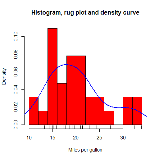
R offers a huge range of plot types out-of-the-box, with many more a package-install away (and installing packages is a trivial affair). Plots in the base package are workman-like but not the most beautiful. I liked the kernel density plots which give smoothed approximations to histogram plots and the rug plots which put little ticks on the axes to show where the data in the body of that plot fall. These are all shown in the plot below, plotted from example data included in R.

histogramrugdensityplot

The ggplot2 package provides rather more beautiful plots and seems to be the choice for more serious users of R.

The statistical parts of the book cover regression, power analysis, methods for handling missing data, group comparison methods (t-tests and ANOVA), and principle component and factor analysis, permutation and bootstrap methods. I found it a really useful survey  –  enough to get the gist and understand the principles with pointers to more in-depth information.

One theme running through the book, is that there are multiple ways of doing almost anything in R, as a result of its rich package ecosystem. This comes to something of a head with graphics in the final section: there are 4 different graphics systems with overlapping functionality but different syntax. This collides a little with the Matlab way of doing things where there is the one true path provided by Matlab alongside a fairly good, but less integrated, ecosystem of user-provided functionality.

R is really nice for this example-based approach because the base distribution includes many sample data sets with which to play. In addition, add-on packages often include sample data sets on which to experiment with the tools they provide. The code used in the book is all relatively short; the emphasis is on the data and analysis of the data rather than trying to build larger software objects. You can do an awful lot in a few lines of R.

As an answer to my statistical questions: it turns out that physics tends to focus on Gaussian-distributed, continuous variables, while statistics does not share this focus. Statistics is more generally interested in both categorical and continuous variables, and distributions cannot be assumed. For a physicist, experiments are designed where most variables are fixed, and the response of the system is measured as just one or two variables. Furthermore, there is typically a physical theory with which the data are fitted, rather than a need to derive an empirical model. These features mean that a physicist’s exposure to statistical methods is quite narrow.

Ultimately I don’t learn how to code by reading a book, I learn by solving a problem using the new tool  –  this is work in progress for me and R, so watch this space! As a taster, just half a dozen lines of code produced the appealing visualisation of twitter profiles shown below:

smoothscattertwitterfollow

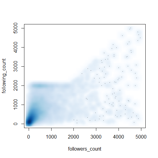
(Here’s the code: https://gist.github.com/IanHopkinson/5318354)

Book review: Machine Learning in Action by Peter Harrington

machinelearningcover

This post was first published at ScraperWiki.

Machine learning is about prediction, and prediction is a valuable commodity. This sounds pretty cool and definitely the sort of thing a data scientist should be into, so I picked up Machine Learning in Action by Peter Harrington to get an overview of the area.

Amongst the examples covered in this book are:

  • Given that a customer bought these items, what other items are they likely to want?
  • Is my horse likely to die from colic given these symptoms?
  • Is this email spam?
  • Given that these representatives have voted this way in the past, how will they vote in future?

In order to make a prediction, machine learning algorithms take a set of features and a target for a training set of examples. Once the algorithm has been trained, it can take new feature sets and make predictions based on them. Let’s take a concrete example: if we were classifying birds, the birds’ features would include the weight, size, colour and so forth and the target would be the species. We would train the algorithm on an initial set of birds where we knew the species, then we would measure the features of unknown birds and submit these to the algorithm for classification.

In this case, because we know the target – a species of bird – the algorithms we use would be referred to as “supervised learning.” This contrasts “unsupervised learning,” where the target is unknown and the algorithm is seeking to make its own classification. This would be equivalent to the algorithm creating species of birds by clustering those with similar features. Classification is the prediction of categories (i.e. eye colour, like/dislike), alternatively regression is used to predict the value of continuous variables (i.e. height, weight).

Machine learning in Action is divided into four sections that cover key elements and “additional tools” which includes algorithms for dimension reduction and MapReduce – a framework for parallelisation. Dimension reduction is the process of identifying which features (or combination of features) are essential to a problem.

Each section includes Python code that implements the algorithms under discussion and these are applied to some toy problems. This gives the book the air of Numerical Recipes in FORTRAN, which is where I cut my teeth on numerical analysis. The mixture of code and prose is excellent for understanding exactly how an algorithm works, but its better to use a library implementation in real life.

The algorithms covered are:

  • Classification – k-Nearest Neighbours, decision trees, naive Bayes, logistic regression, support vector machines, and AdaBoost;
  • Regression – linear regression, locally weighted linear regression, ridge regression, tree-based regression;
  • Unsupervised learning – k-means clustering, apriori algorithm, FP-growth;
  • Additional tools – principle component analysis and singular value decomposition.

Prerequisites for this book are relatively high: it assumes fair Python knowledge, some calculus, probability theory and matrix algebra.

I’ve seen a lot of mention of MapReduce without being clear what it was. Now I am more clear: it is a simple framework for carrying out parallel computation. Parallel computing has been around quite some time, the problem has always been designing algorithms that accommodate parallelisation (i.e. allow problems to be broken up into pieces which can be solved separately and then recombined). MapReduce doesn’t solve this problem but gives a recipe for what is required to run on commodity compute cluster.

As Harrington says: do you need to run MapReduce on a cluster to solve your data problem? Unless you are an operation on the scale of Google or Facebook then probably not. Current, commodity desktop hardware is surprisingly powerful particularly when coupled with subtle algorithms.

This book works better as an eBook than paper partly because the paper version is black and white and some figures require colour but the programming listings are often images and so the text remains small.

Book review: Data Visualization: a successful design process by Andy Kirk

datavisualization_andykirk

This post was first published at ScraperWiki.

My next review is of Andy Kirk’s book Data Visualization: a successful design process. Those of you on Twitter might know him as @visualisingdata, where you can follow his progress around the world as he delivers training. He also blogs at Visualising Data.

Previously in this area, I’ve read Tufte’s book The Visual Display of Quantitative Information and Nathan Yau’s Visualize ThisTufte’s book is based around a theory of effective visualisation whilst Visualize This is a more practical guide featuring detailed code examples. Kirk’s book fits between the two: it contains some material on the more theoretical aspects of effective visualisation as well as an annotated list of software tools; but the majority of the book covers the end-to-end design process.

Data Vizualisation introduced me to Anscombe’s Quartet. The Quartet is four small datasets, eleven (x,y) coordinate pairs in each. The Quartet is chosen so the common statistical properties (e.g. mean values of x and y, standard deviations for same, linear regression coefficients) for each set are identical, but when plotted they look very different. The numbers are shown in the table below.

anscombesdata

Plotted they look like this:

anscombequartetAside from set 4, the numbers look unexceptional. However, the plots look strikingly different. We can easily classify their differences visually, despite the sets having the same gross statistical properties. This highlights the power of visualisation. As a scientist, I am constantly plotting the data I’m working on to see what is going on and as a sense check: eyeballing columns of numbers simply doesn’t work. Kirk notes that the design criteria for such exploratory visualisations are quite different from those highlighting particular aspects of a dataset, more abstract “data art” presentations, or a interactive visualisations prepared for others to use.

In contrast to the books by Tufte and Yau, this book is much more about how to do data visualisation as a job. It talks pragmatically about getting briefs from the client and their demands. I suspect much of this would apply to any design work.

I liked Kirk’s “Eight Hats of data visualisation design” metaphor; which name the skills a visualiser requires: Initiator, Data Scientist, Journalist, Computer Scientist, Designer, Cognitive Scientist, Communicator and Project Manager. In part, this covers what you will require to do data visualisation, but it also gives you an idea of whom you might turn to for help  –  someone with the right hat.

The book is scattered with examples of interesting visualisations, alongside a comprehensive taxonomy of chart types. Unsurprisingly, the chart types are classified in much the same way as statistical methods: in terms of the variable categories to be displayed (i.e. continuous, categorical and subdivisions thereof). There is a temptation here though: I now want to make a Sankey diagram… even if my data doesn’t require it!

In terms of visualisation creation tools, there are no real surprises. Kirk cites Excel first, but this is reasonable: it’s powerful, ubiquitous, easy to use and produces decent results as long as you don’t blindly accept defaults or get tempted into using 3D pie charts. He also mentions the use of Adobe Illustrator or Inkscape to tidy up charts generated in more analysis-oriented packages such as R. With a programming background, the temptation is to fix problems with layout and design programmatically which can be immensely difficult. Listed under programming environments is the D3 Javascript library, this is a system I’m interested in using  –  having had some fun with Protovis, a D3 predecessor.

Data Visualization works very well as an ebook. The figures are in colour (unlike the printed book) and references are hyperlinked from the text. It’s quite a slim volume which I suspect compliments Andy Kirk’s “in-person” courses well.

Enterprise data analysis and visualization

This post was first published at ScraperWiki.

The topic for today is a paper[1] by members of the Stanford Visualization Group on interviews with data analysts, entitled “Enterprise Data Analysis and Visualization: An Interview Study”. This is clearly relevant to us here at ScraperWiki, and thankfully their analysis fits in with the things we are trying to achieve.

The study is compiled from interviews with 35 data analysts across a range of business sectors including finance, health care, social networking, marketing and retail. The respondents are harvested via personal contacts and predominantly from Northern California; as such it is not a random sample, we should consider results to be qualitatively indicative rather than quantitatively accurate.

The study identifies three classes of analyst whom they refer to as Hackers, Scripters and Application Users. The Hacker role was defined as those chaining together different analysis tools to reach a final data analysis. Scripters, on the other hand, conducted most of their analysis in one package such as R or Matlab and were less likely to scrape raw data sources. Scripters tended to carry out more sophisticated analysis than Hackers, with analysis and visualisation all in the single software package. Finally, Application Users worked largely in Excel with data supplied to them by IT departments. I suspect a wider survey would show a predominance of Application Users and a relatively smaller relative population of Hackers.

The authors divide the process of data analysis into 5 broad phases Discovery – Wrangle – Profile – Model – Report. These phases are generally self explanatory – wrangling is the process of parsing data into a format suitable for further analysis and profiling is the process of checking the data quality and establishing fully the nature of the data.

This is all summarised in the figure below, each column represents an individual so we can see in this sample that Hackers predominate.

table

At the bottom of the table are identified the tools used, divided into database, scripting and modeling types. Looking across the tools in use SQL is key in databases, Java and Python in scripting, R and Excel in modeling. It’s interesting to note here that even the Hackers make quite heavy use of Excel.

The paper goes on to discuss the organizational and collaborative structures in which data analysts work, frequently an IT department is responsible for internal data sources and the productionising of analysis workflows.

Its interesting to highlight the pain points identified by interviewees and interviewers:

  • scripts and intermediate data not shared;
  • discovery and wrangling are time consuming and tedious processes;
  • workflows not reusable;
  • ingesting semi-structured data such as log files is challenging.

Why does this happen? Typically the wrangling scraping phase of the operation is ad hoc, the scripts used are short, practioners don’t see this as their core expertise and they’ll typically draw from a limited number of data sources meaning there is little scope to build generic tools. Revision control tends not to be used, even for the scripting tools where it is relatively straightforward perhaps because practioners have not been introduced to revision control or simply see the code they write as too insignificant to bother with revision control.

ScraperWiki has its roots in data journalism, open source software and community action but the tools we build are broadly applicable, as one of the respondents to the survey said:

“An analyst at a large hedge fund noted their organization’s ability to make use of publicly available but poorly-structured data was their primary advantage over competitors.”

References

[1] S. Kandel, A. Paepcke, J. M. Hellerstein, and J. Heer, “Enterprise Data Analysis and Visualization : An Interview Study,” IEEE Trans. Vis. Comput. Graph., vol. 18(12), (2012), pp. 2917–2926.