Tag: graphs

Which country is the UK like economically?

This blog post attempts to answer the economic question: What country is the United Kingdom like economically?

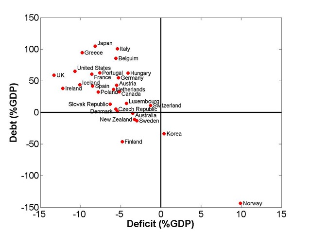
The question arises from discussions of deficit (how much the government’s annual spending exceeds its income) and debt (how much the government is borrowing). To use a digging analogy: debt is a hole, deficit is how fast you are deepening the hole. We can get a feel for how countries compare in this sense by plotting them as a function of their deficits and debts on a graph. I’ve done this for the countries of the OECD (data here). The horizontal axis tells you  the deficit, whilst the vertical axis is the debt. These values are plotted as a percentage of the gross domestic product (GDP) so we can compare big countries and small countries, rich countries and poor countries on an equal footing.

DebtDefict1

As we go to the top left area of this graph we find countries which are in the deepest hole, digging fastest. Out of the extreme left we find the UK – it is digging its hole fastest at the moment, but it is not in the biggest hole – that honour currently goes to Japan. On this graph our nearest neighbours are Ireland, the United States and Iceland, with Greece and Japan having higher debt but lower deficit. France and Spain have similar debts but rather lower deficits.

Norway is actually bringing in more money than it spends and building a surplus, they have large oil revenues and are saving against the day when it runs out. Korea is doing this too but to a far smaller extent.

Economically it is often said that the PIGS or PIIGS countries are in most trouble in Europe, these are Portugal, Ireland, (Italy), Greece and Spain.

But is it true to say we are like Ireland, the US and Iceland? Ireland and Greece have much higher levels of unemployment than us, whilst the US has slightly higher levels and Iceland’s levels are comparable. Iceland has very high inflation (12%) whilst most other countries have moderate inflation including the UK, with a few countries having moderate deflation including the US and Ireland. We have moderate levels of unemployment, with Ireland, Greece, the US having much higher levels. It’s also worth pointing out that the UK has a population of 60,000,000 whilst Ireland only has 4,000,000 and Iceland a mere 300,000.

So whilst in deficit/debt terms we may resemble other countries in other, economically relevant ways, we are quite different.

From a mathematical point of view there are methods for measuring the closeness of things based on large numbers of variables, called clustering algorithms. These algorithms amount to our eyeballing of the debt/deficit data – they are a measure of distance. However, in economic problems things aren’t so simple. The economy is described by many variables and I don’t know their relative importance in determining economic similarity. The problem that the numbers involved may vary tremendously in size is trivially solved. My suspicion is that economists have probably spent a great deal of time arguing about economic similarity and haven’t come to a definitive answer.

So in answer to the question: What country is the United Kingdom like economically? Although the UK may be most like Ireland, the US and Iceland in debt/deficit terms. In terms of many other economic factors such as inflation, unemployment and so forth it is quite different. I suspect the real answer to this question is that the UK is most like France, Germany and Italy economically: these countries are of similar size, have similar unemployment rates, have inflation of the same sign, usually run public sector/ private sector ratios of similar size furthermore given their common membership of the EU their economic behaviour is probably similar. Of this group of countries Italy has the largest debt and we have a largest deficit.

Poor attendance record in the House of Lords?

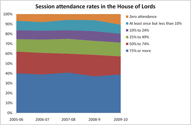
I know my readers love a chart, and today I found some data I thought was begging for a good graphing. It’s the attendance figures for the House of Lords found in a report entitled “Members Leaving the House” – found at the bottom of this article. The motivation for the report is to explore the idea of retirement for peers, something some peers are seeking regardless of any other changes taking place. A secondary motivation is that there is wider reform of the House of Lords proposed, and one of the issues is that the new House is envisaged, ultimately to have substantially fewer members – this type of discussion informs how that transition might be achieved.

The report contains a set of tables for the last five years indicating the fraction of sessions which peers attended broken down into groups:

  • Attended 75% or more sessions
  • 50% to 74%
  • 25% to 49%
  • 10% to 24%
  • Attended at least once but less than 10%
  • Zero attendance

This is what the data looks like:

PeerAttendance

To give some idea of scale: across the period shown here the total number of peers decreased from 777 to 741, the average number of sessions in a year was 140, this latter figure means that a peer attending “less than 10% of sessions” was attending less than twice. It compares with the number of working days in the year of approximately 240 (48*5 day weeks). Nearly 20% of peers attend a session in the House of Lords only once or twice a year.

Being a member of the House of Lords isn’t a proper job, it does not attract a salary, although peers may claim a subsistence and office allowance of up to £26,000 per year. In this sense we should not anticipate the levels of attendance achieved by those working “normally”. Some of the peers will be paid as government or opposition working peers. However, peers do have a direct effect on the laws the country makes and turning up twice a year (which is all 20% of them achieve) does suggest a fairly low degree of interest – if I did something twice a year I wouldn’t even consider it a hobby, I go to the dentist more often!

Yields from income tax

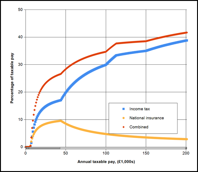
This post is a tour of income tax and personal national insurance yields, it’s motivated by an interest in seeing how one might pay for a part of the reduction in the deficit through taxation. The reason for focusing particularly on income tax is that it yields a fairly large fraction of the total tax income (28.7% in income tax and 46.6% income tax and national insurance combined), as discussed in a previous post; this means that relatively large amounts of money are raised by relatively small changes when compared to other taxes. Furthermore it’s relatively easy to calculate: I can work out how much income tax I pay in a year but would struggle to tell you how much VAT I pay per year, the impact of a tax on insurance premiums the effect of a change on duty and so forth. Thirdly, it is the tax that is most transparently progressive, in the technical sense that the more you earn the greater the fraction of your income you pay in tax.
This calculation is based on a calculation of personal tax rates from wikipedia, this figure generates the tax rates programmatically and I simply translated the code to my computer language of choice – I thought about doing it in a spreadsheet but that turned out to be a bit brainbending. The second component of the calculation is the number of people in each income bracket: this information along with further information on incomes can also be found on wikipedia. Ultimately the data come from the HMRC. I’ve put these two bits of data together into a program which enables me to fiddle with tax rates, tax thresholds and so forth. It appears to be approximately correct since it matches roughly HMRC’s own figures on the effects of small perturbations to the tax system (pdf). This also tells you it’s possible to look this stuff up – but I find it more fun to calculate it myself! It’s also a good illustration of the general process of how to go about repeating someones calculations from literature sources: try to reproduce their graphs; try to match the summary numbers they produce.
This first figure shows the income and national insurance payable as a fraction of gross (total) pay as a function of pay. The thing I hadn’t appreciated intuitively is that the tax banding system gives quite a smooth increase in percentage tax take, this is because you only pay raised rates on the fraction of your income that lies above the threshold:
TaxRatesAsAFunctionOfIncome
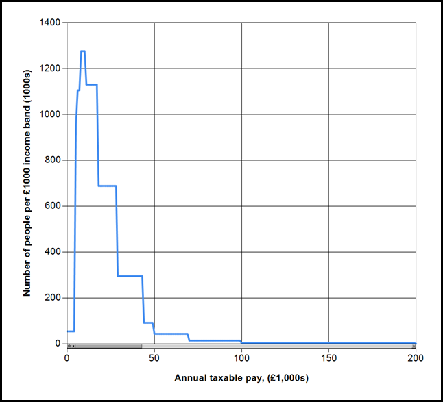
Extending the horizontal scale out towards incomes of £1,000,000 and the rate tends to 50%. The next figure shows the distribution of incomes, in the UK:
PopulationAsAFunctionOfIncomeBand
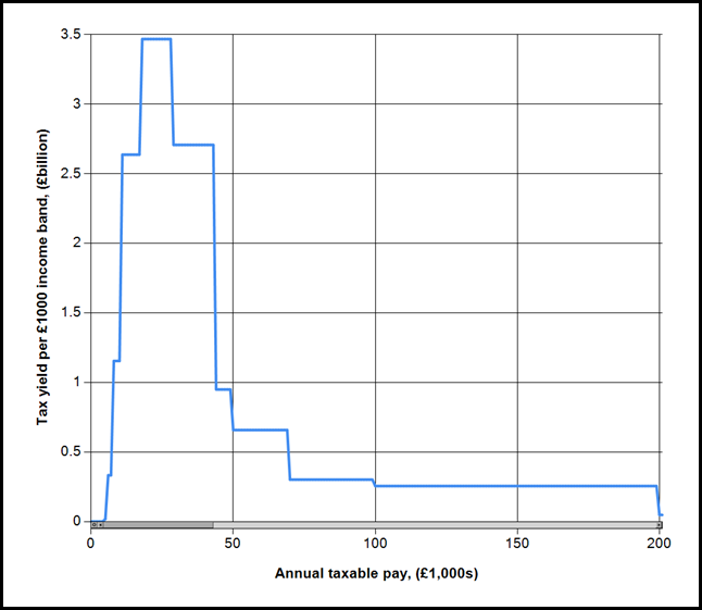
You can see the same information in text form here. The area under this curve between points on the horizontal axis tells you the number of people in an income band. The median income in the UK is £26k per annum – half the population earn more than this, half less. About 1% of the population earns more than about £100k per annum. This final figure shows the amount that each income band pays according to the latest tax rates.
TaxPaidAsAFunctionOfIncomeBand
To summarise this final figure in tax bands, the 20% band accounts for about 57% of tax paid, the 40% band for 26% and the 50% band for 17%. These bands contain respectively 90%, 9% and 1% of the income tax paying population.
In case you’re curious my salary puts me close to the top of the basic rate tax band.
To apply the knowledge embedded in these graphs to some recent problems:
As a rule of thumb: 1p on basic gives about £4bn, 1p on upper rate gives £0.75bn, 1p on the new 50% band gives £0.31bn. The reason for this sharpish dropoff is that relatively few people are effected by the upper rate tax changes so to yield a large tax income the rates have to be changed by a relatively large amount.
Reducing the threshold of the 40% tax band to £40k from £43k yields about £3bn.
The £20billion cut in welfare benefits is equivalent to approximately 5p on the basic rate of income tax, taking it to 24.5% from 20%. This would cost me about £1700 per year.
Tuition fees cost about £7.5billion (based on 1.5 million students each requiring an average £5k tuition fees per year), this is about 2p on basic rate. This would cost me about £800 per year.
The £2.5billion income gained from cutting child benefit from those in the upper tax band could be paid for with an increase in the upper rate to ~43% from 40%. Although it seems the £2.5billion figure is dubious. I can’t help thinking simply increasing the upper rate by this amount, rather than a convoluted attempt at clawback would be simpler. This isn’t to say I support the idea of paying child benefit to all regardless of income, just that implementing withdrawal in this way is technically complicated. This tax rise wouldn’t cost me anything!
I’ve not seen anybody volunteering for these tax increases to support their favoured causes, rather they prefer a range of schemes of dubious value impacting other people to avoid the problem falling upon themselves – a subject for my next post.
Note
This modelling was done using Visual C# running under Windows 7, if you’re interested either in the code or in just the application then let me know in the comments below (or on twitter). There are a couple of minor bits of tidying I’d like to do before release. Please note that the application is “good enough for blogging work” and should not be considered an accurate tool for tax calculations – it’s a toy to help me understand things!

Children and numbers

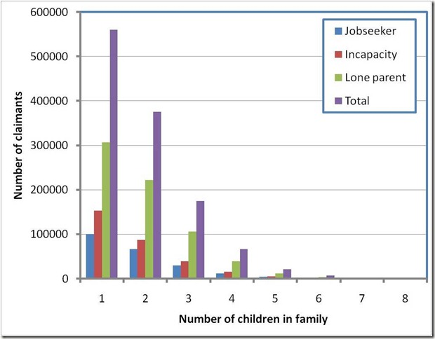
One of this mornings news items is on government plans to limit benefit to a family to the average wage, apparently regardless of the size of the family. This seems to be built around the idea that there are families out there with vast numbers of children who are milking the system to the cost of the rest of us. We can check this idea with numbers. The graph below shows the number of claimants broken down by number of children in the household, the final category is for families containing 8 or more children.
Picture1
The heights of the columns are a lower bound on the fraction of benefit going to each group, an upper bound would be to multiply each column by the number of children but this would be an over-estimate since benefits don’t increase linearly with number of children. There are a little under 1000 families with 8 children or more. 90% of claimant families have less than four children.
These data tell us nothing about the circumstances of each of the families represented which will include the loss of parents, illness, job loss and all the other small disasters which can befall a family.
The data shown here are from Department of Work and Pensions via The Spectator (here).

I was up for Evan Harris

This is a graph that shows you the number of seats (actual seats) each of the three main parties will get*, and the number of seats (proportional seats) they would get under a pure proportional system. You notice for the Labour and Conservative parties the number of seats they actually get is more than the number of seats in proportion to their votes, for the Liberal Democrats the opposite is true and by a very substantial margin.

When Liberal Democrats went into the polling stations yesterday they were given a single polling card, their Labour and Conservative comrades had three. Look them in the eye, ask them:

What is it about you that makes your vote three times more powerful, three times heavier, three times more important than mine?

What is special about you but not about me?

Explain to me how this is fair.

Explain to me how this is democracy.

To put it another way, every Labour or Conservative seat requires about 33,000 votes to win, a Liberal Democrat one requires 100,000 votes. We are the Great Ignored.

We have come to accept this inequity, it’s happened in every election since the early 80’s. As a country we just accept it as part of the way things are. It’s the defining feeling of being a Liberal Democrat, seeing the overall share of our vote creep up election by election and receiving the same feeble, disproportionate harvest in seats. The sinking feeling in the middle of the night that, no, of course there has been no breakthrough. It’s not because we perform poorly, it is because we have one polling card each, the others have three.

In 1997 the defining moment was Michael Portillo losing his seat to Stephen Twigg. My defining moment for this election was seeing Evan Harris lose his Oxford West and Abingdon seat. “I was up for Evan Harris”, I had a tear in my eye.

Footnote
*This is based on the exit poll (see entry at 23:11), which looks consistent with the results of the actual election as of 10:30am May 7th which are Conservative 291, Labour 247, Liberal Democrat 51 616 of 650 seats declared. Under pure proportionality UKIP would receive 20 seats, the BNP 12.