Category: Book Reviews

Reviews of books featuring a summary of the book and links to related material

Book review: Map of a Nation by Rachel Hewitt

ordnanceMap of a Nation” by Rachel Hewitt is the story of the Ordnance Survey from its conception following the Jacobite Uprising in Scotland in 1745 to the completion of the First Series maps in 1870. As such it interlinks heavily with previous posts I have made concerning the French meridian survey, Maskelyne’s measurements of the weight of the earth at Schiehallion, Joseph Banks at the Royal Society, William Smith’s geological map of Britain and Gerard Mercator.

The core of the Ordnance Survey’s work was the Triangulation Survey, the construction of a set of triangles across the landscape made by observing the angles between landmarks (or triangulation points) ultimately converted to distances. This process had been invented in the 16th century, however it had been slow to catch on since it was slow and required specialist equipment and knowledge. Chromatic abberration in telescopes was also a factor – if your target is surrounded with multi-colour shadows – which one do you pick to measure? The triangles are large, up to tens of miles along a side, so within these triangles the Interior Survey was made which details the actual features on the ground – tied down by the overarching Triangulation Survey.

A second component of this survey is the baseline measurement – a precise measurement of the length of one side of one triangle made, to put it crudely, by placing rulers end to end over a straight between the terminal triangulation points.

The Triangulation Survey is in contrast to “route” or “transverse” surveys which measure distances along roads by means of a surveyor’s wheel, note significant points along the roadside. There is scope for errors in location to propagate. Some idea of the problem can be gained from this 1734 map showing an overlay of six “pre-triangulation” maps of Scotland, the coastline is all over the place – with discrepancies of 20 miles or so in places.

The motivation for the Ordnance Survey mapping is complex. Its origins were with David Watson in the poorly mapped Scotland of the early part of the 18th century, and the Board of Ordnance – a branch of the military concerned with logistics. There was also a degree of competition with the French, who had completed their triangulation survey for the Carte de Cassini and were in the process of conducting the meridian survey to define the metre. The survey of England and Wales was completed after the Irish Triangulation and after the Great Trigonometric Survey of India – both the result of more pressing military and administrative needs. As the survey developed in England more and more uses were found for it. Indeed late in the process the Poor Law Commission were demanding maps of even higher resolution than those the Ordnance Survey initially proved, in order to provide better sanitation in cities.

The Survey captured popular imagination, the measurements of the baseline at Hounslow Heath were a popular attraction. This quantitative surveying was also in the spirit of the Enlightenment. There was significant involvement of the Royal Society via its president, Joseph Banks, and reports on progress were regularly published through the Society. Over the years after the foundation of the Ordnance Survey in 1791 accurate surveying for canals and railways was to become very important. In the period before the founding of the Ordnance Survey surveying was a skill, related to mathematics, which a gentleman was supposed to possess and perhaps apply to establishing the contents of his estate.

Borda’s repeating circle, used in the French meridian survey to measure angles, found its counterpart in Jesse Ramsden’s “Great Theodolite“, a delicate instrument 3 feet across and weighing 200lbs. The interaction with the French through the surveying of Britain is intriguing. Prior to the French Revolution a joint triangulation survey had been conducted to establish exactly the distance between the Paris and Greenwich meridians, with the two instruments pitted against each other. There was only a 7 foot discrepancy in the 26 miles the two teams measured by triangulation between Dover and Calais. In 1817, less than two years after the Battle of Waterloo a Frenchman, Jean-Baptiste Biot, was in the Shetlands with an English survey team extending the meridian measurements in the United Kingdom.

The accuracy achieved in the survey was impressive, only one baseline measurement is absolutely required to convert the angular distances in the triangulation survey into distances but typically other baselines are measured as a check. The primary baseline for the Triangulation Survey was measured at Hounslow Heath, a second baseline measured at Romney Marsh showed a discrepancy of only 4.5 inches in 28532.92 feet, a further baseline measured at Lough Foyle, in Northern Ireland found a discrepancy of less than 5 inches in 41,640.8873 feet.

The leaders of the Ordnance Survey were somewhat prone to distraction by the terrain they surveyed across, William Roy, for example, wrote on the Roman antiquities of Scotland. Whilst Thomas Colby started on a rather large survey of the life and history of Ireland. Alongside these real distractions were the more practical problems of the naming of places: toponymy, particularly difficult in Wales and Ireland where the surveyors did not share the language of the natives.

Overall a fine book containing a blend of the characters involved in the process, the context of the time, the technical details and an obvious passion for maps.

Footnotes

In writing this blog post I came across some interesting resources:

Book Review: The Visual Display of Quantitative Information by Edward R. Tufte


tufteThe Visual Display of Quantitative Information” by Edward R. Tufte is a classic in the field of data graphics which I’ve been meaning to read for a while, largely because the useful presentation of data in graphic form is a core requirement for a scientist who works with experimental data. This is both for ones own edification, helping to explore data, and also to communicate with an audience.

There’s been something of a resurgence in quantitative data graphics recently with the Gapminder project led by Hans Gosling, and the work of David McCandless and Nathan Yau at FlowingData.


The book itself is quite short but beautifully produced. It starts with a little history on the “data graphic”, by “data graphic” Tufte specifically means a drawing that is intended to transmit data about quantitative information in contrast to a diagram which might be used to illustrate a method or facilitate a calculation. On this definition data graphics developed surprisingly late, during the 18th century. Tufte cites in particular work by William Playfair, who was an engineer and political economist who is credited with the invention of line chart, bar chart and pie chart which he used to illustrate economic data. There appears to have been a fitful appearance of what might have been a data graphic in the 10th century but to be honest it more has the air of a schematic diagram.

Also referenced are the data maps of Charles Joseph Minard, the example below shows the losses suffered by Napoleon’s army in it’s 1812 Russian campaign. The tan line shows the army’s advance on Moscow, it’s width proportional to the number of men remaining. The black line shows their retreat from Moscow. Along the bottom is a graph showing the temperature of the cold Russian winter at dates along their return.

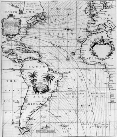
800px-MinardInterestingly adding data to maps happened before the advent of the more conventional x-y plot, for example in Edmund Halley’s map of 1686 showing trade winds and monsoons.

Next up is “graphic integrity”: how graphics can be deceptive, this effect is measured using a Lie Factor: the size of the effect shown in graphic divided by the size of the effect in data. Particularly heroic diagrams achieve Lie Factors as large as 59.4. Tufte attributes much of this not to malice but to the division of labour in a news office where graphic designers rather than the owners and explainers of the data are responsible for the design of graphics and tend to go for the aesthetically pleasing designs rather than quantitatively accurate design.


Tufte then introduces his core rules, based around the idea of data-ink – that proportion of the ink on a page which is concerned directly with showing quantitative data:

  • Above all else show the data
  • Maximize the data-ink ratio
  • Erase non-data-ink
  • Erase redundant date-ink
  • Revise and edit.

A result of this is that some of the elements of graph which you might consider essential, such as the plot axes, are cast aside and replaced by alternatives. For example the dash-dot plot where instead of solid axes dashes are used which show a 1-D projection of the data:

ddp

Or the range-frame plot where the axes are truncated at the limits of the data, actually to be fully Tufte the axes labels would be made at the ends of the data range, not to some rounded figure:

range

Both of these are examples are from Adam Hupp’s etframe library for Python. Another route to making Tufte-approved data graphics is by using the Protovis library which was designed very specifically with Tufte’s ideas in mind.

Tufte describes non-data-ink as “chartjunk”, several things attract his ire – in particular the moiré effect achieved by patterns of closely spaced lines used for filling areas, neither is he fond of gridlines except of the lightest sort. He doesn’t hold with colour or patterning in graphics, preferring shades of grey throughout. His argument against colour is that there is no “natural” sequence of colours which link to quantitative values.

What’s striking is that the styles recommended by Tufte are difficult to achieve with standard Office software, and even for the more advanced graphing software I use the results he seeks are not the out-of-the-box defaults and take a fair bit of arcane fiddling to reach.  Not only this, some of his advice contradicts the instructions of learned journals on the production of graphics.

Two further introductions I liked were Chernoff faces which use the human ability to discriminate faces to load a graph with meaning, and sparklines – tiny inline graphics showing how a variable varies in time without any of the usual graphing accoutrements: – in this case one I borrowed from Joe Gregorio’s BitWorking.

In the end Tufte has given me some interesting ideas on how to present data, in practice I fear his style is a little too austere for my taste.There’s a quote attributed to Blaise Pascal:

I would have written a shorter letter, but I did not have the time.

I suspect the same is true of data graphics.

Footnote

Mrs SomeBeans has been referring to Tufte as Tufty, who UK readers of a certain age will remember well.

Lavoisier: Chemist, Biologist, Economist by Jean-Pierre Poirier

Lavoisier

Recently I read Vivian Grey’s biography of Lavoisier. Although a fine book, it left me wanting more Lavoisier, so I turned to Jean-Pierre Poirier’s more substantial biography: “Lavoisier: Chemist, Biologist, Economist”. Related is my blog post on the French Académie des Sciences, of which Lavoisier was a long term member, and senior, member.

This is a much longer, denser book than that of Grey, with commonality of subject it’s unsurprising that the areas covered are similar. However, Poirier spends relatively more time discussing Lavoisier’s activities as a senior civil servant and as an economist.

The striking thing is the collection of roles that Lavoisier had: senior member of Ferme Générale (commissioned Paris wall), director of the Académie, director of the Gunpowder and Saltpeter Administration, owner and manager of his own (agricultural) farms. It’s difficult to imagine a modern equivalent, the governor of the Bank of England running a research lab? Or perhaps an MP with a minor ministerial post, running a business and a research lab? In practical terms he did experimental work for a few hours each morning and evening (6-9am, 7-10pm) and on Saturdays – having a number of assistants working with him.

Lavoisier was wealthy, inheriting $1.8million* from relatives as an 11 year old he joined the Ferme Générale with an initial downpayment of about $3million. However, this provided an income of something like $2.4-4.8 million a year. On a trip to Strasbourg as a 24 year old, he spent $20,000 on books – which you have to respect. As the collector of taxes levied on the majority but not the nobility or clergy, the Ferme Générale was one of the institutions in the firing line when the Revolution came. Wealthy financiers, such as Lavoisier, bought stakes in these private companies, provided exclusive rights by the King, and made enormous rates of return (15-20%), at the same time serving the Kings needs rather poorly.

As for his activities in chemistry, Poirier provides a a good background to the developments going on at the time. Beyond what I have read before, it’s clear that Lavoisier does not make any of the first discoveries of for example, oxygen, carbon dioxide or nitrogen, nor of the understanding that combustion results in weight gain. But what he does do is build a coherent theory that brings all of these things together and overthrows the phlogiston theory of combustion. With Guyton de Morveau he develops a new, systematic, way of naming chemicals which is still used today and, as a side effect, embeds his ideas about combustion. It’s from this work that the first list of elements is produced. Furthermore, Lavoisier sees the applications of the idea of oxidation in explaining “chemical combustion” as entirely appropriate for understanding “biological combustion” or respiration. In a sense he sets the scheme for biochemistry which does not come to life for nearly 100 years, for want of better experimental methodology.

It’s interesting that gases are arguably the most difficult materials to work with yet it is their study, in particular understanding the components of air, which leads to an understanding of elements, and the “new chemistry”. Perhaps this is because gases are their own abstraction, there is nothing to see only things to measure.

The book also gives a useful insight into the French Revolution for someone who would not read the history for its own sake. The heart of the Revolution was a taxation system that exempted the nobility and the clergy from paying anything, and a large state debt from supporting the American War of Independence. Spending appears to have been decided by the nobility, or even just the King, with little regard as to how the money was raised. At one point Paris considered an aqueduct to bring in fresh water to all its citizens, but then decided that rebuilding the opera house was more important! The Revolution was a rather more drawn out than I appreciated with Lavoisier at the heart of the ongoing transformation at the time of his execution during the Terror, only to be lauded once again a couple of years later as Robbespierre fell from power and was executed in his turn.

On economics: Lavoisier was one of the directors of the French Discount Bank, during the Revolution he was involved in plans for a constitutional monarchy and amongst the ideas he brought forward was for what would essentially be an “Office for National Statistics”. The aim being to collect data on production and so forth across the economy in support of economic policy. This fits in with the mineral survey work he carried at the very beginning of his career and also on his work in “experimental farming”. Economic policy at the time alternating between protectionism (no wheat exports) and free-markets (wheat exports allowed), with many arguing that agriculture was the only economically productive activity.

It’s tempting to see Lavoisier’s scientific and economic programmes being linked via the idea of accounting: in chemistry the counting of amounts of material into and out of a reaction and in economics counting the cash into and out of the economy.

Definitely a book I would recommend! It’s remarkable just how busy Lavoisier was in a range of areas, and the book also provides a handy insight into the French Revolution for those more interested in science. I wondering whether Benjamin Franklin should be my next target.

Footnote

*These are equivalences to 1996 dollars, provided in the book, they should be treated with caution.

Book Review: The Chemist Who Lost His Head by Vivian Grey

Portrait_of_Antoine-Laurent_Lavoisier_and_his_wife

Following on from “The Measure of All Things” my interest in Antoine Lavoisier was roused, so I went off to get a biography: “The Chemist who lost his head: The Story of Antoine Laurent Lavoisier” by Vivian Grey. This turns out to be a slim volume for the younger reader, in fact my copy appears to arrive via the Jenks East Middle School in Tulsa. As a consequence I’ve read it’s 100 or so pages in under 24 hours – that said it seems to me a fine introduction.

Antoine Lavoisier lived 1743-1794. He came from a bourgeoisie family, the son of a lawyer, and originally training as a lawyer. Subsequently he took up an education in a range of sciences. As a young man, in 1768, he bought into the Ferme Générale which was to provide him with a good income but led to his demise during the French Revolution. The Ferme Générale was the system by which the French government collected tax, essentially outsourcing the process to a private company. Taxes were collected from the so-called “Third Estate”, those who were not landed gentry or clergy. Grey indicates that Lavoisier was a benign influence at the Ferme Generale, introducing a system of pensions for farmers and doing research into improved farming methods. Through the company he met his future wife, Marie Anne Pierrette Paulz, daughter to the director of the Ferme – Antoine and Marie married in 1771 when she was 14 and he 28.

Lavoisier started his scientific career with a geological survey of France, which he conducted as an assistant to Jean Etienne Guettard between 1763 and 1767. This work was to be terminated by the King, but was completed by Guettard with Antoine Grimoald Monnet although Lavoisier was not credited. There seems to be some parallel here with William Smith’s geological map of the UK produced in 1815.

Through his geological activities Lavoisier became familiar with the mineral gypsum, found in abundance around Paris. He undertook a detailed study of gypsum which sets the theme for his future chemical research: making careful measurements of the weight of material before and after heating or exposure to water. He discovered that gypsum is hydrated: when heated it gives off water, when the dehydrated powder (now called plaster of Paris) is re-hydrated it forms a hard plaster. He wrote this work up and presented it to the Académie des Sciences – the French equivalent of the Royal Society, on which I have written repeatedly.

He was to present several papers to the Académie before being elected a member of this very elite group at the age of twenty-five, half the age of the next youngest member. Once a member he contributed to many committees advising on things such as street lighting, fire hydrants and other areas of civic interest, the Académie was directly funded by the King and more explicitly tasked with advising the government than the Royal Society was. Lavoisier was also involved in the foundation of the new metric system of measurement, which was the subject of “The Measure of All Things”. Lavoisier became one of four commissioners of gunpowder – an important role at the time. During his life he would have had contact with Joseph Banks – a long term president of the Royal Society, and also Benjamin Franklin – scientist and also United States Ambassador to France.

From a purely scientific point of view Lavoisier is best known for his work in chemistry: his approach of stoichiometry – the precise measurement of the mass of reactants in chemical reactions led to his theory of combustion which ultimately replaced the phlogiston theory. It is this replacement of phlogiston theory with the idea of oxidization that forms the foundation of Kuhn’s “paradigm shift” idea, so Lavoisier has a lot to answer for!

The portrait of Antoine and Marie Laviosier at the top of the page is by Jacques-Louis David painted ca. 1788. It strikes me as quite an intimate portrait with Marie pressed against Antoine, looking directly at the viewer whilst her husband looks at her. Marie played a significant part in the work of Lavoisier, as well as recording experiments and drawing apparatus (something that takes good understanding to do well), and assisting with correspondence and translation  she was also responsible for publishing Mémoires de Chimie after his death. She was a skilled scientist in her own right. The equipment on the table and floor can be identified: on the floor is a portable hydrometer and a glass vessel for weighing gases. On the table are a mercury gasometer, and a glass vessel container mercury – likely illustrating the properties of oxygen and nitrogen in air.

Antoine Lavoisier was executed in 1794, for his part in the Ferme Générale. His execution is attributed, at least in part to the ire of Jean-Paul Marat, who Lavoisier had earlier blocked from membership of the Académie des Sciences. It seems Lavoisier had been warned by friends that his life was in danger but appeared to think his membership of the Académie des Sciences would protect him. Ironically Jacques-Louis David also painted “The Death of Marat”.

100 pages on Lavoisier was not enough for me, I’m going for “Lavoisier” by Jean-Pierre Poirier next – some fraction of which appears to be available online, but I’m going for a paper copy.

Book review: The Measure of All Things by Ken Alder

TheMeasureOfAllThingsThe Measure of All Things“ by Ken Alder tells the story of Pierre Méchain and Jean Baptiste Joseph Delambre’s efforts to survey the line of constant longitude (or meridian) between Dunkerque and Barcelona through Paris, starting amidst the French Revolution in 1792.

The survey of the meridian was part of a scheme to introduce a new, unified system of measures. The idea was to fix the length of the new unit, the metre, as 1/10,000,000th of the distance between the North Pole and the equator on a meridian passing through Paris.

At the time France used an estimated 250,000 different measures across the country with each parish having it’s own (uncalibrated) weights and measures with different measures for different types of material i.e. a “yard” of cotton was different from a “yard” of silk, and different if you were buying wholesale or selling to end users. These measures had evolved over time to suit local needs, but acted to supress trade between communities. Most nations found themselves in a similar situation.

Although the process of measuring the meridian started under the ancien regime, it continued in revolutionary France as a scheme that united the country. The names associated with the scheme: Laplace, Legrendre, Lavoisier, Cassini, Condorcet, leading lights of the Academie des Sciences, are still well known to scientists today.

Such surveying measurements are made by triangulation, a strip of triangles is surveyed along the line of interest. This involves precisely measuring the angles between each each vertex of the triangles in succession: given the three angles of a triangle and the length of one side of the triangle the lengths of the other two sides can be calculated. It’s actually only necessary to measure the length of one side on one triangle on the ground. Once you’ve done that you can use the previously determined lengths for successive triangles. All of France had been surveyed under the direction of César-François Cassini in 1740-80, the meridian survey used a subset of these sites measured at higher precision thanks to the newly invented Borda repeating circle. As well as this triangulation survey a measure of latitude was made at points along the meridian by examining the stars.
The book captures well the feeling of experimental measurement: the obsession with getting things to match up via different routes; the sick feeling when you realise you’ve made a mistake perhaps never to be reversed; the frustration at staring at pages of scribbles trying to find the mistake; the pleasure in things adding up.

Méchain and Delambre split up to measure the meridian in two sections: Delambre taking the northern section from Dunkerque to Rodez and Méchain the section from Rodez to Barcelona. Méchain delayed endlessly throughout the project, trusting little measurement to his accompanying team. Early on in the process, at Barcelona, he believed he had made a terrible error in measurement, but was unable to check whilst Spain and France were at war. He was wracked by doubt for the following years, only handing over doctored notes with great reluctance at the very end of the project. He was to die not long after the initial measurements were completed, leaving his original notes for Delambre to sift through.

At the time the measurements were originally made the understanding of experimental uncertainty, precision and accuracy were poorly developed. Driven in part by the meridian project and similar survey work by Gauss in Germany, statistical methods for handling experimental error more rigorously were developed not long afterwards. I wrote a little about this back here. Satellite surveying methods show that the error in the measurement by Méchain and Delambre is equivalent to 0.2 millimetres in a metre or 0.02%.

In the end the Earth turns out not to be a great object on which to base a measurement system: although it’s pretty uniform it isn’t really uniform and this limits the accuracy of your units. The alternative proposed at the time was to base the metre on a pendulum: it was to have the length necessary to produce a pendulum of period 2 seconds. This is also ultimately based on properties of the Earth since the second was defined as a certain fraction of the day (the time the Earth takes to rotate on its axis) and the local gravity which varies slightly from place to place, as Maskelyne demonstrated.

Following the Revolution, France adopted, for a short time, a decimal system of time as well as metric units but these soon lapsed. However, the new metric units were taken up across the world over the following years – often this was during unification following war and upheaval.

The definition of the basic units used in science is still an active area. The definition of the metre has not relied on a unique physical object since 1960, rather it is defined by a process: the distance light travels in a small moment of time. However, the kilogram is still defined by a physical object but this may end soon with some exquisitely crafted silicon spheres.

I must admit to being a bit wary of this book in the first instance, how interesting can it be to measure the length of a line? However, it turns out I like to read history through the medium of science and the book provides an insight into France at the Revolution. Furthermore measuring the length of a line is interesting, or it is to a physicist like me.

Thanks to @beckyfh for recommending it!

Footnotes
1. The full-text of the three volume “Base du système métrique décimal” written by Delambre is available online. The back of the second volume contains summary tables of all the triangles and a diagram showing their locations.
2. The author’s website.
3. Some locations in Google Maps.